For a show named after a town, the establishment of the location was always going to be of utmost importance. In this extensive interview the shows production designer reveals how much of a part the design of the fictional town played in the series’ eventual success.
SPLENDOID: Welcome Richard. Let’s start at the very beginning. How did you get involved in the project? Did you actively pursue or did it just arrive on your doorstep unannounced?
HOOVER: I was in Grad school at the University of Minnesota. I happened to meet Warren Frost who was teaching there, I did plays for him and met his sons as a result. Years later I went to Telluride Festival and happened to see a film with Mark’s name on it. At that time Warren lived in Los Angeles, I think I got Mark’s number from him and I called him to congratulate him on the film, which of course was the pilot for Twin Peaks. He asked what I was doing and invited me over. I then met Greg Feinberg and we talked about the series that was upcoming…they invited me to join and shortly after introduced me to David.
So what was your actual experience at that point? You had worked on films as a set decorator/art director and done some TV movies but I think Twin Peaks was the first TV show that you had production designed in full?
Correct. At that point, I had done theatre sets and had, in the mid-’80s, migrated to Los Angeles to pursue design for film. I didn’t know much about how one does that. Twin Peaks was a trial by fire with a need for a fast learner. The show was really the first time I practiced set design in the real world of TV and there I was constantly under pressure.
What was the feeling on set going in? Was there any idea what the show would become such a hit and create such a legacy of a huge and dedicated fan following or the establishment of the trend for high-quality‘ box set’ TV shows?
We had no idea of the particular potential of the show but we enjoyed its journey, its goofiness and the mix of humour and drama. It was really a good time. We shot the first episodes and they would be then on the air the following week…some of the crew would meet to get food and watch the show. During this time we became even more excited by what we were seeing and what we were doing.
The spaces were treated as locations within a 4 wall reality riffing on material themes of the Pacific Northwest: stone, wood, moss, rain, dirt…
I think this enjoyment really comes across in those early shows but how was the working environment as the show developed? There was famously a lot of tension between studio and writers. Did this affect the design process at all?
We started with very little time to get things ready. I had the reference from the pilot show, some location photos etc. I went from there under the guidance of Greg, Mark and David. The reality was that we had to move fast, we had to build quickly and so much of the time I was allowed to get things going with very little problem from the writers. If I remember correctly the series was written before we started the first season so Mark had a clear trajectory of what we needed to make and or find. The network actually was never a hold up…this was David’s and Mark’s show and we were there to get it going as they saw it.
To get more design specific, Lynch is a director with a great spatial awareness. In other words the places he creates on screen are always of great importance to the narrative, they are like characters themselves. How was it working with a director with a strong visual drive? Were there any specific challenges?
The spaces were treated as locations within a 4 wall reality riffing on material themes of the Pacific Northwest: stone, wood, moss, rain, dirt.. The series depended on altered pacing of time, that teased us constantly…eg the lynch effect. We wanted that we see character in environment from a specific normal place in the American idiom.
We had real ceilings and real walls white the camera often used wide shots, real and literal spacing of rooms and halls. The series is a celebration of the mystical in the midst of the organic woods of the north west with the repeated question: what really lies beneath the comfortable and banal reality of these characters. Surface context of spaces was linked always to geography of where the story was set: the NORTH WEST mountains. This demanded that we embrace the atmosphere of the North West: fog, rain, wood all with an idea that the landscape was more or less like a primordial soup for the story.
The challenges location-wise were to find the story in the LA area, a rather dry place, while the story was wet and overgrown. We gravitated to any place that has pine or fur trees, wood buildings, log structures, etc. On stage, the problems were mainly how to fit everything into the warehouse in Van Nuyes… at times we built sets within sets. We often did not know if the sets would be used again or not.
Was the working environment very prescriptive as a result or were your team able to bring much to the table?
Both are true: demands to match the pilot became the leading idea at first while we were able to riff from there on both the banal and mysterious settings.
Did you get to see the scripts in full before you started to design?
At times yes in the first season. The Second season was more difficult since writing was going on during shooting.

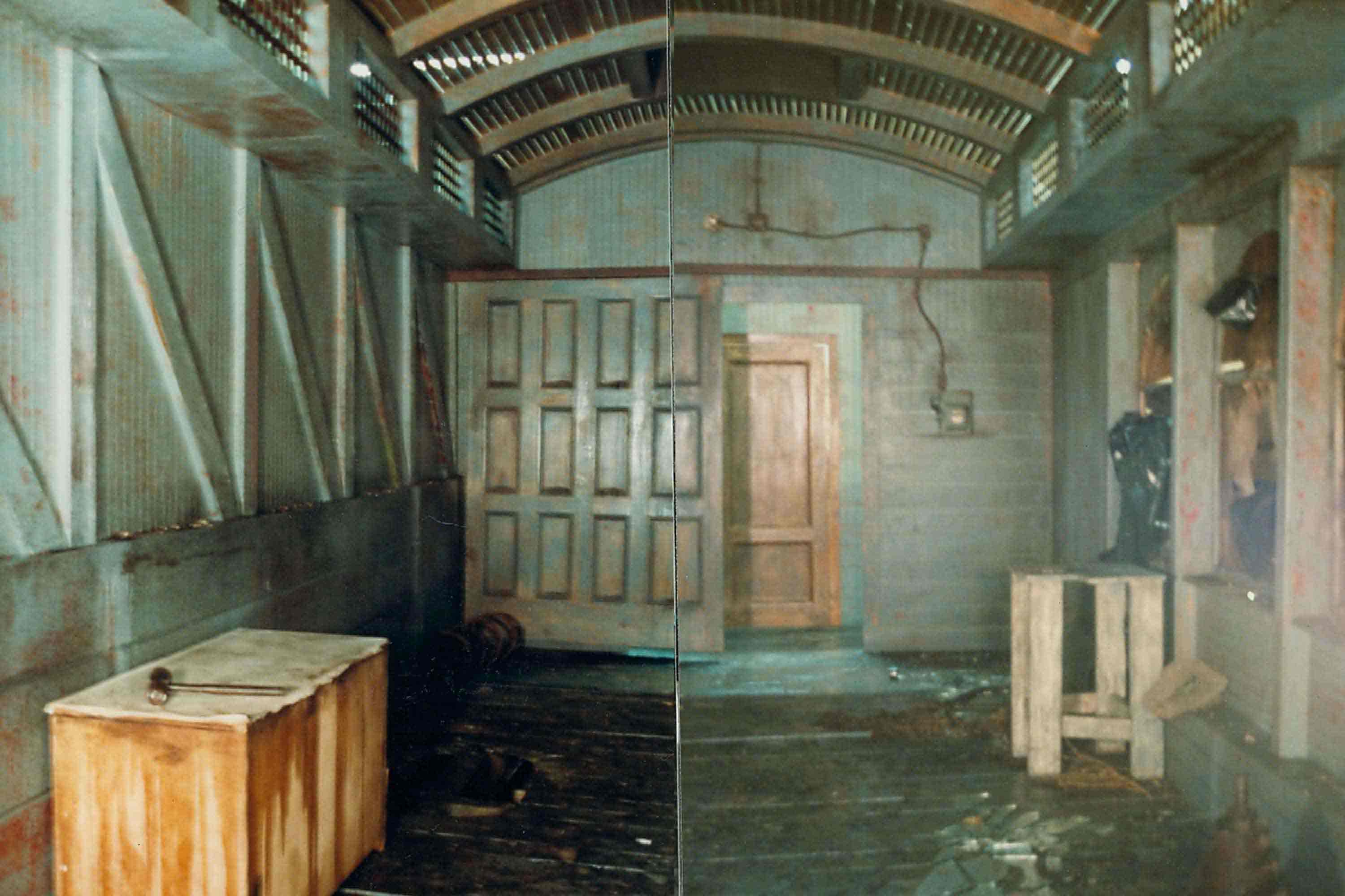


The show is a mix of soap opera, police procedural and the supernatural, that’s quite a mixture. But you managed to reflect each element in the set design – there is a naturalism but also a ‘studio’ quality. Was there an over-riding concept to adhere to?
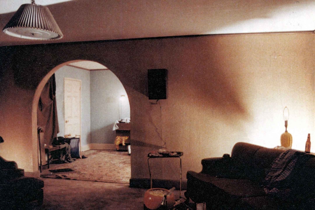
The sets were built on stage which perhaps gave them a gloss of unreality, although some were studies on the mundane in a suburban America. While looking into the banal, we wanted mystery in the appearance of the real. But really mystery is the step child of pacing, acting, and method of shooting which of course is true of the humor.
I think Lynch celebrates the normal in which both funny and dark things might occur…but all are based on something apparently real.
I always like the fact that the stage sets have a very sumptuous quality for the most part. Was this all genuine or did you employ some tricks to create that high-end look on a budget?
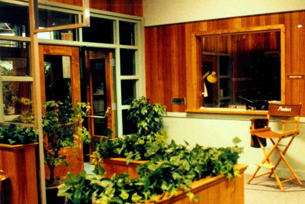
The wood in some gave it a rich feeling…eg we use real pine planking and real stain to get the woodiness there. I think it speaks to the producers that allowed making as well as exploration of the rich and sometimes outrageous kinds of places. Also, it probably reflects that I had not come from a TV design world (three wall sets, hard lighting) but rather from a world of discovery. No one told us how to do it we just did it. We embraced detail and created a whole environment into which our characters were inserted….again each kind of place reflected the dynamics of wealth vs working class in the TP community.
How many sets were there on total? What was the percentage between location settings and studio sets?
Maybe 10 on stage, several in storage. Mostly over 7 days we were two days out of the stage, but this depended on the script.
Could you detail where you built the sets, which studio, lot etc?
We were in warehouses near the Van Nuys airport on the west side…never on a studio lot but always in our zone. Sets were built either on stage in these locations. We had two large spaces and could build while they were shooting. Eventually, we had a shop off-campus. Set dressing stored where it could…
How long was the schedule in which you had to complete the sets?
We had about 6 weeks to do the initial design and build for the first season. (Big Pine Lodge, the hotel lobby, café, hall, and office, the police station, the dr house, the diner etc)
For a European certain sets scream ‘America,’ some even seem familiar, as if extracted from other TV shows and films. Was it the shows intention to create a stereotypical pastiche in terms of setting to create a recognisable grounding on which to build the fantastical elements of the rest of the story?
The story is set in a “normal” American town that speak to a very archetypal America. Residences spoke to a “normal” banality as did the police station and diner. The hotel reflected the rather kitsch of a lumbering area where wood and rock are brought inside to reflect what is outside. And in these normal places the abnormal has seemingly taken root… Forces of darkness, man made or mystical, lurk within and just below the skin of normal America. This was Lynch and Frost’s milieu. And here while rooms seem normal suggestive “evil” boils and digs in. This was true of environments as well as characters.
Some of the sets are real locations like the Sheriffs office and Double R diner. If shooting on location how much dressing was necessary? Did you recreate the interiors in the studio?
The pilot was done on location west and east of Seattle. I should say that I did not do the pilot. Locations there were sometimes duplicated for the series based on photos taken during the scouting. Yes…we recreated and expanded these sets for the stage work which kept the work mostly in Los Angeles. Some second unit work was done back up in Washington State.
How were these locations found? A lot of scouting?
At the start, we designed and built. Scouting happened simultaneously. We gravitated anywhere with pine and fur trees for exteriors in an effort to suggest the Northwest… Interiors were sought that also reflected both the mundane Americana and the woodsy feel the piece needed.
I had not come from a TV design world (three wall sets, hard lighting) but rather from a world of discovery
No one told us how to do it we just did it. We embraced detail and created a whole environment into which our characters were inserted
Did you make use of existing sets from other shows, with a bit of retrofitting? Maybe there are some surprises with elements that came from other shows that we might know?
All the stage sets were original builds.
Of course some exteriors are in LA. How hard was it to match exterior etc so it looked like the North West? I feel some of the locations you used seem familiar from shows like The Man From Uncle through to Desperate Housewives, would I be right in that thinking?
Gosh, I do not know these shows well enough to make a comment. As said earlier we found places with trees in abundance…that had the north woods feel, and that also might reflect the Americana feel in the story. Note that in the area, such as Alta Dena and Pasadena, we relished the existence of rows of craftsman homes, and ,any streets that were lined with pines. This type of housing built in the early 20th Century were common in the Northwest and indeed throughout the USA.
Now to get on to something very particular, lets talk about the iconic set of Twin Peaks. Of course, I am talking about the Red Room.
Sure. The Red Room was a design from Lynch which he created for the pilot. I then re-produced it for the series.
What I love about the Red Room set is that it has huge presence and yet is a very simple idea. Also, it seems very scalable in that it sometimes it seems very large and yet can be very small. In many ways, the perfect set as I imagine it was also quite cheap to build? Can you reveal how it was put together?
The red room was all on stage…I guess maybe 30 foot square…hard to remember. Drapery was done professionally by industry drapers working with the set decorating group. We then had a grid from which we hung our drape pipes….the floor was built up of two layers of MDF and with masonite over to allow for smooth painting.
And finally, to close, looking back now all the sets but the Red Room particularly, seem to be very much a forerunner of what some people call ‘retro-chic.’ On the show you took elements from all over, adding them together to create something very stylised. This influence is now seen everywhere, particularly in other film material, Wes Anderson springs to mind. We also see it in interior design of homes, restaurants, offices etc. Did you and the show set out to openly make such a design statement?
We did not design to become a style but rather to fit the wacko world found in the Northwest. Lynch and Frost created the idiom and we sought out sets and dressings to run with it. Retro was not discussed although it was implicit in the making of a “normal” America.

