Eric Rosenberg is a graphic designer with a film-related CV even longer than the combined hair length of The Allman Brothers Band, circa 1972. The films he has designed graphics for include such luminaries as Fight Club and The Truman Show, as well as that tour de force of period detail, Forrest Gump.
Working in the historical recreation mode requires a certain kind of designer with a special kind of creative process. In the following interview Rosenburg details the challenges peculiar to bringing near history back to life on screen.
SPLENDOID: Welcome Eric. To start us off, how did you get involved in the project? Did you actively pursue or did it come to you?
ER: I had worked on Cameron Crowe’s previous film Jerry Maguire, which went very well. Besides having the opportunity to develop a good working relationship with Cameron, I also worked closely with Set Decorator, Clay Griffith, and Art Director, Clayton Hartley. They were all also subsequently hired by Cameron to design and art direct Almost Famous. In fact, multiple personnel from Jerry Maguire were asked to return for the new film.
The answer is fairly clear but would you say that you are a fan of American rock music of the period depicted in the film?
Yes, absolutely! In 1973, the year the film is set in I was 10 years old, so just a bit too young to know the music scene depicted in the film. However by 1975, I had begun buying records, and within the next two years had collected a great deal of what we now call “Classic Rock”. In the Summer of 1977 most of the top acts played my hometown of New York City, appearing at Madison Square Garden. This came at the end of 8th grade, a time when my friends and I had gone deep into rock music. Within a three month span, I attended concerts by Led Zeppelin, Pink Floyd, Yes, Bad Company, Electric Light Orchestra, Fleetwood Mac and Peter Frampton. Coincidentally, Frampton was hired by the Almost Famous production as their chief performance consultant, teaching the actors who played Stillwater at the film’s “rock school”. When I met him following his costume fitting the first thing I said was “Well the last time I saw you it was on stage at Madison Square Garden in 1977!”. That’s one of the amazing things about working in the film business, you never know who you’re going to meet.
However, once the tide of punk and new wave hit, I thoroughly fell into that music. In 9th grade the cover of my school notebook was adorned with photos of Lynyrd Skynyrd and the Sex Pistols, I was straddling two worlds for sure! With this new area of interest, I moved sharply away from the popular rock music that had been my focus, and it was many, many years before I returned to it. Almost Famous played a big part in that, I distinctly recall back in 1999, sitting in my Almost Famous office and listening to the Led Zeppelin BBC Sessions. Hearing that familiar music played in what was to be a fresh way helped me to once again appreciate Led Zeppelin as that young, raw and vital rock band they’d been. Count me in as one of the buyers for the upcoming deluxe reissue of that set, on vinyl of course!
How far did you take that personal enthusiasm into the project?
Sometimes there are projects you feel destined for, Almost Famous was certainly that for me. I’ve always been passionate about music. Amongst my friends I had the most records, went to the most concerts, and retained that zeal all through my adult years, whereas for me friends it largely fell away. Though I wasn’t playing them too much in the age of CDs, I had kept my 1200 records, and during the production of Almost Famous began to play artists of that period once again.
If we might ignore the music itself for a second. If we talk in pure graphic design terms, the early 1970s period, certainly in the US, has a specific look. The experimentalism of the ’60s lost its steam and design went back to more traditionalist, read safer forms, albeit with a few bits of psychedelia, etc seeping through. Much like the music itself, which had a return to classic blues/country structures albeit with a bit of a modern edge. Firstly, Would you agree? And if so, how far did you design with a personal interpretation of that period?
Once I was hired I dove into researching the period. I had my record collection of course, but I also had the “Album Cover Album” book by Roger Dean of Hipgnosis fame (Pink Floyd, Yes), along with a few others. Upon looking closely at these books distinct design and stylistic trends come through. With this foundation, I as a designer can start to go back in time and approach the film’s design projects with a 1970’s mindset. The goal is not to just mimic another design from the period but to create a new design that truly feels like it was designed back then
Upon looking closely at these books distinct design and stylistic trends come through. With this foundation. aS A designer I can start to go back in time and approach the film’s design projects with a 1970’s mindset
Agreed, there is a need to be historically accurate in period films. Stillwater are loosely based on groups like Creedence, The Band, and The Eagles. Did you use the graphics work of those groups as inspiration?
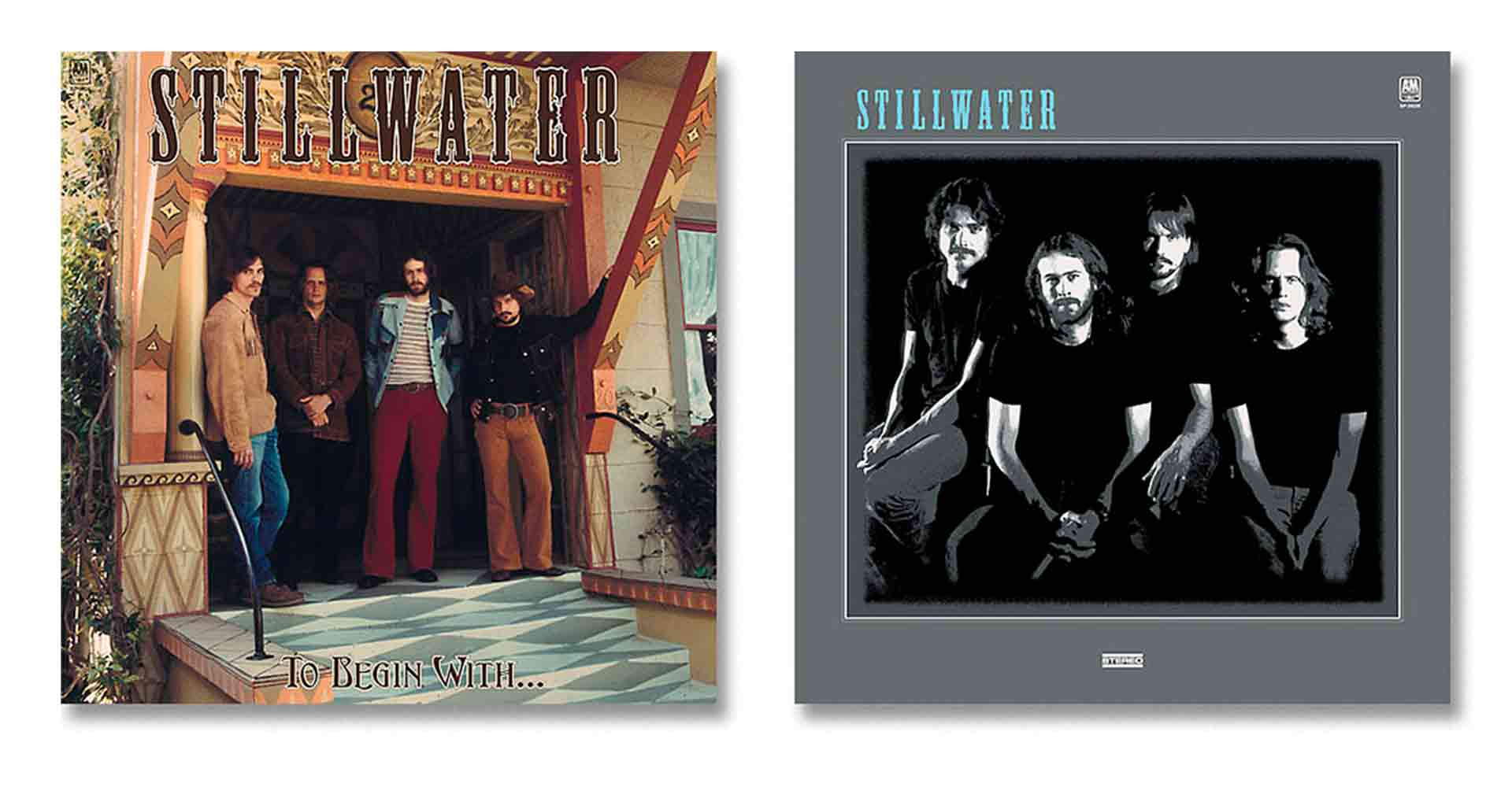
When I went to meet with Cameron Crowe to discuss the designs for Stillwater‘s album covers he had a small stack of records ready to show me. The most important to the tone and eventually the location and composition of the first Stillwater album “To Begin With” was The Allman Brother’s Band‘s first album cover. The band stand astride one another on the porch of an old southern mansion house. With this directive I met with our Location Manager Kristan Wagner. I explained the need to find a great porch we could photograph the band on, and the the particulars of the architecture I had in mind. Stillwater were supposed to be from Michigan, so there wouldn’t be any huge southern porches required, but perhaps something more along the lines of Crosby Stills & Nash‘s famous ‘Couch Photo” first album cover where they sit on a porch. Cameron also had the Allman Brotherssecond album on the table, that was a cover I mimicked directly.
As luck, and Kris’s fine skills as a location manager would have it, the perfect house for the cover was quickly found in the beach community of Venice which was close to our production offices. Besides being architecturally correct, the entire front of the building was painted with 19th century ornament in earth tones, absolutely spot on for this 1973 album cover.
For the comp I proceeded to extract four of the Allman Brothers band from their cover and using Photoshop placed them into a photo I took of the Venice house. I next added their logo (two options were presented) as well as a couple of treatments for the title “To Begin With…”. One of those was chosen and became the visual that all departments involved with the photo shoot would follow.
The back cover photo with the band standing in front of the gate to the property is a favorite of mine. It evokes the Beatles‘ “Hey Jude” cover shot which I thought would be a fun nod.
What comes first in period, script or historical accuracy? Was there any occasion where the script needed to be overruled because of inaccuracy?
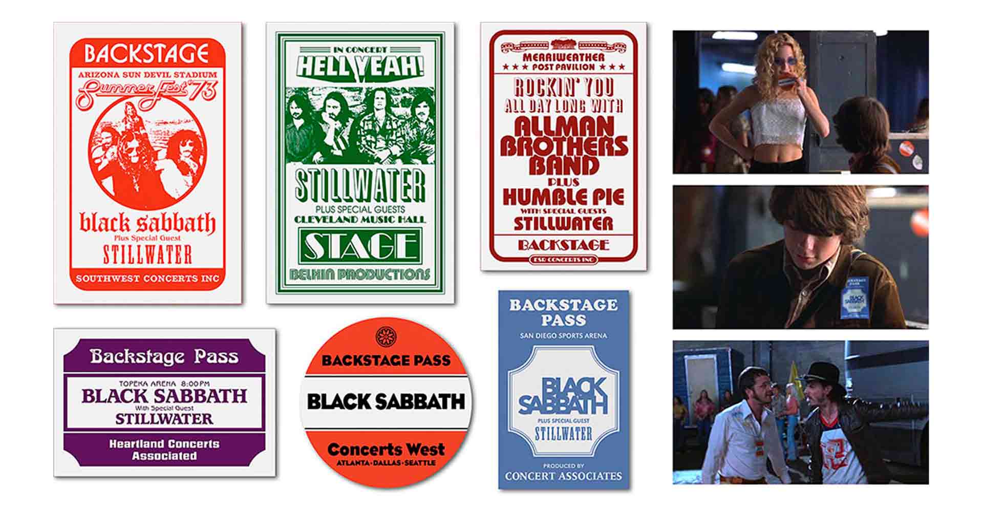
I don’t recall anything like that happening. Remember, this film is autobiographical, Cameron was there living this story, and not only did he remember all the details, as a teenage journalist he was recording everything. In addition he has a huge collection of memorabilia from the period, his album of backstage passes was an invaluable resource.
When working on period recreation, how is the design process? Could you explain your working methods for this project?
As I explained previously when discussing the first Stillwater album, it always began with Cameron and I talking about the particular record cover, poster, or T-Shirt. He never failed to have some items format the period to serve as inspiration for direction or in some cases a few of Rock’s most famous visual iconography he wanted to mimic or pay homage to.
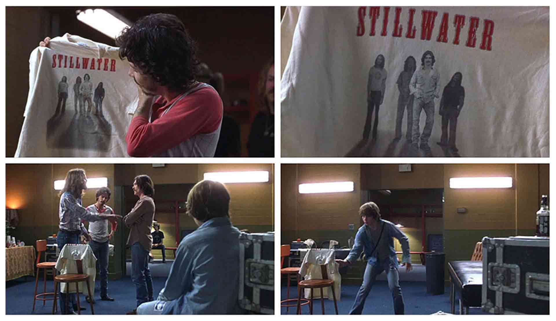
One of the trickier projects was the Stillwater T-shirt that featured the Band’s guitarist Russell Hammond at the expense of the other members, this was known in the Production as “The Bad T-Shirt”.
I did many, many comps for this shirt. During our three days of photo shoots from which all the Stillwater imagery would be captured for the various projects, Unit Photographer Neal Preston had shot the band to mimic directly the first album cover by The Doors. However when it came time to close in on the T-Shirt design Cameron decided against that one, and for a time I had no idea what he wanted.
One very hot day while Cameron was filming a scene with Frances McDormand at Pierce College in Woodland Hills, California, we met once again to discuss the T-Shirt. This time he brought out Bad Company‘s “Burning Sky” album, the band stand aside one another in black & white, floating in the sky, we now had a plan. While that meeting lead to my finding a design solution that satisfied Cameron and worked well on camera, that T-Shirt is the one thing I designed for the film that I wasn’t very satisfied with. This is mostly due to my being unable in the year 2000 to give the photo of the band the right look for 1973, complicated further by three of the band members needing to look blurred, with only Russell Hammond (Billy Crudup) in focus. I did what was asked, but the result really isn’t a T-shirt that looks like it was created in 1973. That said it does it’s job in the scene, and that’s what matters.
Does designing for a given historical period differ to designing contemporaneously or even futuristically?
Every project, even a contemporary one is a period piece, all must be researched throughly to make sure I have the correct basis for my designs. What’s become trickier these days is designing for periods nearer to ours, the 80’s to a degree, but the 90’s and even the early 2000’s. We quickly forget what was or wasn’t around us, and only through research can we be sure about a period’s visual cues and the popular fonts of the time.
A few years ago I did a film set in 1987 in Central California, McFarland USA. The film’s Set Decorator Alice Baker (12 Years A Slave) asked me to create a style sheet for 1980’s fonts. I was in design school from 1981 through 1985 and began working professionally in magazine art direction immediately afterwards so I certainly had more than a few fonts come to mind for this list. But I didn’t leave it there I began searching the the questions of 1980’s fonts online and sure enough found a discussion about this on several sites. There I saw mention of many fonts I hadn’t been thinking of, but upon reading the names realized right way that indeed these other fonts had been widely used during that period.
Every project, even a contemporary one is a period piece,
all must be researched throughly
How many individual pieces were created for the film? There’s hero pieces like album sleeves, tour bus graphics etc but then there are all those pieces of small ephemera. There must be quite a bit in total?
I designed some 30+ pieces for the film, with my main task being all of Stillwater‘s graphics. This also included planning and art dirtying the three day photo shoot with the actors playing the band as well as sessions with Frances McDormand, Patrick Fugit, and Zooey Deschanel for various set decoration photos. One other fun task was creating a replica from very poor reference of the carpeting at the Hyatt House Hotel on Sunset Boulevard. In addition there were tow other graphic designers on the show doing a variety of signs and props.
How important to you was it that everything looked convincing? Do you believe incidental graphics help sell a story or are they just a nice extra?
It’s vital to me that everything I produce be as period correct as possible. Even if many of these items don’t show up well in the film, or are missed entirely by the camera, they are there for the actors benefit, they contribute to the actor’s feeling like they are really there in 1973. Anything any crew member does to contribute to that is valuable. In this era of film fanatics and the home video freeze frame it’s more important than ever that we do our jobs and get it right.
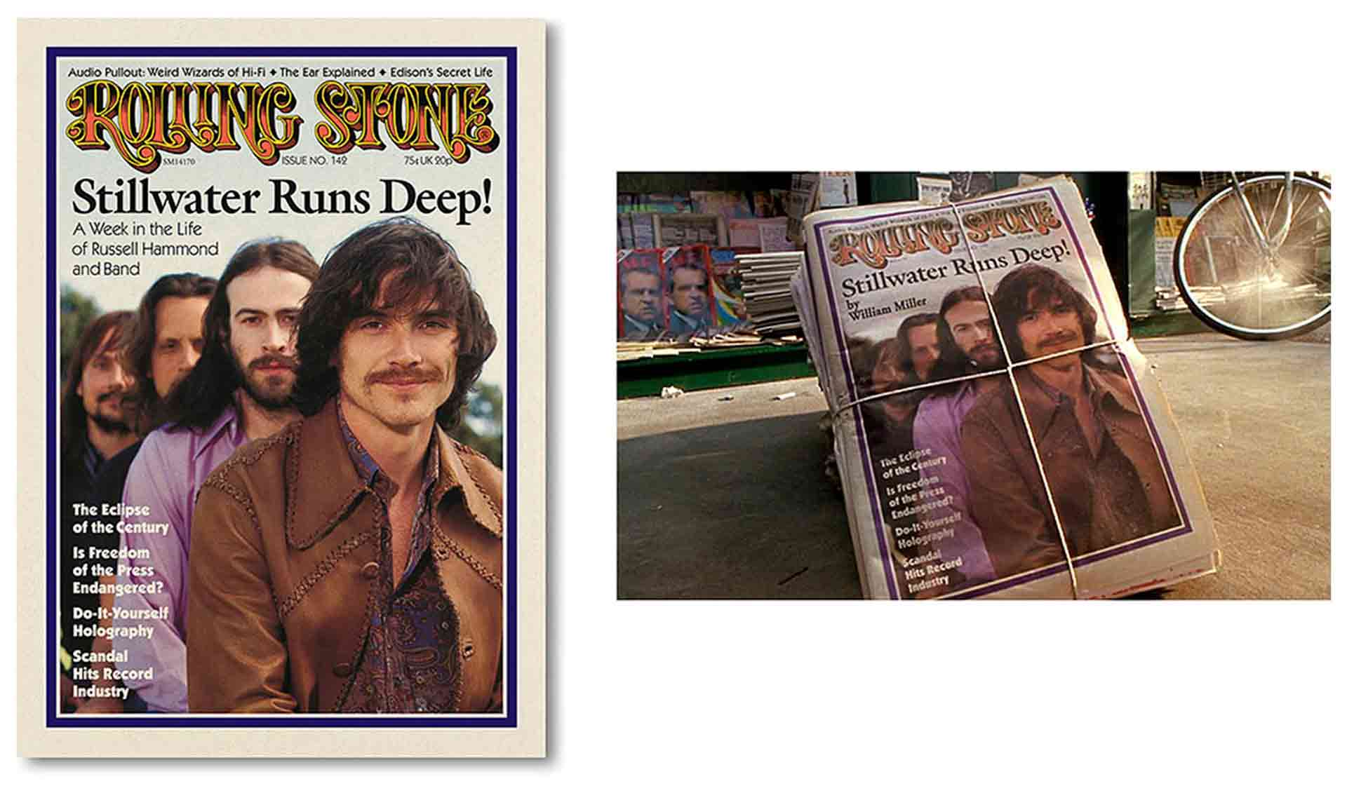
Sometimes compromises need to be made. One of the projects that it was hard to be 100% correct on was the hero Rolling Stone magazine cover that featured the band at the end of the film. While I was able to ascertain many of the correct fonts used on a typical Rolling Stone cover of the era, the headline font, a bold serif font eluded me. This was likely due to two factors. Back in 1973 the lettering would have been suggested in a tissue comp by the cover designer, and the actual lettering for the paste up and mechanical which the printer would use as a source and guide to make four color film for printing came from photo typesetters. Many digital fonts differ form those hand drawn fonts that existed as photo negatives back in the day. Second and more likely, was that the headline font Rolling Stone used was probably custom drawn, a practice regularly used by the magazine (Tip from the top: Research Dennis Ortiz-Lopez for more on this).
One thing I did do with painstaking care was create vector art versions of the Rolling Stone, both the one that appears on the Stillwater cover, and it’s earlier incarnation when the magazine resembled more of a newspaper and arrived folded in half. That version of the magazine was for a scene that was cut from the film but appears and an extra on the “Untitled” Director’s cut of the film. BTW, it’s “Untitled” as that was the production’s name all through filming. Almost Famous wasn’t selected until near to the film’s release.
How was the material created? All on computer or did you design with usage of period reproduction techniques i.e. Screenprint, letterpress, hand rendering et al?
I designed everything on computer but nearly all the key Stillwater items were printed on four color press. The album covers were all done at Stoughton Printing outside of L.A. They had been one of the biggest printers of record covers and as the LP faded away had been doing most of the printing for laserdisc video sleeves. That’s how I found them when I contacted Image Entertainment, one of the leading laserdisc distributors. I recall when I was over there having a tour, the fellow I was speaking with told me how they were slowly back doing record covers, in this case reissues of some of the big classic rock titles. In particular he mentioned CSNY‘s “Deja Vu”. I now know that those reissues were by Classic Records, and they command premium prices on today’s hot vinyl market. A near mint copy of that Deja Vu pressing can go for well over $100. They’re highly regarded for their mastering by Bernie Grundman, and the high quality of the vinyl and pressings.
All of the custom T-shirts were screen printed. Besides “The Bad T-Shirt”, there was another Stillwater shirt featuring the band that was based on a shot of Derek & the Dominos and was the gatefold photo for Stillwater‘s current album, “Farrington Road”. I also did a Jeff Bebe shirt and a few replicas of period shirts.
How far do you see artifacts through? Did you hand over at any point to other art department members.
I saw through all of the Stillwater projects, attending press checks for the album covers and the Rolling Stone magazine cover. The backstage passes were all done by a company that does the real thing, I emailed them all of my designs for fabrication.
How were your final designs supplied? Flat art, electronic?
Digital files were provided to all of the vendors so they could take it from there.
Who had final approval on the pieces? Did you work closely with the director or were you given creative freedom?
Cameron as author and director of the film had final say, but all of my designs were first approved by Production Designer Clay Griffith. On Almost Famous I was given full solo access to the Director, this was great for process, but is not what usually occurs. In nearly all cases it is the Production Designer who shows artwork to the Director, sometimes I’m in attendance, but more often I’m not. That’s the norm, Almost Famous was not the norm, but I’m very grateful that was the case. On each of the three Cameron Crowe films I worked on I had great freedom which I really appreciate.
In your experience, is that normal or do you think that was extraordinary to this production? It was quite a personal project for Crowe, so perhaps it ran differently to a more studio/finance led production?
I think there’s an environment of collegiality amongst the crew on Cameron’s films that exist because of who he is as a person. He’s as kind, smart, thoughtful a leader and collaborator as you could hope to have in what is most often a very odd and stressful business. While there have been other groups I’ve worked with where that sense of fun and creativity also existed, and I would would hope all of them were that way, most aren’t, it’s the personalities at the top who set a direction and tone for the production. On a Cameron Crowe film it’s an environment you are glad to be part of.

