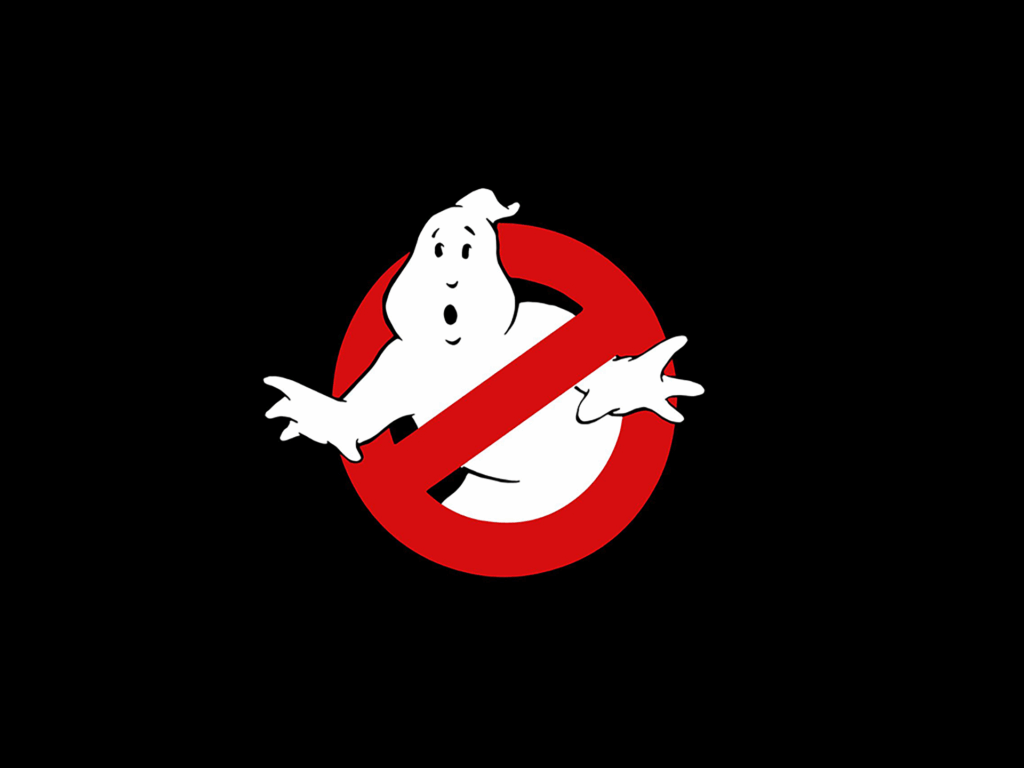
The late Michael C. Gross was many things but, with his graphic design hat on, he gave us the self-contained and perfectly formed ‘No Ghost’ symbol, a film logo that became a pop-culture icon.
SPLENDOID: Hello Michael. I am incredibly pleased to be speaking to you as the ‘No Ghost’ is probably very responsible for getting me into graphic design in the first place and is one of my favourite pieces of film design, probably design full stop…
GROSS. My pleasure!
Ghostbusters feels like it was one of the first films where a logo from within the production design was used externally as a symbol in its own right (outside of the comic book Superhero genre perhaps?). Was this something that the production specifically set out to do? If so, where did the idea come from?
The introduction of No Ghost to sell the film was an accident. We didn’t have the rights to the title Ghostbusters (that belonged to a company called Filmation). We tried lots of other titles (Ghost Breakers etc) in the meantime.
While Columbia was negotiating and we were filming, a teaser poster was needed…hence the “Coming To Save The World This Summer” poster with just the No Ghost logo. We simply didn’t own the name yet. This is where having a well-designed logo came to the forefront…if the logo had been poorly conceived and designed, it just wouldn’t have happened that way.
Do you think that the fact that No Ghost went on to become such a huge pop culture icon demonstrates that film-related graphics always have an iconic quality that the general public tap into? My theory is that because they exist within a theatrical context first and foremost, because they are created as a storytelling device, they somehow become more attractive than those created for a straight commercial purpose. What’s your take on that?
All such iconic images are happy accidents. You can’t set out to create one, they happen through exposure and success i.e. association with a “hit.”No Ghost would not be an icon now if the film were not the success that it was. But, if the logo had been poorly designed in the first place and the film was then a hit, would the logo have become such an icon? Maybe not. In our case we had a great visual device that was useful for promotion and advertising, a “bad” logo would not have been so useful to us.
A film logo only has to be considered within the context of the screen and story.
Their purpose, first and foremost, is to serve the needs of the film
Agreed. I think most people would agree that you had a great device but why is it that this seems so hard to achieve? Quite often graphic content produced for on-screen application seems substandard in comparison to that produced for the ‘real world’. Can you say why that is?
Because film logos are usually created by the movie’s art department who are primarily set designers, not graphic artists. A film logo only has to be considered within the context of the screen and story. Their purpose, first and foremost, is to serve the needs of the film. It’s just another of many elements needed for storytelling. There is no real comparison to the real world outside of the film frame.
Meaning that when you and your artist Brent Boates started designing No Ghost you were aiming for something that just would look convincing as a company logo within the context of the film? That said, did you still look to the real world for inspiration? Was it important that the logo looks like something you might find in New York backstreet?
Absolutely. When I was art directing at National Lampoon magazine, half the time I was designing parodies and they had to be perfect graphically speaking. Plus I was always a student (and teacher) of design, so I was constantly observing.
And did the logo have to be pragmatic in any way? I ask this because I read once that the Zorin Industries logo for the Bond film A View to a Kill had to look a certain way because the film borrowed an airship from the Fuji Corporation for some long shots, hence the logo created for close-ups had to look similar. I always wondered whether, because the logo feels so perfect, something like this might be the case with Ghostbusters?
Actually, logos created for films are never thought out to that extent unless the script is like ours was and specifically called for the logo to be on seen on cars, on buildings as well as on hand props etc.
As well as No Ghost you were also you involved in another iconic graphic design project, the 1968 Mexico Olympics branding. How does the process of creating an identity for fact differ to creating for a film?
I just believe in solving graphic problems wherever needed (or the client requests) that‘s why my work is so varied. I have no “style”. I just solve the problem with the only skills I have.
And what is your preferred process for this problem-solving?
A good meeting with the client (director?), a think tank session of designers and artists working for me, a series of roughs to show than if lucky implement. I think it’s the same for any commercial designer.
And finally, I have got to know, where is the most unusual place you ever saw the No Ghost?
Easy. On a girl’s naked butt…

