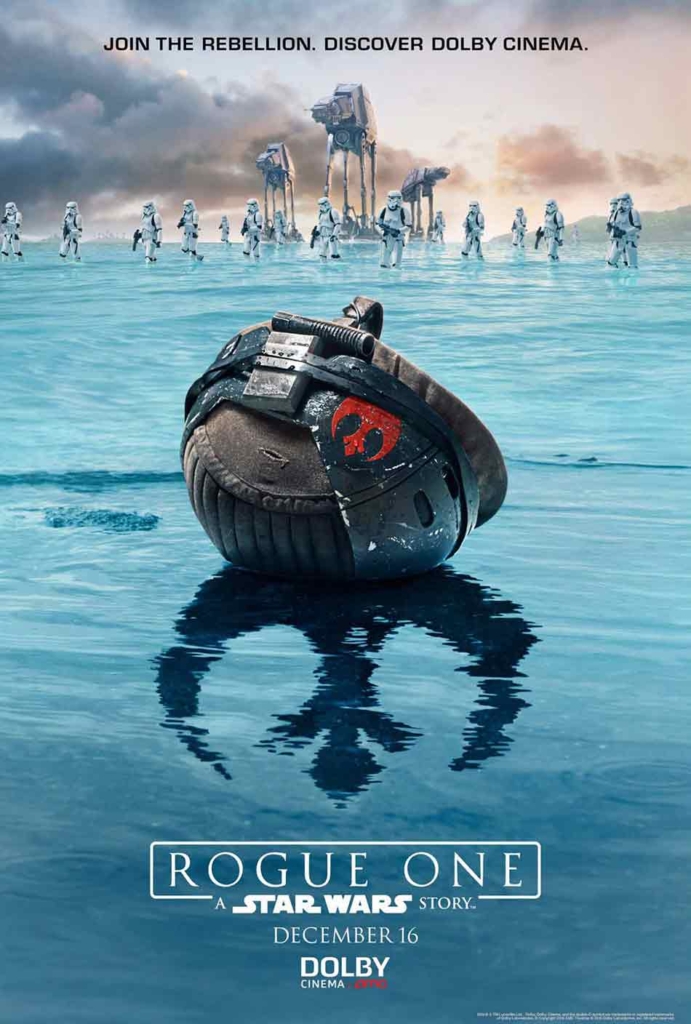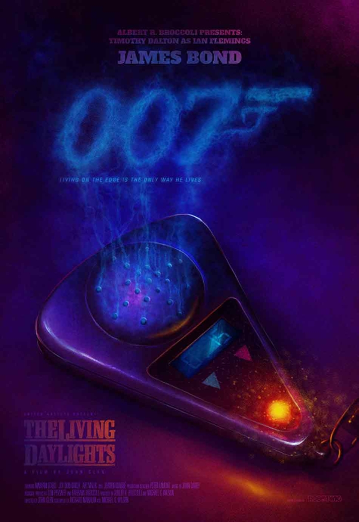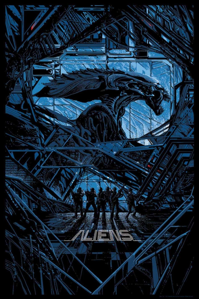
Simon Hawes is a graphic designer and the founder of Alternative Movie Posters.com, one of the main portals for the distribution of so-called alternative movie posters, unofficial versions of film marketing key art created by enthusiastic amateurs and designers on their day off to promote their love of a particular intellectual property through the medium of their chosen artistic skillset.
In the following interview, we talk at length about the site and what the trend for fan art film posters says about contemporary visual culture.
SPLENDOID: Hello Simon. Jumping straight in, and at the danger of creating some sort of black hole by two internet sites talking to each other, can I ask first how your own website came about?
SIMON HAWES: AMP was originally born out of boredom. While freelancing in London as a Graphic Designer and illustrator I found I had a lot of time on my hands waiting for briefs to filter their way down to me, so I would use this so called “downtime” to do what I loved most, create. My boredom quickly became anything but, as I started to fill my time designing alternative movie posters for some of my favourite films, Planet of the Apes, Logan’s Run, all usually classic B movies that I’d grown up with as a kid. Little did I realise at the time, as alternative film art was all new to me, that there was an underground collective of artists doing exactly the same thing. The more I looked into this the more I found amazing pieces from incredible artists, but they were hidden. Hidden in the sense that they lived on a twitter feed, or way down someone’s Instagram post, or on a website that worked every now and again, but one thing was clear, it was hard to find this type of work. This is really where AMP came to life. With my feeble attempts at poster designs, and the ever growing amount of work I was finding hidden online, I decided it would be quite nice if all this work was in one place where people could find it easily, search for a film title, discover more about these amazing artists, and most importantly become a resource to inspire more people to join our little site and build a real community.
How long has it been running?
AMP has been going now for about 6 years.
It’s proved to be immensely popular. Posters featured on your site are all over the Internet…
Correct, but it has been a hard process to build our audience, as at first no one knew about us. We didn’t have money to spend on advertising so we had to do it the hard way. Contacting every artist, being super active on Facebook, as that was the only social thing we used when we first launched, and generally spending most of our spare hours searching the web to build the work on the site. Today we have a global audience with tens of thousands of daily visitors serving 6-digit monthly page views, which is awesome.
How would you describe your interest in both graphic design and film?
I have always loved graphic design, not sure why but even as a kid I knew that was what I wanted to do. I studied design at school, college then at Central Saint Martins School of Art in London. I guess I just loved to draw and create things and that has stayed with me through the years. Film has always captured my imagination, as I’m sure it has with most people at some point. I’ve always wondered how amazing it would be to work on a film, walk on the sets and see it all happen first hand. That creativity and sense of craft has always been a driving force for me and something I love to see in the work that we feature.
Have you also made AMPs yourself?
I’ve made a few as I mentioned, but that was when the site first started. Nowadays I’m too busy with the running of the site to have time to make any new ones, and the fact that the more amazing work I see from all our artists it’s probably best I leave it to the talented people. I’ll stick to giving them the platform from which to share and connect.
Generic key art is definitely a factor. People are crying out for more creative workaround releases, and I think that is certainly filtering through
OK, so in your opinion as their online benefactor what kind of people create AMPs and why?
That’s a good question and I think the beauty of the genre. Anyone who can draw, use a computer, hold a brush and loves movies instantly qualifies to be able to make an AMP. I’m not saying that they are all good, but anyone can get involved. We see submissions from top artists right through to schools and universities that have been set a brief by their teachers to create AMPs, which I think is inspirational. As to the why, I think it’s just an area that has always captured the imagination, movies are where you go to escape and be transported somewhere amazing, and I think the sense of creating an alternative poster is someone’s own form of escapism and love for film and art.
What kind of people make up the audience for AMPs?
It’s such a broad audience, I like to think we appeal to anyone who loves movies and art. We have work submitted from people all over the world, and I would say it is pretty even among guys and girls.
What’s the attraction of AMPs, both for the audience and the creators?
For the creators I think it is just a great self initiated brief, design a movie poster for your favourite movie. No restrictions just have fun and make something you love. I think this really allows people to create something totally unique that you wouldn’t get from a studio, as there are no limitations. And for the audience, it’s seeing a film they know portrayed in a completely fresh way in a variety of styles. One film title could have 20 alternatives and all done in a totally unique way, illustrated, painted, hand drawn, you name it. We’ve even had clay models used by one artists!
Of course multiple versions have always been a part of poster design since day one but the trend for making AMPs by amateurs and design professionals in their downtime is really a modern thing. In your opinion what has been the driving force behind their popularity with creators and the audience? Is it perhaps the ease of sharing work via social media or is it maybe that film design has got a little generic and people are dying to see something a bit more creative?
The generic key art format is definitely a factor I think. People are crying out for more creative work around releases, and I think that is certainly filtering through. The crazy thing is that what was once a thing to do in your downtime is now a full time job for some artists. Creating alternative art for exhibitions, limited prints and commissioned work is now a potential path to pay the bills.


AMPs are a very subjective area. How do you judge the work that you feature on the site? What are your selection criteria?
We try to keep it quite open. We 100% curate the collection to ensure a certain standard, but if the submission is well considered and executed then it stands a pretty good chance of being featured. A submission doesn’t have to be all Singing all dancing intricate work, a simple piece can be as effective as a 10 colour screen print. Clever ideas, good composition and well delivered.
What do you see as being the future of AMPs? Do you think the general public are aware of them enough that they are now a staple of graphic design or are they just a fad that people will tire of eventually, perhaps the artists will start to be used for actual release posters, that’s happened a few times already hasn’t it?
I think AMPs are here to stay, well we are anyway. But I definitely think more needs to be done to spread the word about this type of work. It is already very popular within certain circles, but we want everyone to know about these talented artists and the work they do. Over the years there have been more and more people doing similar things to us, in terms of starting websites along the same format, but this is all great as it shows our influence and all helps to spread the word.
What are the legal aspects of the practice and your site? Technically all AMPs are using other peoples IP so would seem to be infringing copyright?
AMP was always set up as a showcase to spread the word about this form of art and their creators. We never see it as an infringement to share this amazing work that is in homepage to films their creators love.
Have there been any occasions when work has had to be taken down at the request of a studio?
We have never been asked to remove work that we feature by a studio. I think this is mainly because what we are doing is pretty cool and the art featured is amazing, why would they want it taken down, it shows true love for a film. We were however asked by Marvel to stop the release of a screen print we were going to release a few years back for Thor. In hindsight I totally get it, but it would have been nice if they’d accepted our request to work with them, but maybe next time hopefully;)
We have never been asked to remove work that we feature by a studio. I think this is mainly because what we are doing is pretty cool and the art featured is amazing, why would they want it taken down?
Have there been any occasions when art that you have featured has been selected for use as live promotion for a film i.e. as a re-release poster, as home entertainment artwork etc?
Work we’ve featured has been used for promotional uses, we even started the first competitions to fans for alternative art to be used in live briefs. We’ve worked on films such as American Psycho, Automata, Maniac, The Lazarus Effect and Filth to name a few. Unfortunately we’ve stopped these types of briefs as we felt the artists were getting a bit of a rough deal from the studios as the rewards were pretty low, and we really didn’t want to devalue the amazing work we feature. But we have many exciting plans for 2017, so watch this space. We also get emails from artists on a regular basis saying how they have been contacted by studios or our audience that either want to work with them or find out more about their work, which we always find a very pleasing thing.
One possible criticism of AMPs is that they aren’t real film posters in the same way as official release posters because often their mechanism is different.
They aren’t real now. But when this craze started it was only ever people having fun and being creative. That still rings true but now I think studios are noticing the amazing talent, executions and concepts for posters and I think we can all see a shift in the way they are getting fans more involved with artworks. Social media is obviously a massive factor as it makes it so much easier to share work and potentially get it in front of the right person.
Official release posters are about creating excitement in a viewer for a film that they haven’t seen by giving visual clues, inspired by the narrative, that may stimulate excitement; alternatively AMPs seem to very often rely on the audiences knowledge of a film and sell themselves by the audience recognition of certain visual clues, quite often using already established iconic images from the film that have taken on a life of their own over time. We might even go so far as to say that there is an AMP vernacular (they all have a certain approach to what they feature even if the renderings are varied) as a result. What’s your take on this?
You have to remember that these are not used to sell a film release and are very much, as you say, based on the artists knowledge of the film. That said, many of the posters we feature could easily be used as a key piece of art, as they do create the excitement and tease, but in a far more creative way.
Related to the above, do you believe AMPs have a valid place in design culture, in other words can they be seen as a genuine cultural expression or, because they rely on other peoples creative, are they actually more like novelty items?
I don’t think AMPs rely on other people’s creative at all. They are inspired by other people’s ideas, which is surely where we all get our inspiration from isn’t? Was it Mark Twain who said “there is no such thing as a new idea, just combinations of the same ideas that have been used through the ages”. I think this form of art will have more of an effect on studios creative, and this can already be seen now, with exhibitions on alternative art for Star Wars, alternative art created for IMAX screenings, even through to directors such as Quentin Tarantino being influenced by alternative art for The Hateful Eight key art. It’s difficult to ignore the talent of alternative work and the ever more dull and uninspiring studios key art for modern releases.
To finish, what is your favourite AMP and why?
That’s far too difficult to answer. We see so many different pieces each and every day that my favourite AMP changes pretty regularly. I have to say though that I love the unique style of Kilian Eng and the simple ideas and execution of Daniel Norris, but I admire so many of our featured artists, incredible talents out there.

