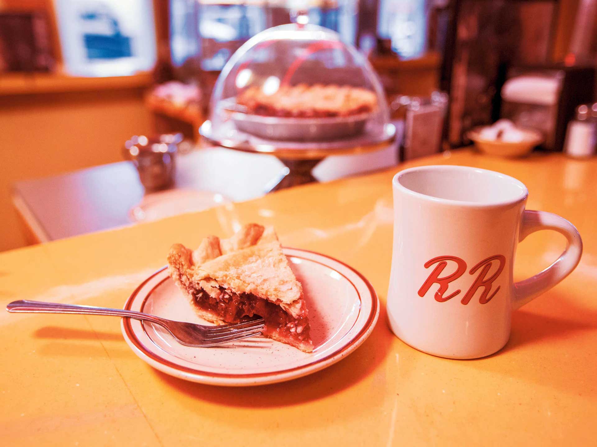
In the 25 years since it originally aired, it has become something of a cliché to say that Twin Peaks redefined American television and laid the groundwork for today’s #boxsetbinge serials
Whether it did or not is debatable but beyond argument is the fact that the show managed to achieve the enviable heights of being both an instant smash hit and a second series cancellation and has enjoyed the pleasure of finding an ever-increasing audience over the last 25 years.
I admit to being a late adopter and, in geekery terms, a mere lightweight. I didn’t watch a full episode until 2004 but, nevertheless, I knew who Bob was and, more importantly, why he was at the end of the bed; I knew what and where the Red Room was or wasn’t; the title sequence with its synth-drenched theme tune and juxtaposition of documentary visuals and obscure green/brown typography never failed to install a mix of apprehension and melancholy.
Surely, it must be fairly unique for a TV show to be able to achieve this in a viewer who hadn’t actually seen a full episode? For me, Twin Peaks is not the series that redefined television but rather it is extraordinary because it’s a mainstream show that is arguably less about character and story and more about the establishment of pure atmosphere through design.
The goal of any production design is that it should be invisible, not unnoticeable and boring but rather so natural and authentic-feeling that we never question it being a fabrication. All of this is true on Twin Peaks and more so. So specific is it in the creation of its settings that the location’s become characters in their own right. The production values are high and there isn’t one set that doesn’t look like everything hasn’t been meticulously placed. There seems to be such an emphasis on realism that it becomes hyper-real.
The design is so straight that when things go strange they feel very strange indeed
Take the ’Welcome’ sign that introduces the show; it looks exactly like the type of sign that welcomes the visitor to most US towns but amplified. This approach carries on through the rest of the set design. All situations look plausible and yet they all have a slightly askew element that has the effect of unsettling the viewer; the Palmers house feels too squeaky clean, the bars and diner perhaps too firmly tick the ‘American’ box, the hotel with its heavy wooden somehow too prestige and too Native American influenced.
Throughout proceedings runs a pure vein of Hopper-esque (both Edward and Dennis) Americana, a place of both neon-drenched roadhouses and blinding white picket fences. In other words, very human spaces. But, as the show tells us, all that apparent normalcy is always surrounded by the Big Country, a place where the spirits of old still dwell.
What is notable is that, fantastic a story as it is, everything looks authentic, it has weight and plausibility. Indeed this lends the show its unusual atmosphere. The design is so straight that when things go strange they feel very strange indeed. And when production design breaks into the theatrical it is best exemplified in the moments of outright strangeness, the apotheosis of which being when narrative meets design and medium in perfect symbiosis to create the openly theatrical Red Room, an odd-looking staging populated on-screen by strange beings and mediated to us via strange editing techniques. the counterpoint creates an incredible resonance.
It feels like easy journalism to say that Twin Peaks redefined TV. My thought is that it didn’t really. As a show, it very much adheres to the formula of commercial episodic television i.e. cliff hanger endings, story arcs over a series, etc. It also is very happy to borrow heavily from crime procedurals, supernatural thrillers, soap operas, situation comedy et al. But in so doing it redefined what we think of TV. David Lynch showed us that, through design, TV doesn’t have to be cinemas’ poor cousin, it can take it on and, as the plethora of shows that have followed demonstrate, in many cases actually win.

