
© JWT Brazil | AC Camargo Cancer Center
While the packaging of medical products can be a life and death affair, could we designers play a role that goes beyond the purely functional?
Consider the humble surgical glove, perhaps a slightly comedic request given certain associations but, putting those behind us, let’s see instead a high volume consumable essential to clinical practice but one with a health warning attached. This demonstrates that in this industry even a seemingly innocuous product can have massive implications1. In this case, key ingredients may provoke an allergic reaction in certain users, the resultant responsibility for overcoming the issue falls on graphic design.
The perpetual challenge for healthcare manufacturers is to ensure that in the stressful, time-poor environments of clinical practice the correct product will be easily identified. The method to best achieve this is graphical demarcation. This need for utility gives rise to what we might call the ‘clinical aesthetic,’ a visual language that aggregates the myriad of potions and applications but also the processes, regulations, collateral, architecture, vehicles, and other materiel. It is one of the most definable and complete visual vernaculars ever devised yet, rooted in functionality as it is, it remains almost invisible except until we need it.
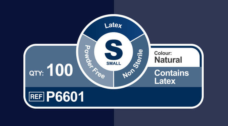
Information panel from latex glove packaging | © Shermond Healthcare
By the Enlightenment medicine emerged as a venerable profession, science, and academic discipline, a paradigm shift necessitated a visual identity to support this new authority
That said hear the words ‘healthcare’, ‘medicine’ or ‘hospital’ and an immediate image is brought to mind, one of stark sterility and a vague suggestion of ‘science,‘ the overall effect being a distilled authority that seems to say ‘trust us, we know what we are doing’. It was not always this way, however. Previous to the 18th Century the common image of health care was ramshackle quackery or the brutalism of the barber-surgeon. With the Renaissance came a renewed interest in the sciences, particularly the study of the human body as proposed by the ancient Greeks. By the Enlightenment medicine emerged as a venerable profession, science, and academic discipline, a paradigm shift necessitated a visual identity to support this new authority
The evolution continued, arriving at the highly competitive industry of today but, as the example of surgical gloves demonstrates, here is a visual culture that goes against what we expect of commercial creativity. It is not about superficial beautification for the sake of shifting units. As Deborah Williams of Intersurgical elucidates: “Healthcare considers the end-user to be the clinician, not the patient, clear product information and identification always comes above corporate branding.” Indeed, whether we engage with therapeutic products bought over-the-counter or within a clinical environment, the purely functional user experience remains the same.

© JWT Brazil | DC Comics | AC Camargo Cancer Center
© JWT Brazil | AC Camargo Cancer Center

© Torke & CC | Fox Networks Group | Portuguese Institute for Blood and Transplantation
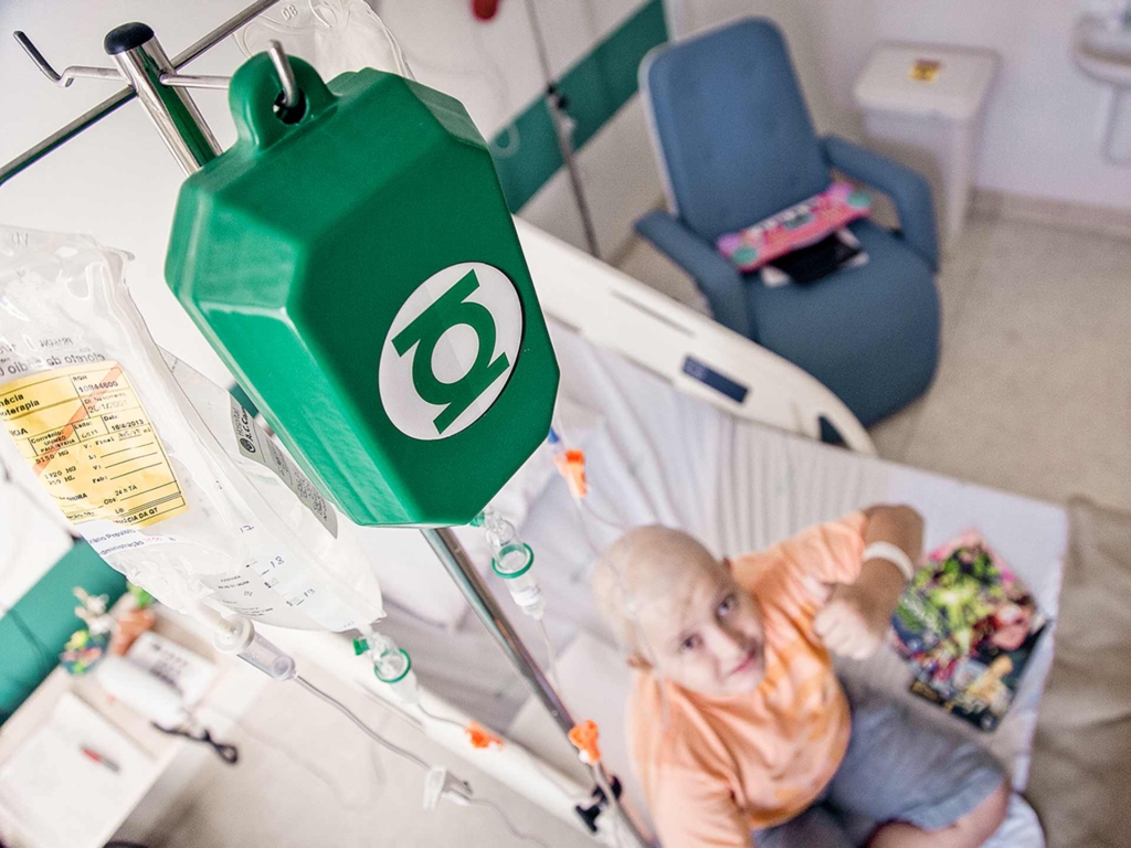
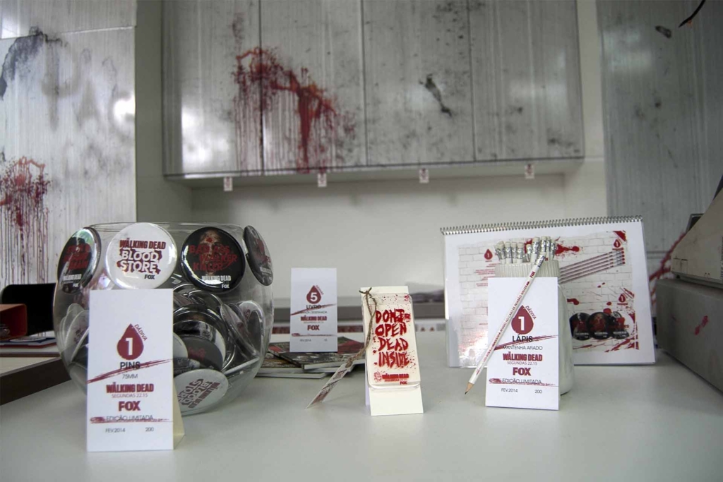
So used are we to this approach we might be forgiven for thinking that the creative development has reached its end-point but certain recent projects point to the arrival of a new philosophy. Superformula, created by JWT Brazil for the AC Camargo Cancer Center, styled treatment packaging with the iconography of popular comic book superhero characters. In a similar vein, Portuguese agency Torke & CC took the design cues of a genre TV programme, namely NBC’s Walking Dead, and applied them to public health to create Bloodstore, a pop-up that allowed volunteers to trade blood donation for themed goods.
In both examples, the usage of pop-culture mythology installs positivity into complex and difficult situations. It is no doubt that the need for chemotherapy is a frightening prospect but through Superformula the youngsters no longer felt in danger, rather that they were taking on the super-powers of their favourite characters. Similarly, Bloodstore exploited enthusiasm for a fictional world to overcome a very real public apprehension of the hypodermic needle. Their success is important to recognise as the results question whether, once necessary practical details have been communicated, is the rest of the clinical aesthetics’ authoritarian expression necessary or merely a self-supporting artifice?
‘Art’ in the widest sense should be thought of as less of a mysterious enigma and more as a practical tool with the definable purpose of helping us to achieve personal rebalance
An answer might be found in the thought-provoking manifesto Art as Therapy2. Here, Alain De Botton and John Armstrong explore how ‘art’ in the widest sense (a category that they suggest also includes design, architecture, and craft) should be thought of as less of a mysterious enigma and more as a practical tool with the definable purpose of helping us to achieve personal rebalance by ‘distilling and concentrating the hope we need to chart a path through the difficulties of life’. Recent research supports the supposition. One example that comes to mind is a paper exploring whether patients surrounded by bucolic imagery might exhibit a faster and more complete recovery than patients not exposed to such cerebral stimulus3. This evidence suggests that positive emotive content external to immediate clinical surroundings could be beneficial to health due to neurological responses that stimulate physical recovery.

© SkyFactory
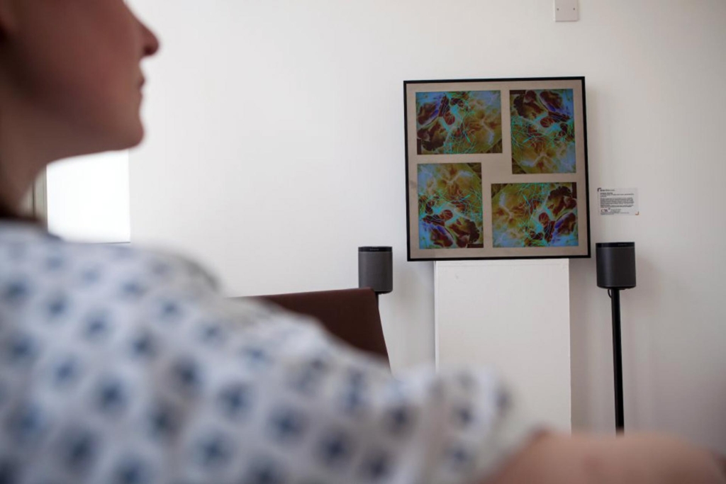
© Brian Eno | Royal Chelsea and Westminster Hospital, London
Companies such as SkyFactory, who create ‘blue sky’ AV technology for hospitals, and projects such as Brian Eno’s sound installations for London’s Royal Chelsea and Westminster Hospital certainly seem to apply the theory, as do the many specialist clinical architecture practices that base complete complexes on the principle. However, laudable as these may be, architectural writer Sebastian Redecke rightly points out that this is an area where the medium is unfortunately the message. There is always the danger that a patient ‘will feel afraid, even though the goal of the institution is to lessen such fears4.’
The problem is that these approaches are ultimately only dressing, the treatment itself remains unchanged. In contrast Superformula and Bloodstore apply De Botton & Armstrong’s theory more completely. In both cases, semiotic stalwarts of ‘art’ such as narrative and symbolic association directly changed the meaning of the therapeutic act. Both could be easily dismissed as glib impositions of entertainment licensing on medicine but in practice, they have demonstrated new, culturally relevant, methods with which to uphold Hippocratic values.
This may be problematic for some to admit but, taking cultural theorist Michel Foucault’s conclusion that first and foremost clinical practice is a language through which corporeal malady is observed and rationalised then it must, by definition, be open to adaptation and evolution5. This takes away some of the importance of scientific discipline and replaces it with the as yet unquantifiable maverick element of the emotional. Under future observation could the next stage in the development of clinical practice prove that the most effective treatment is one that offers cultural enrichment as an active ingredient?
Appendix
- We should also consider that as recently as 2010 33% of medical errors could be attributed to packaging and labeling of treatment, 30% of these errors being fatal.
Ref: FDA Division of Medication Error Prevention & Analysis in the Office of Surveillance and Epidemiology, quoted in ‘Quality, then Cost’, Pharmaceutical & Medical Packaging News, 26th August 2010 - Art as Therapy, Alain De Botton, John Armstrong, Phaidon Books, 2013
- Neural Correlates of Nature Stimuli: An fMRI Study, Health Environments Research & Design Journal, Winter, 2014
- Healing Architecture, Christine Nickl-Weller, Hans Nickl, Braun, 2013
- Birth of the Clinic, Michel Foucault, Routledge, 2003
Notes:
This piece came directly out of visual work created for the global healthcare consumables distributor Bunzl Healthcare.
The agency I was working with at the time was heavily involved in creating a visual language for the packaging of latex and non-latex gloves. Initially, the work seemed incredibly banal but, as I began to understand the serious implications of false usage, the work opened up a host of questions regarding the look of the medical profession as we know it.
The result was an in-depth essay informed by lengthy empirical research with a number of organisations that kindly supplied me with background knowledge from which to build my hypothesis.
Many thanks to Nickl & Partner, Deborah Williams of Intersurgical, Pamela Ford, from the Library, Archive and Museum Services at the Royal College of Physicians, and Alec Ward of the London Museums of Healthcare & Medicine for their assistance with this article.

