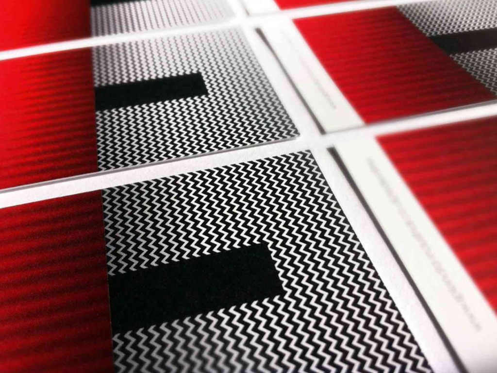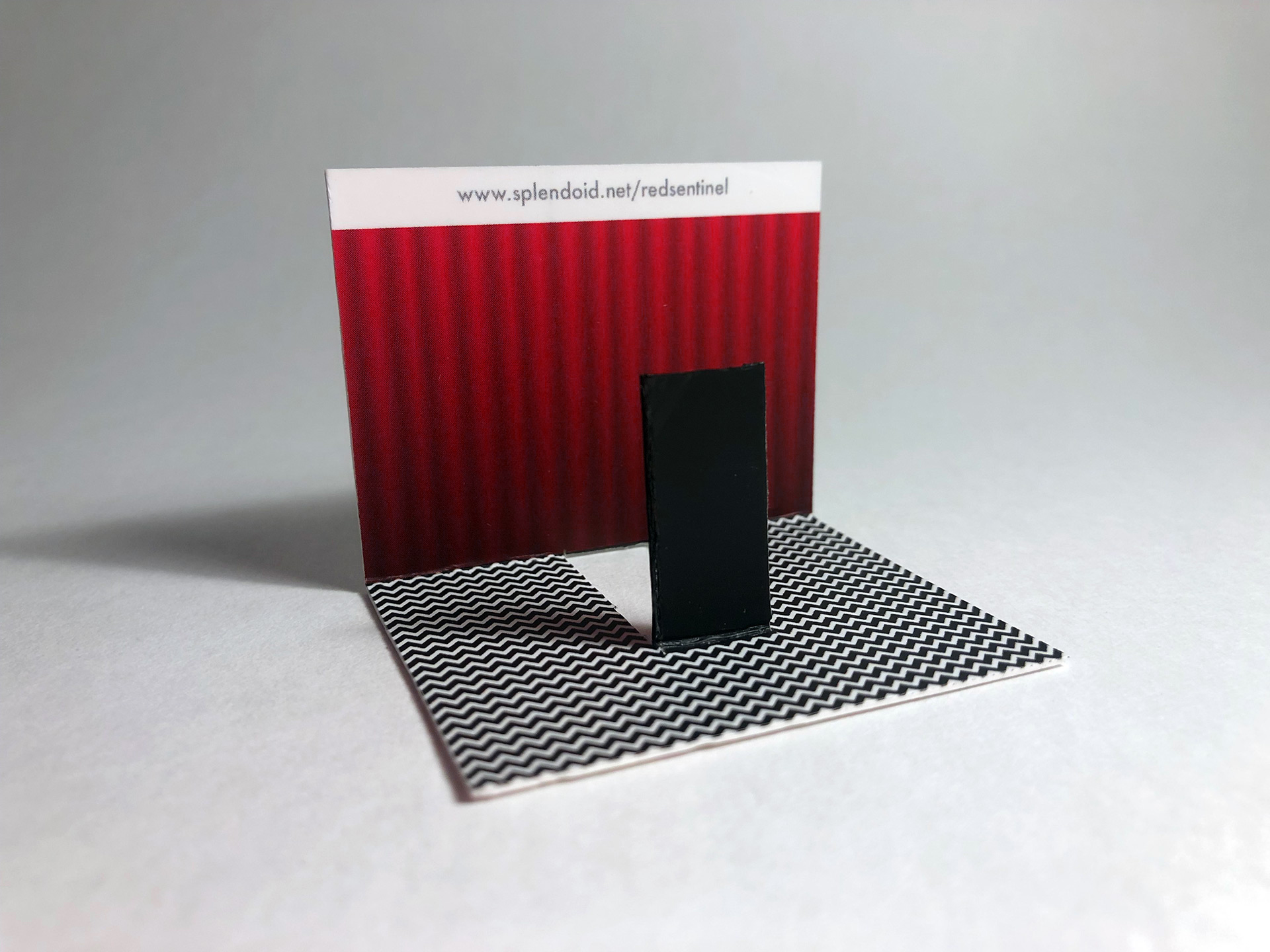
Business cards are generally a necessity but still a fairly dull thing to have to design. Useful sure, when on the tradeshow circuit or out on lead generation duties, but still incredibly banal.
For my latest edition, I wanted to break away from doing something standard but also keep it sane, as ultimately there are constraints on how they will be used that need to be adhered to; it needs to fit into a wallet, it should be staple-able, needs to be easy to read etc.
I had an idea floating around the sketchbook for a while, to do a piece of work based on a melding of 2001 or Twin Peaks. I’m not sure where the idea came from other than I am a massive enthusiast for both and I was intrigued by the graphic possibilities that such a mash-up might provide.
Then I found the excellent book, ‘The Architecture of David Lynch.’ In one chapter author Richard Martin explores conceptual similarities between the Red Room and the future prison scenes of Kubrick’s 2001. As an extreme enthusiast for both texts the suggestions Martin makes were enough for me to want to explore the idea visually, and I wondered if it could be translated into the medium of a business card?
Both feature places/spaces where all logic breaks down, where time and space have no meaning, where everything and nothing is possible
It goes without saying that both Kubrick and Lynch are directors with a strong sense of the visual, by that I mean above and beyond that which would be expected of a film director, I’m talking about an understanding of mis-en-scene and an interest in creating iconography that has the ability to escape the frame and enter the audience’s consciousness. Cases in point being the combination of the red drapes and floor pattern of the Red Room, an image that looks immediately familiar and yet strange, dated and yet timeless, a sort of Art Deco motif somehow with the look of Native American artwork, a look that is perfectly offset by the Catholic theatricality of the red drapes.
Similarly, Kubrick and Arthur C. Clarke devised the notion of the Monolith, changing it from the pyramid transmitter of Clarkes’ original concept in his short story The Sentinel and turning it into the enigmatic design of the film, something perhaps familiar from sculpture and architecture, particularly with the Minimalist movement, and yet imbued with an otherworldly oddness perfectly appropriate for the film that he wanted to make.
Now, if you are not familiar with either 2001 or Twin Peaks I urge you to go and acquaint yourself forthwith
Once you have done that you will know that both feature places/spaces where all logic breaks down, where time and space have no meaning, where everything and nothing is possible (much like working in the creative industries) and where the main protagonists of their requisite narratives find themselves at the end of their respective journeys. If we take the conceptual similarities between the two to their natural endpoint then we end up somewhere where the mythologies of both can be easily mixed.
This led me to think why couldn’t the Monolith turn up in the Red Room? Or maybe it’s been there all along?


