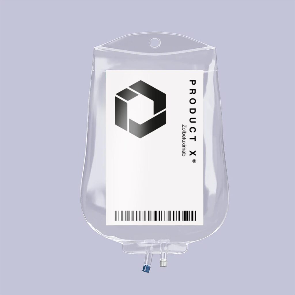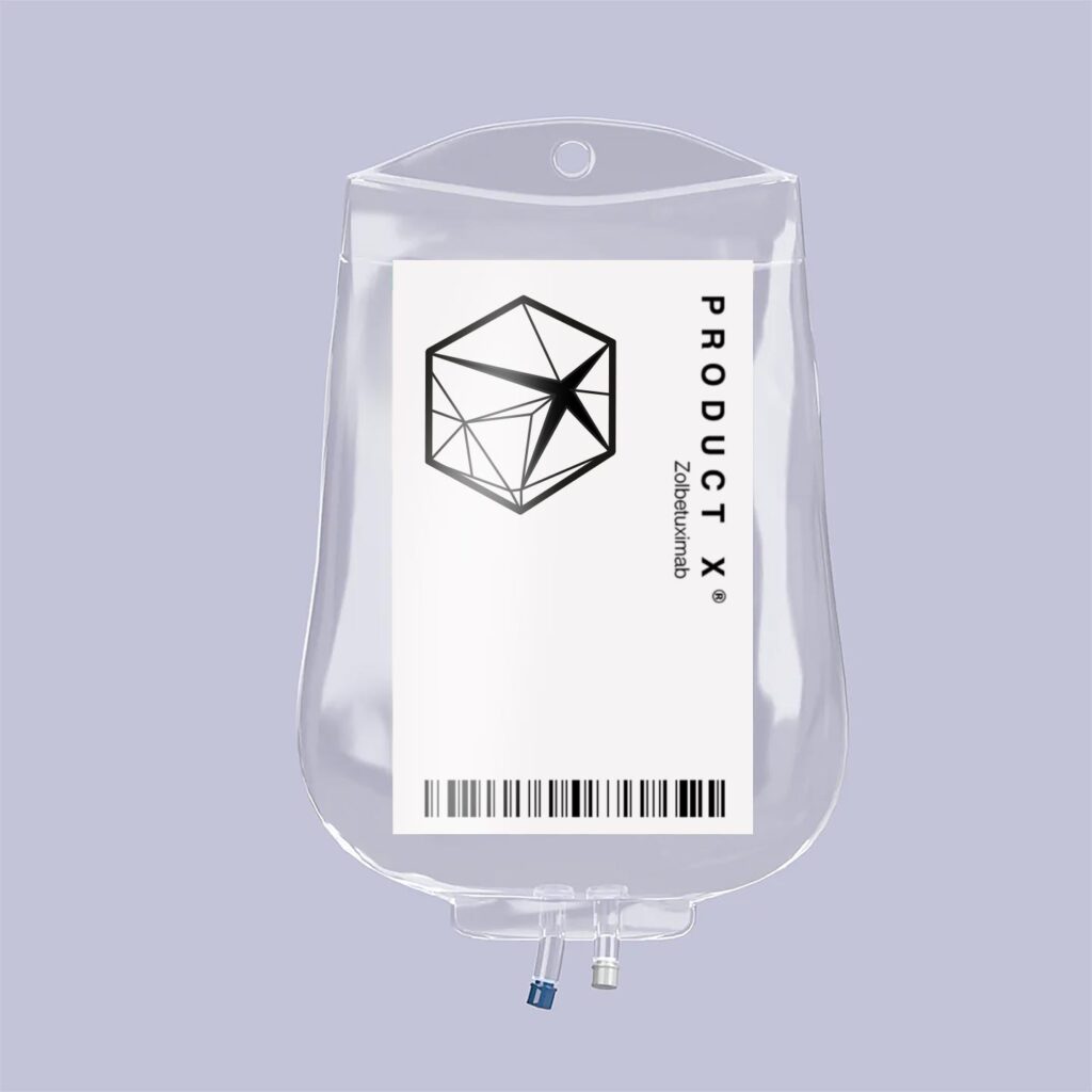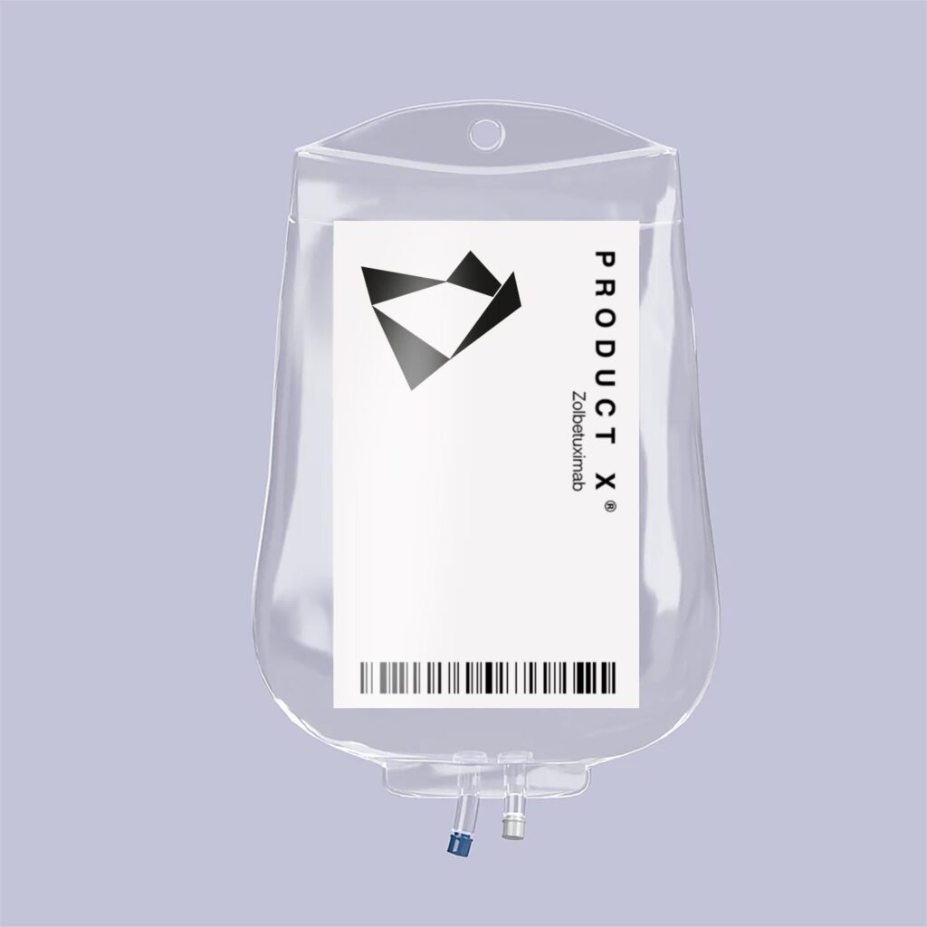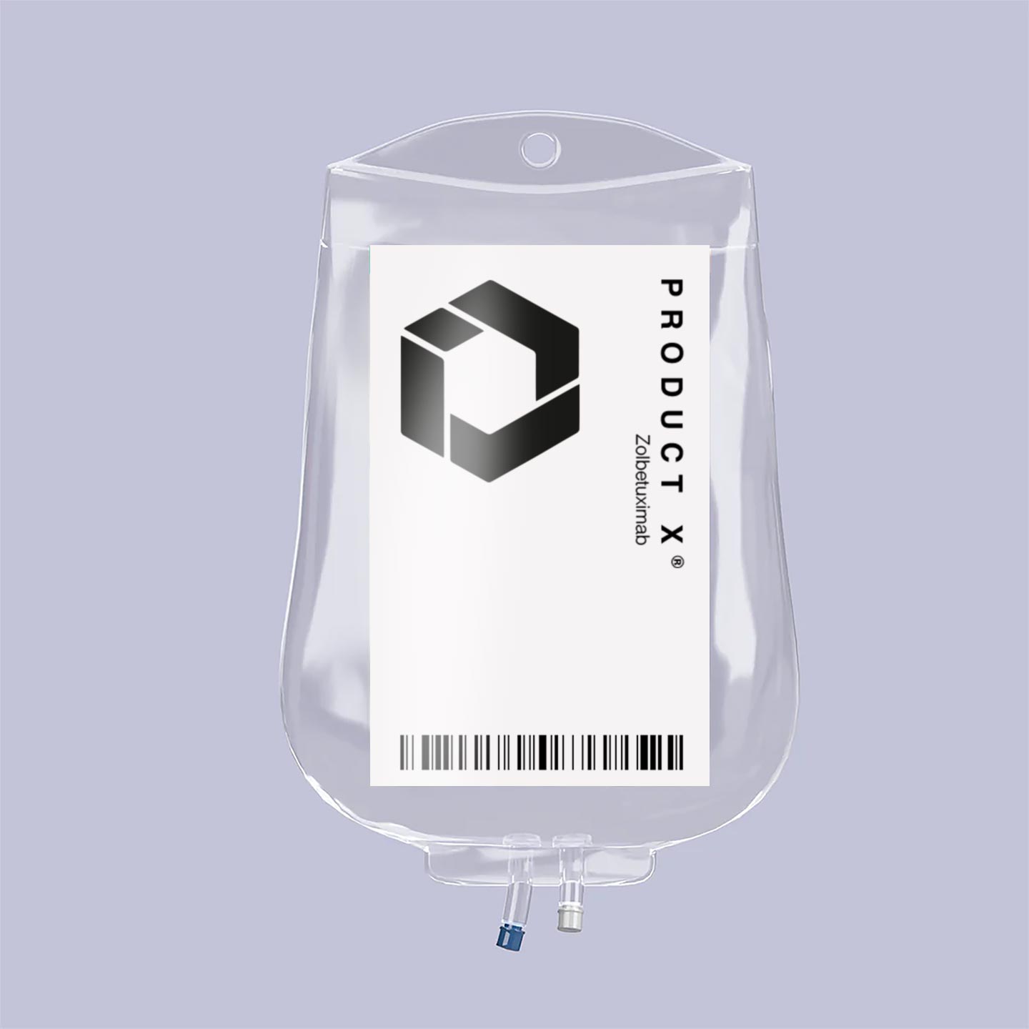
A series of logo concepts for a new cancer treatment
Being a logo for a pharmaceutical, the jury is out whether a cancer drug actually needs a logo or not but, nevertheless, that was the task in hand.
The results are a series of marks that try to suggest the medications mode of action, essentially the same as other drugs in its class but containing an extra functional element.
The marks attempt to symbolise the compound as being like a container for ‘something special’ within.


