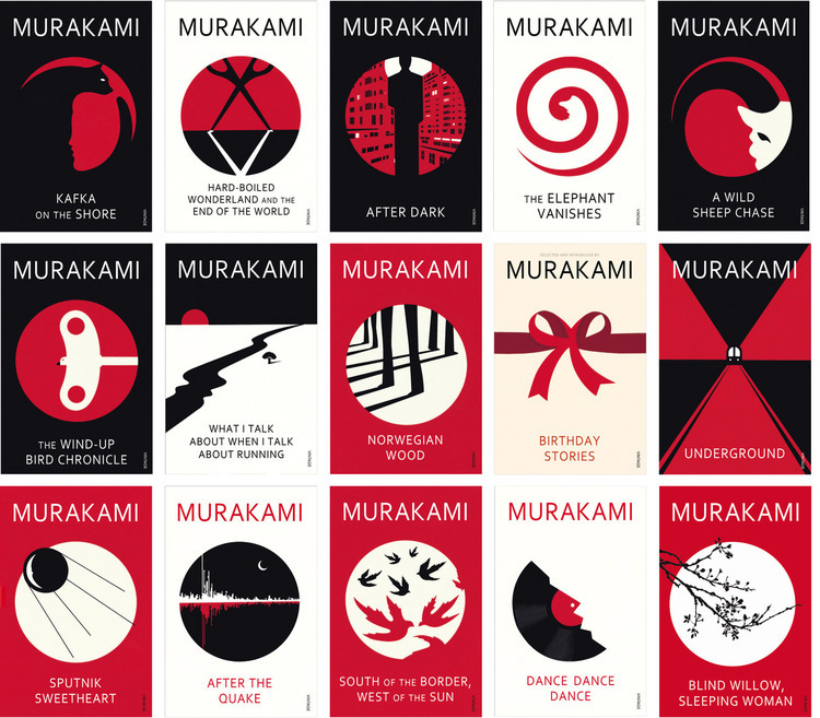
An exclusive chat with the hugely successful London-based illustrator on his work for Vintage Books‘ Haruki Murakami novel series.
I must admit, to this day, I have not read any of the titles but I have always enjoyed the artwork on their jackets.
Due to the subject matter, it would have been easy for Bar to make the covers convoluted and over the top but instead, he used a simple and clever style that, as many people have said, gels perfectly with the themes of Murakami‘s writing. The use of a simple three colour palette and good screen print finish gives the range a great standout and no doubt stimulates a need to collect all of the range.
According to Random House creative director Suzanne Dean:
“Murakami’s work has a sense that something has been lost or hidden, what is real and what is not,”
“To match this playfulness for the covers, we commissioned Noma Bar whose powerful graphic illustrations cleverly utilise negative space concealing secondary images and illusions. Noma’s illustrations were then screen-printed by hand to give them a personal and softer edge.”
Very interesting but I just had to investigate more. So I gave Noma a call…
Splendoid: How did you get involved with the Vintage Books/Murakami project?
Bar: Very easily. Vintage got in touch directly via my agent, Dutch Uncle. They had seen my work and I liked the books so it was a good match
Could you outline your process, from start to finish?
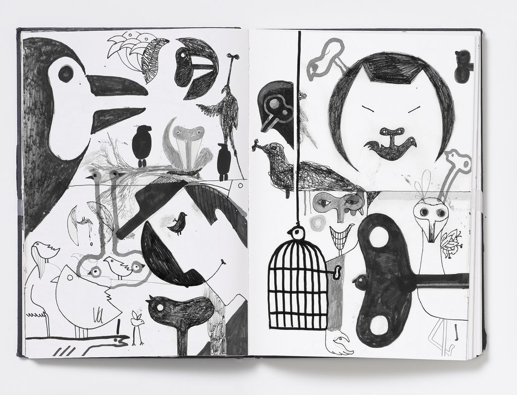
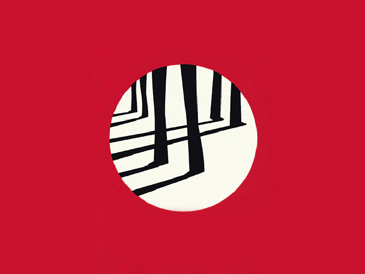
Again pretty simple. The jacket layout, with the typography, colours and the important circle device was supplied by the publishers so I just had to concentrate on the illustration. I then worked like I tend to do, sit in Highgate Woods and sketch as many ideas as possible – the peace and quiet helps me focus. Once I felt that I had enough ideas I would come back into the studio, scan or photograph the sketch and then trace them with the computer. Concepts then went to the publisher and they made their selections.
Did you read all of Murakami’s books or do any other research before working on the illustrations?
I knew some of the books already, I read some others and I also had notes from the publishers to create a skeleton of the story
How was the final work rendered?
All the works were supplied as digital art.
Were there many iterations before the final decision in the cover?
Yes, there were multiple finished versions, I always like to produce the maximum of ideas that I can.
I often liken my work to music: you start with a basis of notes and lyrics but you then can play it with different instruments and the same music will sound different.
Were there many iterations before the final decision in the cover?
Yes, there were multiple finished versions, I always like to produce the maximum of ideas that I can.
The final pieces have a slightly different tone to your other work, would you agree?
Yes. These pieces have a different flavour to my other work, a more ‘normal’ illustrative approach and a bit darker in tone. I often liken my work to music: you start with a basis of notes and lyrics but you then can play it with different instruments and the same music will sound different.
A good analogy. So, as an aside, how did you develop your signature style?
I originally arrived in England from Israel as a typographer but because I didn’t know much English and I needed to create a portfolio relevant for the UK so I decided to do what I know. Hebrew is my native language so I am used to communicating with symbols – I just took that idea and applied it pictorially.
Returning to the books, what was the feedback from Murakami, if any?
I don’t know actually. I never heard from him directly or via the publisher.
What has been the legacy of the project?
Very good. I’m working a lot generally, many posters and editorial illustrations but in terms of books I did the Don Delillo novels for Picador and I just worked with Penguin on Erica Jong’s Fear of Flying


