Mike Salisbury is a creative director who has worked on an incredible amount of films, many of them classics; Aliens; Apocalypse Now; Basic Instinct; Star Wars; Raiders of the Lost Ark…
In the following interview, he discusses branding Jurassic Park, both within the film but also it’s monstrous marketing.
SPLENDOID: Welcome Mike. To get straight down to business. Jurassic Park is a premium example of a film with a very cohesive visual identity, from the on-screen props right through to the accompanying marketing material. Was this something that you and Spielberg were intending?
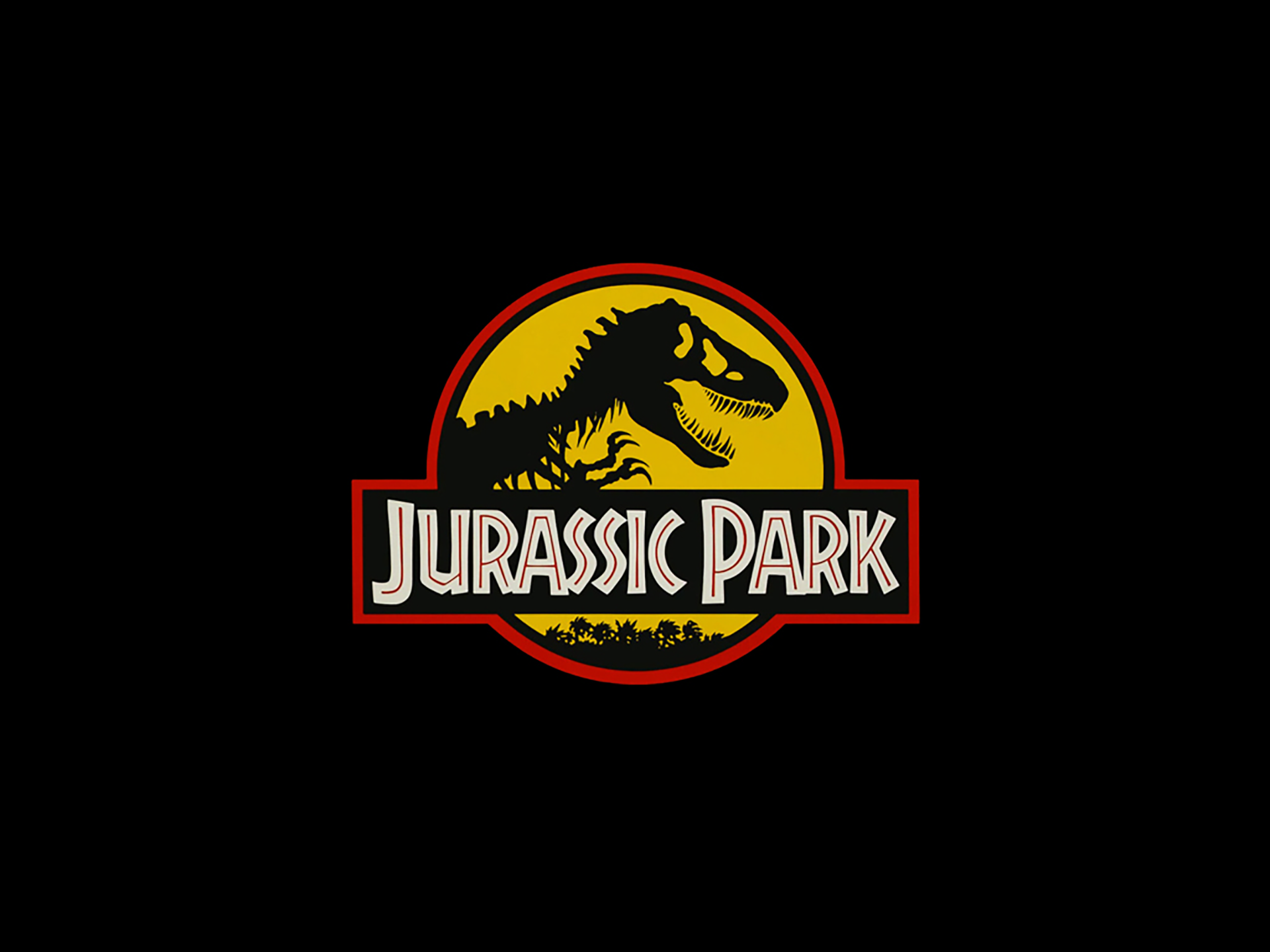
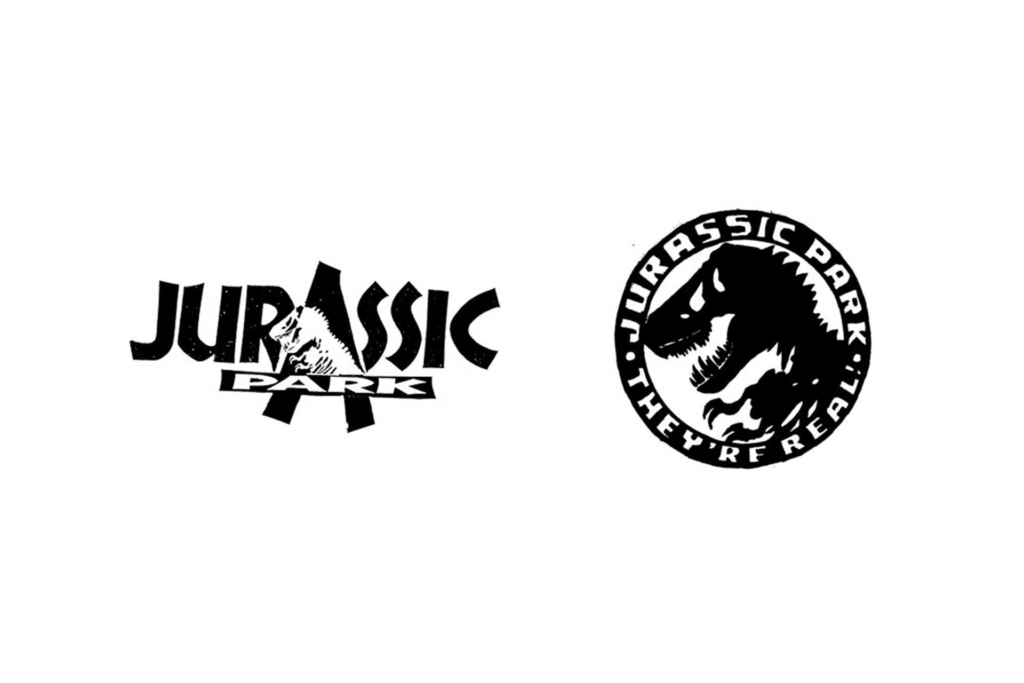
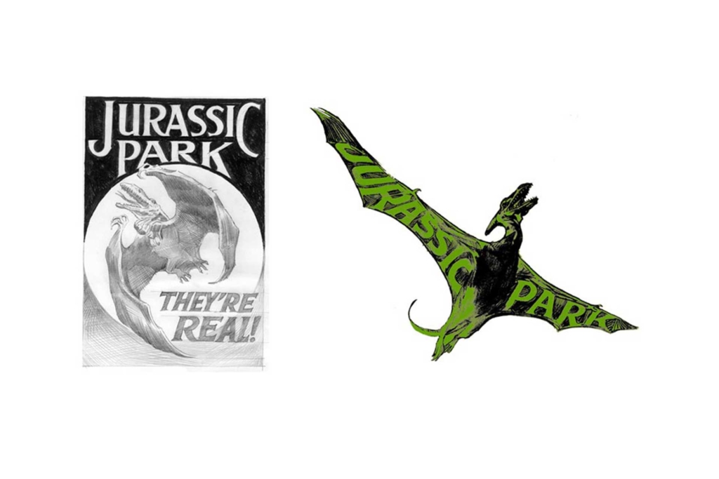
SALISBURY: Right from the start Steven wanted a badge, a shaped logo that could be easily applied to any prop or merchandise, essentially something that looked good and wasn’t too expensive to reproduce. I wanted the lettering to look like an amusement park. After exploring other dinosaur images we went back to the skeleton motif found on the first cover illustration for Crichton’s book, this original silhouette was felt to have some recall and association value.
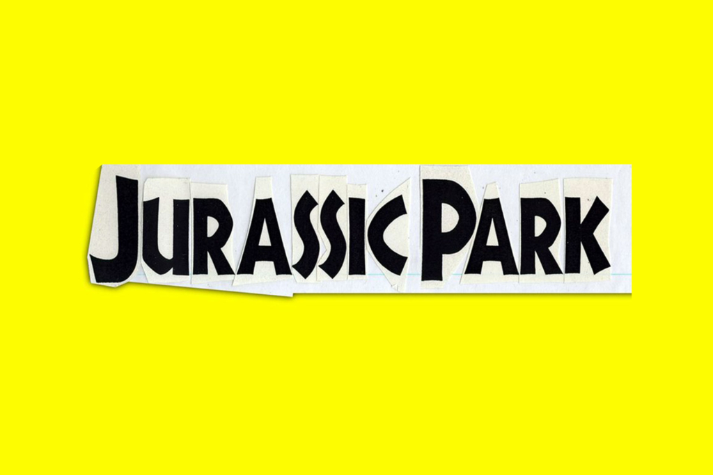
Looking back, after developing hundreds of title treatments for Jurassic Park I was driving on the Sunset Strip and saw a wild posting of the title alone on posters and thought where did that come from because it wasn’t all that attractive. Going back through my files, I found it was lettering I myself had put together.
The logo is everywhere in the film, was the eventual styling driven by a need to be pragmatic i.e. did it need to be easily recognisable in long shots, in low-key lighting, applicable to multiple types of props etc or did it just have to look good?
Jurassic Park branded items featured heavily in the movie as part of the background so the logo simply had to be highly recognisable.
A slightly boring question perhaps, but I will ask it anyway as I like this kind of stuff. How was the final logo put together, was it a computer vector graphic or was it done by hand? It must have been around 1991/2 that you were working on this?
You’re right, it is a boring question, but I’ll answer it anyway. I simply xeroxed the letters to size and pasted them up. We then drew the dinosaur, added the trees, and drew the shape around.
So it was an old school process then?
A bit of both really. Once the design was finished, it was photographed, scanned and traced as a vector graphic which could then be easily resized for all the various applications.
There are many other brands ‘guest starring’ in the film. At any point in that process did the brand people and/or brand guidelines from these companies have to be involved with the design process at any point?
As I recall for Jurassic Park, the big brands supporting the film, like Ford, were happy to be branded with our logo.
Jurassic Park aside, logos created for fictional companies in films arguably possess a theatrical quality. It could even be said that they don’t ever look quite ‘real’. Do you agree?
Depends. In our case here the logo created had to be a ‘real world’ symbol for the film as a marketable product but also signify the fictional destination Jurassic Park, which creates its own reality.
Most important to a fictional prop brand is that it must communicate immediately since it has no history and so no associations for the viewer
In that case, do you consider it important that brands constructed for a film look like ‘real world’ ones or can they exist solely in a theatrical context-free from any need to function as a commercial logo must? (i.e. they just serve the narrative and only need to look convincing for a small fraction of screen time, there are no ‘real-world’ technical worries i.e. easily photocopiable, translate into onto the Web, look good on a billboard, packaging, etc.
A made for screen brand/logo usually has no other purpose but to be a prop and so communicate as a prop does…a gun is a gun:) But if the gun is also the title, Winchester 73 or a Radio Flyer wagon in Radio Flyer then the gun or wagon has to be branded for real.
For example, a phony motorcycle brand probably would never be effectively convincing to an audience which may be there partly for the motorcycles – that audience can be demanding of detail!
On the other hand consumers may not know how best to judge quality. They need the right visual clues. Marketing communications created with a targeted message can help consumers see the context in the right way.
Most important to a fictional prop brand is that it must communicate immediately since it has no history and so no associations for the viewer.
In our studio we always develop objective, core criteria that address a client’s strategic communication and needs. This works equally for real or faux brands. They are as follows:
– Task (what are we trying to achieve?)
– Positioning (how does/will the company stand out in the market?)
– Response (what is the target supposed to do or think as a result of this work?)
– Desired identity/personality (what are we trying to convey?)
– The core (single most important work in the desired identity/personality)
– Tone and manner (necessary tonal values)
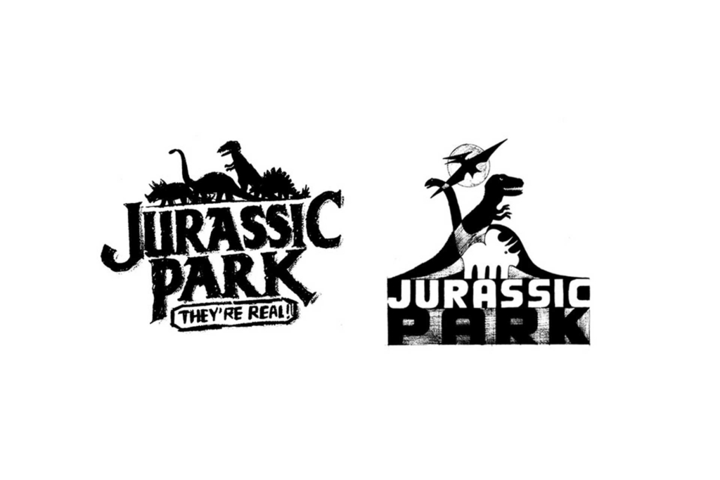
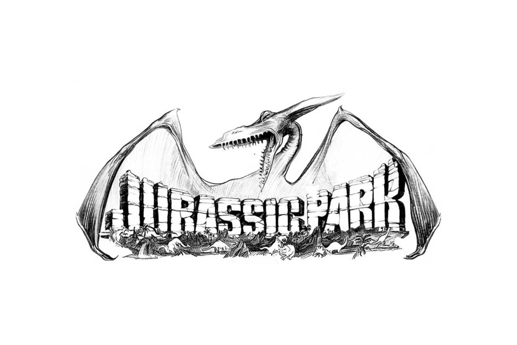
Yes, I think you’re right. This seems to be proven by the success of film-related merchandise bearing logos, originated for film production design, like Jurassic Park (Ghostbusters would be another), that cross over and become real world products, demonstrating that even though faux, these diagetic graphics (logos etc created purely as mis-en-scene) still have an iconic quality that the general public tap into.
My theory is that this is derived from a combination of this theatrical flair for style that is more attractive than many real world logos and the fact these logos take on the fond remembrances of an audience that enjoyed their experience of the film, any after-film collateral thus becomes imbued with the same. Do you think this is a fair assessment?
Yes. Good. If you look at early movie merchandise like Disney‘s –who could design fantasy better than the best artists working (who apparently were all at Disney)?
Moving on to some more general questions, you are both a corporate designer and a film art department designer. How did you get involved in your film projects?
Most film marketing including graphics was done in-house at the movie studios and was graying out a little as a result. When I started out new movies were produced for new hip audiences and I had had some good exposure with my advertising, editorial, surf industry and music industry work, illustration, photography and writing and was seen as one who had the voice for that audience.
When constructing the visual for a film do you look to the real world for inspiration?
If the visual is a piece of information to support the story as a literal reference. I created all the signage for Dick Tracy to look like a period that no longer existed but I romanticised the looks to be hyper period as the movie is. For Apocalypse Now, creating the identity and back story of Marlon Brando’s character who only had minutes on screen, the hard copy references for his story we created were all real world – his military documents, family photos, Time and Life magazine articles and more. All was revealed with close-ups and all had to be genuine.
What is your general design process, from sketchpad to screen?
I first brainstorm with myself for any immediate response to the film before reading a script or seeing any cut of the film. Then I read it and/or view the movie and we – my staff and the client – have meetings to get the filmmaker’s input, then back to the drawing boards and crank out a lot of ideas. A film is a corporation with one product and possibly no shelf life, so the principle is to explore and test all possibilities, which some in my business don’t like to do.
A film is a corporation with one product and possibly no shelf life, so the principle is to explore and test all possibilities, which some don’t like to do
As films like Jurassic Park become like brands in their own right do you foresee a time when marketing departments could affect a films design by attempting to impose a cohesive identity derived from advertising throughout the films fabric and on into the surrounding communication materials. Perhaps it is already like that?
The General Motors derived Transformers, adapted from the Japanese toys, are most of the movie. The Toy Story movies are essentially all product, the Pirates of the Caribbean franchise is based on the Disneyland attraction. And, having worked on Star Wars from almost the beginning, it was created to be an eternal branded merchandising mega franchise.
Much like The Wizard of Oz, Star Wars has a recognisable cast introduced very theatrically establishing each character with its own look, color, voice, props—each a sub-brand of Star Wars. All of which help move the story and all of it merchandisable.
In that case then is branding becoming a design skill set criteria? Is the design industry developing a lack of respect for ‘design’ as a very open process that can be applied to any outcome? Could it be that this is happening in film also, or is the cinema the last bastion of Renaissance men like Saul Bass; I mean designers who were able to get involved in every conceivable area of design, both in film and in general? If it has changed, and you were just starting out again, do you see yourself as having the skills to break in?
Personally, today I feel that there is no separate graphic design. It is all communication. With Bass, it was marketing but recognisably graphic design. Today, unfortunately, graphic design is being taught not as a part of communication. There is to me, as I review portfolios of graduates, a lack of teaching storytelling, editing skills, and motion and selling. I taught myself how to communicate. I was drawing and writing and taking pictures very early and sold door to door at about age seven.
What if anything would you have to do today to make yourself known that is different to when you started?
Have new friends inside:)
But the movie marketing business has gone to some degree, back in-house or to graphic sweat shops because the computer does everything and it can be done cheaper. Unfortunately all movies are marketed with about six templates for visuals and look it and most in house designers are reduced to being basically production designers executing the same looks.
To close, whats best – working on film projects or ‘real-life’ branding work?
I like it all but the movies can pay better:) Movies are good clients because they are selling a visual product. And, I communicate visually

