It goes without saying that Jurassic Park is an extremely well-made film: a solid story, great cast, amazing effects, and a superb score but somehow the sum of those parts leaves me feeling a little hollow
Even at an early age, I had a problem with production design that looked false. I could never understand why art departments couldn’t just spend an extra 5 minutes giving things a bit more finish so that they looked a little more ‘real-world’. Suffice to say, no such problem here.
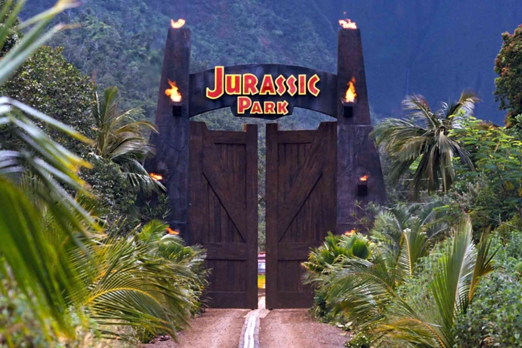
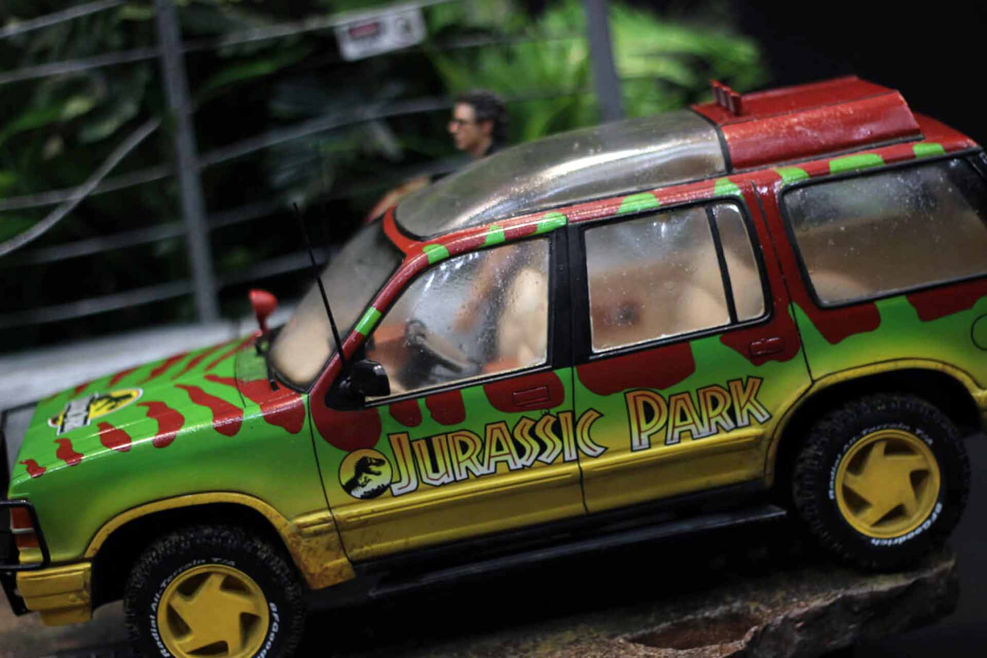
I always wonder what it would have been like had it have been made in the 1970s, but that’s another discussion. Where the film does hit home is in its production design. Even now, 20+ years later, it all just looks ‘right’ and the primary reason for this is the logo.
As events begin to spiral out of control and all-around literally start losing their heads, the logo takes on a heavy dramatic irony
It is now, as it looked back in 1993 ( I remember first seeing the symbol on the poster outside a cinema whilst on holiday in Weymouth – amongst the shiny amusement arcades it just fitted right in ), a perfectly self-contained ident and exactly what the branding for a theme park with genetically engineered animals established by a brainiac billionaire would look like.
If we were to get all semiotic and let’s indulge ourselves for a second, the logo is a perfect piece of visual diegesis but also stands as a celebration of the notion of what we might call The Brand™. As events begin to spiral out of control and all-around literally start losing their heads, the logo takes on a heavy dramatic irony. On one hand, everything it stands for has fallen apart and yet there it is, still standing, complete and for the most part, pristine but rendered impotent by circumstance, on the other hand, seen with a heavy dose of 1990s style commercial confidence, it seems to also say that the brand is King, that a logo can withstand the absolute worst and come back to fight another day, a thought that the films sequels perhaps qualify?

