The VFX designer talks about creating modern sci-fi classic Moon (2009), a personal project that he developed with director & friend Duncan Jones.
The film was released on a modest exhibition schedule but its distinct retro-futuristic atmosphere and adherence to timeless genre idioms found the film a passionate audience with both the public and critics alike.
SPLENDOID: Welcome Gavin. I am a huge fan of this film so it’s a real pleasure to be able to talk to you about it. Let’s go back to the very beginning then, how did the project come about?
GAVIN ROTHERY: I’d been flat-sharing with Duncan (Jones – Director) for ten years or so. We were both freelance and just worked on everything together. We’d been trying to make a film all that time and Moon was the end result.
Was there any particular process driving things along?
Just me sitting in my bedroom knocking out designs and wandering through to the kitchen to chat about them with Duncan. The film came about basically through a couple of blokes wandering around their house drinking tea and talking about what we could do to make this film feel right.
Doesn’t it seem like all the best films come about like that? Talking of avid tea drinkers, the film has proved to be very popular with both sci-fi fans and intellectual critics alike. One thing that is always talked about, and indeed the thing that I have most enjoyed about the film, is the incredibly cohesive visual identity. It has a definite aesthetic that flows right through everything; from the on-screen graphic pieces like corporate logos, way-finding signage, data readouts, etc through to the physical architecture through to the key art and marketing material. Was this something that you both were intending?
Thank you. And yes it was. Part of this is probably due to the fact that I had to pretty much design everything myself. That’s bound to bring a level of cohesion to the proceedings.
When starting out to construct this visual language, what was your inspiration?
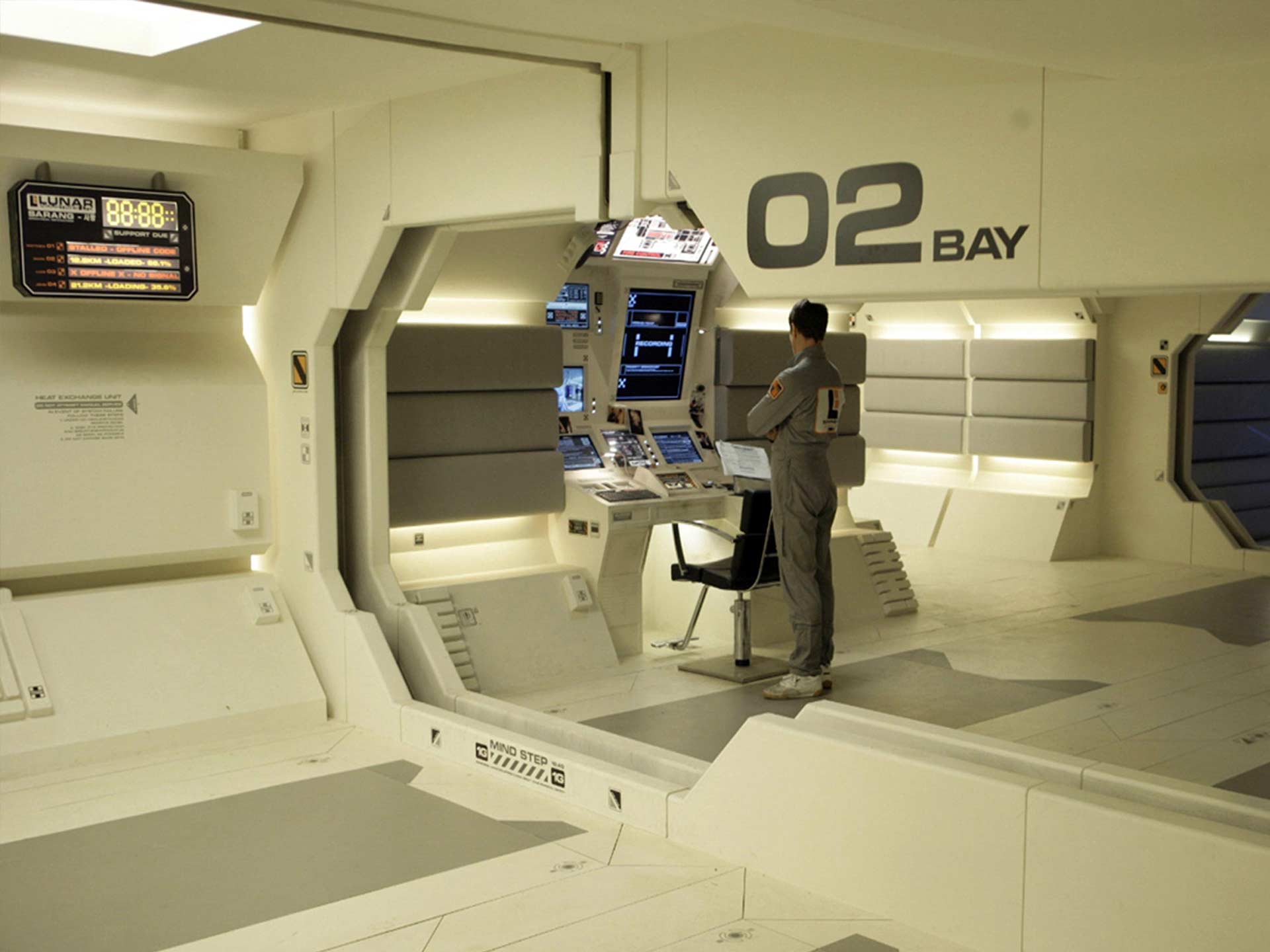
There was one single piece from Alien that I always loved which was the Ron Cobb graphic from the Purina dog food label. This was the only design cue I needed to get started and everything just rolled out from there. The monitor screens were designed to look like they could have come from interface screens from an Amiga era computer game. Just very clean and simple delivery of information with the odd bit of design here and there. Everything was pretty much made up as we went along. There was so much to do and I was on my own.
Were you thinking more pragmatically or just concerning yourself with meeting your ideas for an overall aesthetic? I’m wondering if you were thinking more about whether things needed to be visible in long shots or under low-key lighting or if it was just to make things look pleasing to the eye?
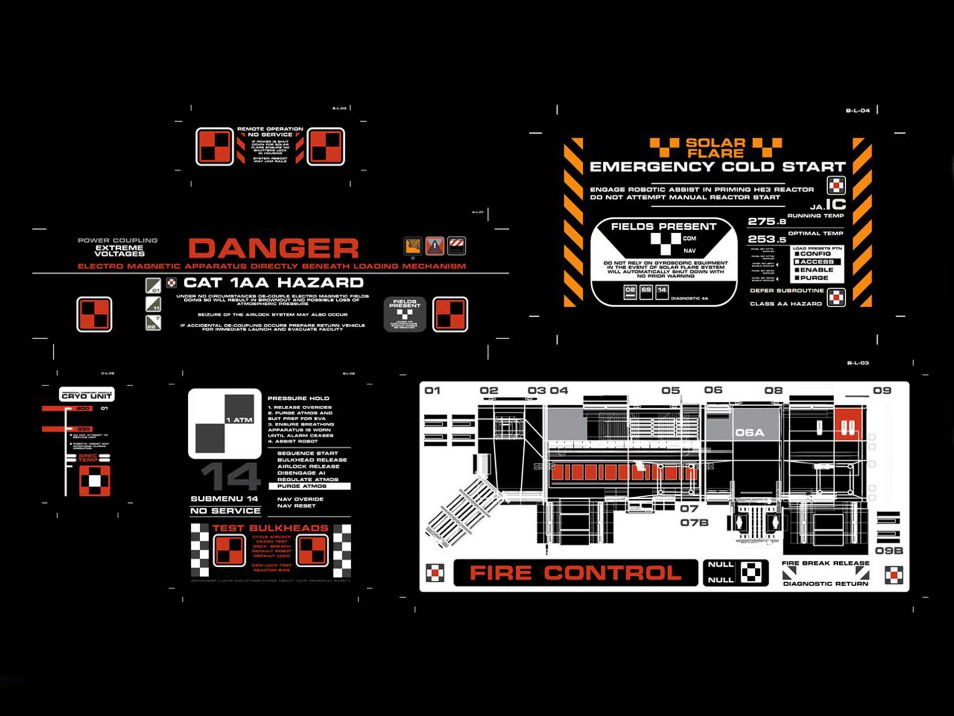
Both. I wanted it to feel like a real facility and, actually, all of the graphics with text mean something. I put in all sorts of detail that the cameras never picked up such as service access details and evacuation instructions. I find adding this level of detail incredibly satisfying and, as we built an enclosed set, it really helped the authenticity.
All these little details only really existed inside my own
head but I love getting deep into my work like this
The graphics on the side of each bay have a specific meaning and relate to an emergency. In a depressurization event, the bulkhead doors would automatically seal, segmenting the base. This graphic key tells the rescuers what hazards they may encounter as they make their way in, opening the bulkhead doors one by one. All these little details only really existed inside my own head but I love getting deep into my work like this.
That way of working really speaks to me, I love anything with that kind of detail too. For me, if it’s not even seen, it’s somehow even better! Now, you mentioned earlier Ron Cobb’s work on Alien as being the starting point, and I think it’s fair to say that the look of Moon is very much in line with the look of 1970s/early 80’s sci-fi films. I imagine that this was a very conscious choice?
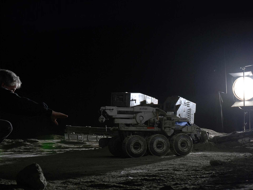
It was conscious but actually, it was driven mostly by the Visual Effect Route. From the start of the project, I was conscious that we wouldn’t be able to marshal the budget to compete with films such as Transformers 2 and Avatar. The script initially called for some 21 minutes of lunar exteriors, and it was apparent to me right from the start that we would have to use model miniatures. I was excited about this as I have always loved miniatures and wanted to see what we could do to them working into the photography with subtle CG. Although I had to fight for it, once we’d expended all our options for going the full CG route, we ended up back at this sweet spot. So I designed the film to make it look as if it was a lost film from the 70s or early 80s so that everything would fit together and the model work wouldn’t look out of place.
Absolutely, I always find model work adds a feeling of physical weight which helps promote a sense of reality for the audience. One thing, kind of related, kind of tangential, is that you very much created your own brands and logos for the film. As an aside, can I ask what your feeling is on films that feature real-world brands and products in them? You mentioned Transformers earlier. Does such product placement as seen in that franchise help create an on-screen, fictional, world or does it destroy the illusion?
It all depends on how it’s handled. Like all advertising, it can definitely be shoved in your face too much. But then a good script will do this on purpose and the corporation becomes a character. This is the kind of approach I was going for in Moon. A good example of this done well is with the Omni Consumer Products corporation in Robocop. It’s very in your face as a brand throughout the film but is done intentionally to set up the public face of a company, which is run by ruthless businessmen, as we eventually find out.
However, of course Robocop is a fiction and not film where a real-life brand finds a home. Having spent a long time working in advertising, I’d have to say that there are far more examples of this sort of thing being done badly that being done well. Although the money the product placement brings to the production is always going to be welcome, the invasion into the narrative by drawing focus to random objects isn’t. A good example of this working well is Will Smith’s Audi in I, Robot, where a custom vehicle was designed around the brand for the production.
In I, Robot, the brand (Audi) got involved with the production
and worked with the director and production designer
to create a nice-looking vehicle that featured
heavily in the big chase scene
This is quite an interesting area. I’d like to talk around it a bit further. Moon is exempt so have you worked on other projects where a guest brand has been involved in the design process? I always wonder if collaborator brand guidelines have any effect on final designs?
I haven’t personally in films, but I have on computer games. Brand people are always going to get involved to some degree, it’s their job to make sure the brand is represented accordingly. Often people see this as a negative thing and a hassle to making the product but at the end of the day, we’re working in an industrial environment and I find it’s always best to get friendly with everybody and get a good dialogue going so I can do my work properly whilst making sure their needs are accommodated. If everybody’s prepared to talk to each other, there’s always a way.
So, in your view, guest brands are just merely another technicality, a simple practical consideration?
Yes. I think product placement can be a very positive thing if they embrace the opportunity and put themselves in your hands as a filmmaker. Again, using the example of the Audi in I, Robot, the brand got involved with the production and worked with the director and production designer to create a nice-looking vehicle that featured heavily in the big chase scene. They were especially bold, as the car gets trashed in the chase and many products would not like to see their output in any sort of negative light (dirty, burnt, destroyed, etc). So here we see Audi getting on board with the film and working with the people making it. There’s some good relationship-management going on with the people that made this film, you can just tell.
Agreed. Let’s flip that around and talk about brands created specifically for films. With Lunar Industries you created your own corporation, as you said earlier in the vane of OCP from Robocop. I love the logo you created but for me these, for want of a better word, fake logos have a kind of theatrical quality. I might even go so far as to say that they don’t ever look quite ‘real’. As someone who has made a fully functioning ‘fake’ logo, what’s your take on that?
To be honest it’s yes and no, it all depends on who made them. I think the Weyland Yutani logos from the Alien films are very believable. Con Am from Outland also looks great. On the other hand there are swathes of sci-fi films that feature much less believable corporate brands, even in good films. For example, Delos Robotics from Westworld is pretty unbelievable, purely because no company has that kind of output in the real world yet.
Interesting. So when you were creating Lunar Industries, were you thinking that it should look like a ‘real life’ brand, like something that could exist in the real world or were you seeing it existing solely in the theatrical context of the film. My point is that being on screen the Lunar logo was free from any need to function as a commercial logo, it just needed to look good for the moments it’s seen. A real corporate logo has similar aesthetic considerations but it also has technical considerations like will it photocopy, will it translate across desktop and device, will it be visible at billboard size as well as on a business card, etc etc.
A logo like Lunar Industries is designed ultimately to look good on-screen, however, it appears. A good designer will always try to find the tone of the corporate character and do whatever suits it best. Like I say, OCP as a design solution was pretty over the top but it suited the tone of the film perfectly.
But should they also look like they could actually function in the Real World?
Again, it depends on what the film is. All they need to do really is to fit the tone of the film and represent their brand accordingly. Personally, I like it when they do as it gives things a bit more authenticity.
A logo like Lunar Industries is designed ultimately
to look good on-screen, however, it appears
Yes, I would definitely agree with that. It’s interesting that logos for corporations created for films, like Lunar Industries, OCP, and all the rest, have become marketable on collectible products. I think this demonstrates that film-related graphics have some sort of automatic iconic status that the general public tap into. For me, the success of such merchandising must be derived from a combination of the theatrical, aesthetic approach and the fact that people have fond remembrances of watching and enjoying these films which means any related collateral therefore also radiate the same good feelings. Would you agree with that?
To be honest, I think it’s both but probably tipped a little more on the affection people have for the product. Ultimately there will be a sweet spot where the two cross over and that’s where you’re going to sell the most merchandise. Companies like Last Exit To Nowhere seem to be doing very well out of this sort of thing. I’ve got a couple of their t-shirts myself.
You’re saying then that the audience’s enjoyment of Moon bestowed the Lunar Industries with a mythology? If you are are film-related graphics somehow more iconic than ‘real-world’ brands? Or will The Swoosh and Golden Arches always win out because their audience interacts with them in a more tangible way?
There’s no way any logo/graphics in any film, Lunar Industries included, could compete with the real-world graphical dominance of brands such as McDonalds or Nike. They are present in our everyday lives in a way that no single film ever managed.
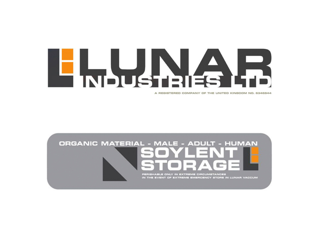
This means then that even if a film logo is a beautifully realised piece of design work, the difference in context means that it can never be compared to a real-life corporate logo?
Yes, this different context makes the two largely incomparable. Logos in real products in the real world are strong signifiers of expectations and are often involved with you making a decision to spend your money with them. Films just don’t have this sort of interaction.
Trying to get back to Moon… your background is in advertising but you know have a critically and aesthetically successful film in your portfolio. As we are seeing with the way Disney is building the Star Wars and Marvel franchises, films are becoming like brands in their own right. Do you foresee a time when marketing departments could affect a film’s design by attempting to impose the same kind of cohesive visual identity that you achieved with Moon, but for product marketing reasons rather than aesthetic/artistic reasons? Perhaps it is already like that?
Possibly. As you say, there are some interesting examples out there. One example that comes to mind is the anime series Freedom. Here we have a whole show paid for by a food company; Nissin Cup Noodles. They took their marketing budget and made a sweet six-part science fiction anime series. The trade-off was that there was a point in each of the six episodes when the characters sit down and eat some Nissin noodles. A good way to get your show made though. I’m not complaining.
Yes, a good example. Maybe if more stuff is made in that way marketing strategy will become a default design skill-set criteria? At the moment though, with people like yourself involved, would you say that film is the last bastion of the true Renaissance man? I’m thinking specifically of designers like Saul Bass, creatives who were able apply their craft to every conceivable area of design, be it film design, corporate identity, advertising, anything really.
At the end of the day, the film-making process is all about people with complementary and sometimes overlapping skills pulling together to finish a big project. Some people bear more responsibility than others and some people work harder than others. At the end of the day everybody pitches in and the job gets done.
If I were to start over I like to think I would still be able to force my way in. I did it before. I’ve never had anything handed to me on a plate and, as I hope that I demonstrated with Moon, I’ve always been a firm believer in making my own opportunities.

