Neil Kellerhouse has found the Holy Grail of a graphic design career; he has managed to be able to design for Hollywood using his own style, in other words, studios come to him because they want the ‘Kellerhouse Look.’
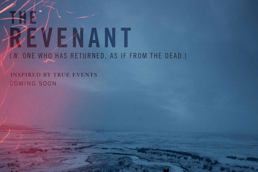
Films bearing his mark include The Revenant, Under the Skin, The Social Network, The Girl with the Dragon Tattoo, Gone Girl, and countless more. And he doesn’t just work for the arthouse, he also did the ident for Finding Nemo.
SPLENDOID: Welcome Neil. To start, can you tell us something about how you got here today, how you became a poster designer?
KELLERHOUSE: I kind of fell into this. I was accepted to the California Institute of the Arts as a fine artist. I had no idea what Graphic Design was, but the classes looked interesting and they let me attend some of them. I ended up transferring to what they call the ‘Visual Communications’ program. After graduating, my first job was with a traditional advertising agency. Later I worked for several record labels and then the Disney/Pixar work.
Are you a film fan first and foremost?
I love film, but I’m not a ‘fan’ in the popular sense. My father took me to see the films he wanted to see. I took a lot of film classes at CalArts.
Do you think to be a good film poster designer you need to be interested in film? (n.b. I have been amazed sometimes when poster designers tell me they aren’t that into film, and conversely, so many graphic designers are borderline obsessed with film posters and yet don’t work in the field.)
Not especially. I think you have to be a good problem solver. I think most good design is a well-executed conceptual solution that’s authentic and genuine to what it represents. Form following function, for the most part.
I look at the subject matter I’m working with for inspiration. That’s where you’ll find the best solution. Outside of that, it’s everywhere. Anything that’s genuine.
What are your tools? You seem to use a lot of possibly hand-rendered finishes, are they, or are you completely digital?
I have paintbrushes and pencils! Whenever I’m stuck, I try to change my tools. That’s sound advice from Lou Danziger.
What is your general working process, from briefing to delivery?
I’ll start by immersing myself in the subject matter. Most of the time the client has spent much more time with the subject than I have. It’s my job to glean out of them, the information I need, to help make what I do successful. Before I sit down and design anything, I’ll do a lot of sketching and writing. I’ll begin with a few solid ideas to start with. And then it’s a process of building and failing.
Where do you look for inspiration? Your work seems to follow in the tradition of great idiosyncratic cinema poster designers, Saul Bass, Robert Brownjohn etc. are you looking to cinema history for inspiration? Do you care about that heritage even?
I look at the subject matter I’m working with for inspiration. That’s where you’ll find the best solution. Outside of that, it’s everywhere. Anything that’s genuine.
Do you find your process changes according to each film production?
Almost always. Again, I look to the subject matter I’m working with for inspiration as well as the client. What you make and how you make it are usually very different.

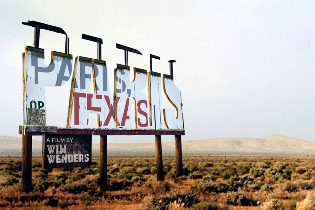
One piece of your work that I particularly enjoy is your Paris Texas artwork for Criterion. Could you share something about how that came about? It’s a very original approach, and I have to know is there much retouching?
I remember that taking a very long time to solve. Criterion is a great client, and I think you need a good client to get good work. Part of that relationship understands their curatorial voice and their aesthetic sensibility. It sometimes takes a while to discover how that voice manifests itself in the design or concept.
And making new advertising and/or packaging for a great film can be another layer to consider. It’s like redesigning a cover of a great book. The book means so much to some many, how do you capture what all that means? I love the film Paris, Texas and I thought the title perfectly reflected the relationship in the film. Like oil and water. They tried. It seemed like a good idea, but the relationship didn’t work. As far as retouching, the whole thing was built from scratch. The image without the billboard is Wim’s, from his book of photographs, Written In The West.
I think the ‘poster’ or ad, is a great exercise for anyone trying to sell anything. It helps everyone involved to come to a consensus on how they want to market their product.
Now, your logos for Pixar, notably the Finding Nemo ident. Is the approach to designing a film brand that will very definitely have merchandising and licensing attached to it very different from approaching working for production that simply needs advertising for posters/billboards etc?
In a way, they tend to be more disconnected to the imagery they’re placed over. They’re more like a ‘badge’. We’d start very early on those. Those films are huge enterprises, with major promotional partnerships to consider, localization, product manufacturing, etc.
They also have a very definite reflection of the Pixar brand identity in them. Is this something that is very controlled or is the film itself always paramount?
In the beginning, all the marketing for animation was handled by the same department at Buena Vista that handled the live action. It was Dick Cook that saw a need for a completely separate marketing department for animation. Fred Tio and later John Blas led that. Those two were the guys I worked for and they reported to Dick Cook and Steve Jobs directly. From an advertising perspective, Fred and John really created the look you now identify as the Pixar identity. Fred works for Apple now.
How does working with a company like that differ from working with a Malick or Fincher? Or is it more similar than we might think? I say this as Pixar has a very strong identity that runs across all their films but then each of the productions has its own theme. Moreover, as an identity it follows through from the film into the merchandising almost seamlessly, in a way I would say not seen since Star Wars originated that level of thinking, would you agree?
Yeah, in part, you’ve answered your own question. I think you see an aesthetic voice through all of these artists. One of them has the opportunity to ‘extend its IP’ more than the others have had. A Pixar film has the opportunity to spread through a lot of disparate industries. And when that happens, its brand becomes much more ubiquitous.
When you see your work rolled out by agencies such as ourselves do you tear your hair out at the various misuses and abuses or is it very much that you hand it over and it becomes its own thing?
No, not really. That speaks to a larger answer to this question. If you set it up properly, it should be difficult to destroy.
In your experience how much does a marketing department get involved in the design? Obviously, a poster is key to the film marketing mix but their approach will be very different from an artistic approach, but maybe we’re wrong on that? From my experience, they tend to be more concerned with the message the image conveys. And if that message conveys what we all have agreed we’d like it to say, and it says it well, then it’s successful.
I think the ‘poster’ or ad, is a great exercise for anyone trying to sell anything. If you never did another still image, poster, or ad to solicit your product, and everything was motion all the time, for example, I still think it would be a prudent thing to do. It helps everyone involved to come to a consensus on how they want to market their product.
That is actually a great point to finish on, but if you would permit one final question…if you had to pick one piece of work that defines your approach to design, which would it be?
That’s tough because the approach depends on the subject. The problem steers you toward the approach, and ultimately the solution. This is what makes them uniquely their own.

