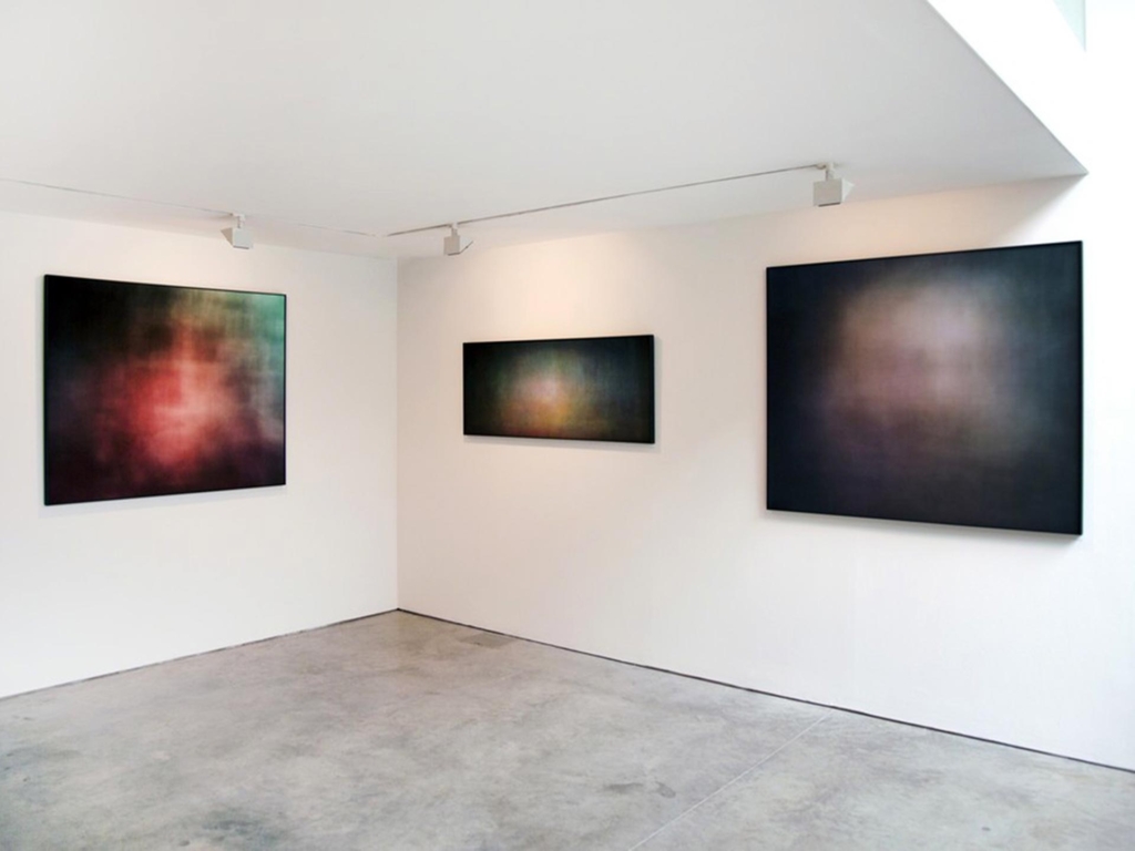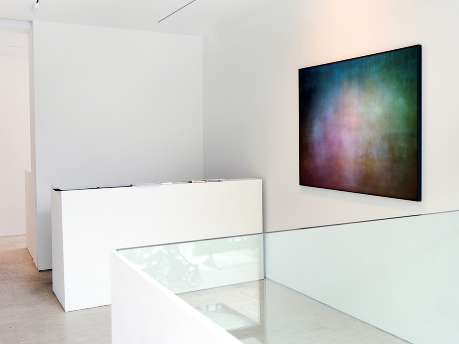
What I love about the project is that it’s an idea so obvious that no one ever thought about it. That is until it featured on Wired, CNN, the Guardian, Financial Times, and a host of visual culture and photography sites
It’s fair to say that the work captured the public imagination. And it’s easy to judge why. Although originating as a gallery-bound exhibition of physical prints, the series is perfectly suited for digital distribution. They are immediately striking to look at, are easy to understand both in form and methodology and their collective subject is one that everyone knows, at least in principle.
As has been said many times, by freezing the disparate elements of a film into one image the pieces tell us something about the visual concerns of the film-makers. They inform us of the colour palette, show us the effectiveness of the original film stock in capturing that element, suggest the degree of kineticism in the cinematography and, related to that, some of them hint at their production design.
What I find most intriguing about the project is that it is one application of the photographic process recording another, the still camera remixing the disparate elements of moving image into a new form and easily dismissing what it doesn’t like (theatrical performance, sound, the nuances of each film frame). This rampant reductionism could be read as saying something about the dominance of the static image over cinema but for me, the reverse is actually the case. In the same way, as architecture has been described as frozen music, these images are like frozen film theory. Like the most sensitive and revealing essays, these images deconstruct a film text and reflect it back at us, allowing us to consider their formal qualities in a unique way.
In many cases, the titles could be swapped and the audience would be none the wiser. This sounds like a negative but, in fact, speaks of the power of the audience’s association with a film title
Many of these images are, of course, very similar. In many cases, the titles could be swapped and the audience would be none the wiser. This sounds like a negative but in fact, speaks of the power of an element of cinema that is critical but not often thought about; the audience’s association with a film title. This means that even if they have not seen the film in question the viewer is able to bring something to the artworks. Much like the work of colour field artists, the images are pareidolic, allowing the audience to impose their own meaning by finding familiar patterns in the images, their thoughts inspired by their particular level of knowledge of the given film.
Photographs of Films makes the process of watching a film tangible. When the credits roll we might remember a few specifics but in general, our memory of a film starts to fade as soon as we leave the cinema or turn off the BluRay. What is left is an impression, all the many elements of a film, the design, the performances, the camerawork, the music et al, have worked together to create an experience which, whether positive or negative, has nevertheless had an effect on us.
When we recall this in the future we will have our emotions stimulated once again, based upon our reaction to the film in that first instance. Shulman’s images are a representation of that imprinting process, their own power being that they once again invite us to recall our experience of a film, whether we have seen it or not.

