For 80 years Blue Note, the New York jazz record label, has defined how jazz music looks. Across that period they have created a visual language that looks as fresh on a streaming device as it does on a 12” record sleeve.
Here is a deep dig into the extensive archive to uncover some pitch-perfect examples from a remarkable history.
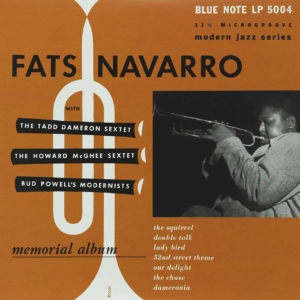
Memorial Album (1952)
Fats Navarro with various artists
Design: Paul Bacon
Photography: Francis Wolff
The Look:
An early release in the catalogue, the famous aesthetic is yet to be established but it still graphic design of the highest order although with, it must be said, a certain 1950s naïveté. Navarro was a highly influential trumpet player and so the instrument’s silhouette is present as a layout device but with the inspired usage of lozenges bearing the recording artist’s names as its valves. Unusual elements include a track listing, plus a cheeky designer credit hiding in the horn.
The Sound:
From the beginning of the 1950s, this is a record that demonstrates how jazz evolved from dance music into listening music. Seven short, sharp tracks start to disregard the earlier emphasis on melody and arrangement in favour of improvisation and harmonic experimentation but it all still swings along in classic time signatures, albeit with a hint of what was to come.

Jutta Hipp with Zoot Sims (1956)
Jutta Hipp / Zoot Sims
Design: Reid Miles
The Look:
What the significance of the X amount of green shapes and the 14 blue ones might be is sadly lost in time (unless any more knowledgeable readers want to get in touch). What we do know is that this sleeve is notable because it feels more loose and organic than normal label fare but is still strikingly original; the rough shapes perhaps an abstract representation of the music, complete with ‘blue notes’ jumping out at us, signifying something special – like a German woman competing on a very masculine stage?
The Sound:
A selection of swinging bop stompers, this is the German pianists’ swan song before leaving music. Boasting original compositions alongside standards the music is very much dominated by the serpentine soloing of sax giant Zoot Sims but the rest of the players are given enough space to create parts that, as the sleeve suggest, merge into an album that is of the 1950s but remains good fun to listen to.
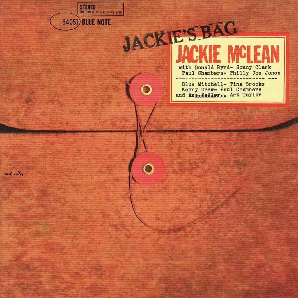
Jackie’s Bag (1959)
Jackie McLean
Design: Reid Miles
The Look:
Post-modern skeuomorphism is not something one generally associates with a jazz record but here is a sleeve of the Cold War era that attempts to look like an official Governmental dossier. Nice touches are the print glitches on the title and the crossing out and re-typing of drummer Art Taylor’s name, an in-joke the reasons for which are seemingly long forgotten.
The Sound:
Coming from 1959 the music is very much in the vein of the times; fast tempos, complex chord progressions, and harmonic improvisations, and not so much emphasis on melody. Interestingly two tracks bring in elements of ethnic exoticism that would become incredibly popular in 1960s mainstream music.

A New Perspective (1963)
Donald Byrd
Design: Reid Miles
Photography: Reid Miles
The Look:
The definition of ‘Modern’ and, perhaps, one of the most refined layouts of the classic Blue Note era. The negative space and low-angle photography accentuate the iconic lines of the E-Type but with a sensibility that allows it to take centre stage but never dominate Byrd’s portrait or the type and logo lockup.
The Sound:
Byrd is a name more associated with pioneering jazz’s return to the dance floor as jazz-funk in 70s / 80s but he was already innovating in the 60s. Also a keen motorist Byrd chose the Jaguar as the perfect metaphor for his experimental record that mixes a Gospel choir spiritualism with classic bebop quintet arrangements.
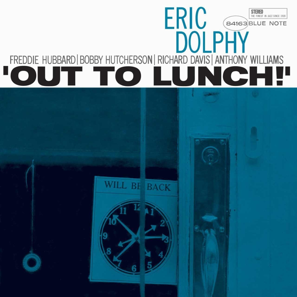
Out To Lunch (1964)
Eric Dolphy
Design: Reid Miles
Photography: Reid Miles
The Look:
This is notable by the absence of any overt reference to the music, apart from the names of personnel. At first, it all looks rather straight and structured, a counterpoint to the seemingly ‘un-composed’ snapshot image, its ice blue tint pushing out the clock detail. Typography is tightly set – technically wrong but it looks all right – the bold sans serif of the title contrasting the condensed of the players’ name pushing Dolphy’s name into the logo.
The Sound:
The suggestion of the cover is one of relaxation but the music certainly isn’t. Considered by many as a landmark of ‘avant-garde’ jazz, each of the 5 compositions begins with something of a recognisable melody and tangible rhythm before each of the instrumentalists (drums, bass, trumpet, sax, and the crucial addition of vibraphone) break down the structure with free improvisation, wild time signatures and changing rhythms.
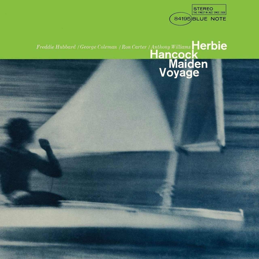
Maiden Voyage (1965)
Herbie Hancock
Design: Reid Miles
Photography: Reid Miles
The Look:
Green is unusual for Blue Note and signifies a record doing things differently musically as well as graphically. The layout is the oft-used header bar/image composition but this time with a coolly disobedient title that encroaches into the ahead-of-its-time motion-blurred sailing imagery.
The Sound:
Sailing is the correct visual signifier for an album whose 5 pieces are lengthy compositions that establish a strong sense of journey. Melodies are established before merging into smooth, lilting improvisations that explore the themes further before returning to the main melody. Others had tried before but in Hancock’s hands, it’s seamless.
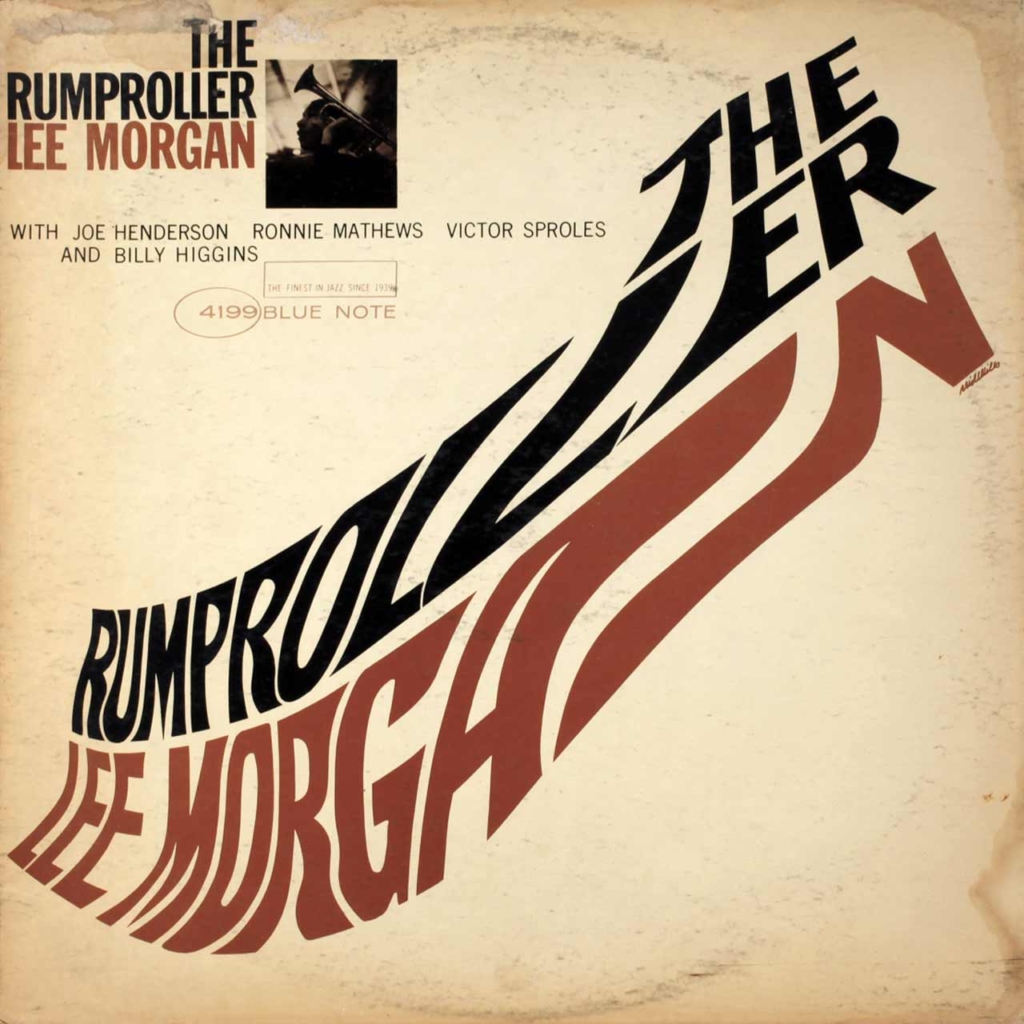
The Rumproller (1965)
Lee Morgan
Design: Reid Miles
Photography: Reid Miles
The Look:
Here we find an example of fluid distorted type years ahead of the Psychedelic era. The effect is strikingly different for a jazz record. So much so that the title is repeated in the top left, above the standard artist line –up and branding. Could it be that it was too progressive for it’s time that there was a worry about legibility?
The Sound:
Music that demonstrates that jazz can be just good fun, its title track is a rhythm heavy groove for the dancefloor, the rest are the epitome of café bar music, all pleasing melodies with easy on the ears arrangements that put the listener at ease.
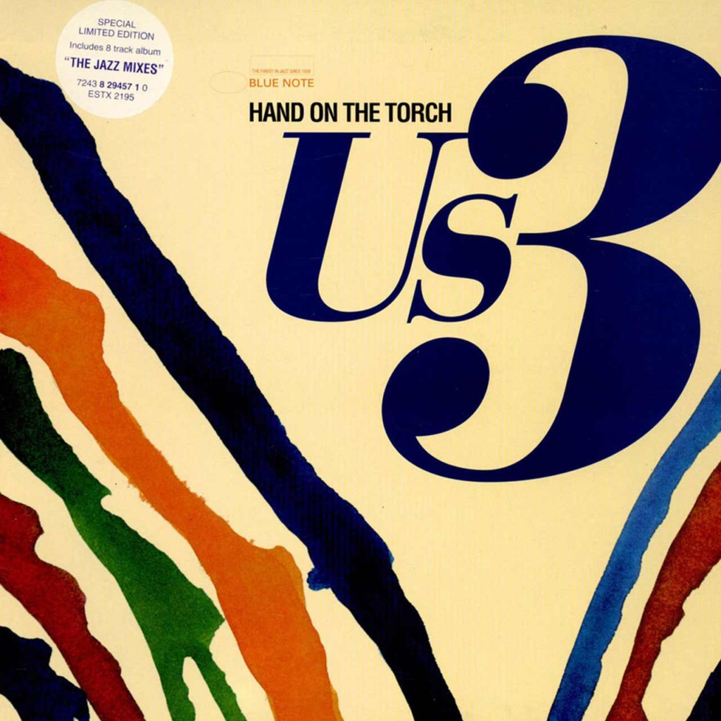
Hand on the torch (1993)
Us3
Design: unknown
The Look:
Dominated by the group logo in a fat serif font, locked in with the album title and branding, there is a contemporary (90s) feel but with a heavy reference to classic-era Blue Note, whilst the colourful stripes suggest something timeless, they have a primitive quality that references the tribal cultures with which hip-hop culture of the time strongly identified.
The Sound:
Like the visual element suggests, the record is a manifesto for the next stage in the evolution of jazz, namely a merging with hip-hop. Proceedings are dominated by heavy drum rhythms and laid-back rap vocals working together with samples of classic recordings from the label’s back catalogue and live playing on piano, guitar, bass, and brass.
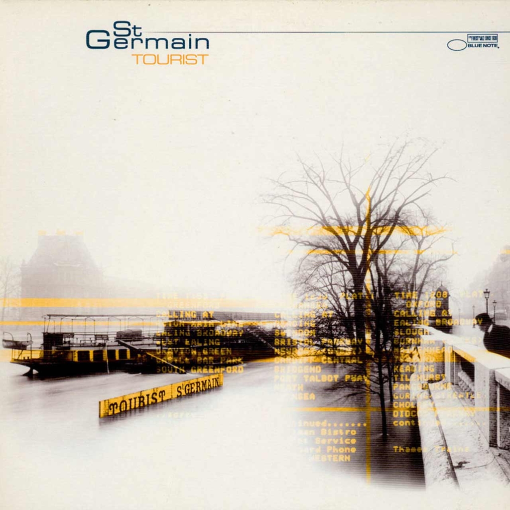
Tourist (2000)
St Germain
Design: unknown
Photography: unknown
The Look:
Overtly referencing the nationality of the creator the sleeve mixes a hazy historical image of classic era Paris with non-specific digital read-outs. They could be destination boards to reference the title, but it doesn’t really matter, the mix of old and new is just suitably enigmatic. Artist and branding take second stage in a contemporary, non-self serving way.
The Sound:
The very definition of a fusion album, electronic beats and basslines, sampling of instruments and vocals and live soloing combine to reference most of jazz history; early spirituals, swinging dancefloor styles, melodic cool jazz, chilled funk & reggae, all are present. The result is music that, if possible, feels like a warm and smoky embrace.
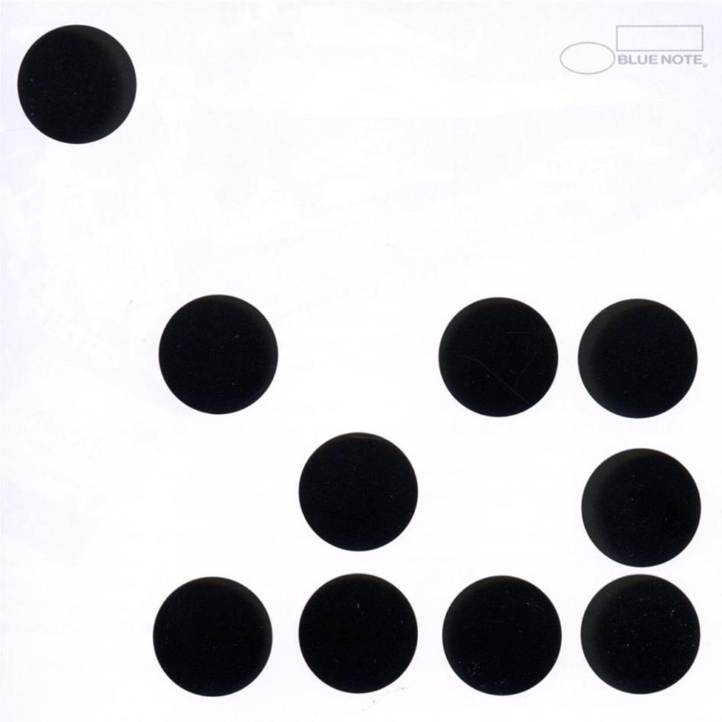
Ten (2010)
Jason Moran
Design: unknown
The Look:
Calling to mind everything from musical notation to computer coding to Damien Hirst paintings or Maurice Binder title sequences, the 10 dots are an approach loaded with meaning and their abstract quality has an inherent ‘avant-garde-ness’. It’s not all style as they also denote the title of the album symbolically. And the one escapee top left suggests something about breaking from the crowd.
The Sound:
With a sleeve attempting to be so ruthlessly contemporary-looking much of the music follows various idioms of modern jazz explored by the label in the 1950s/60s – free-jazz break downs, bebop explorations of harmony and melody reference – although the 21st Century creeps in with white noise and electronic artifacts.
Sometimes a dream assignment lands on your desk, and when it does, it’s something to savour.
Being a fan of both graphic design and jazz music, it’s only natural that I am also a fan of Blue Note and their mastery of both the sonic and the graphic.
When Amex asked me if I would like to put together a ‘Best of’ (in chronological order) for their online cultural magazine, Essentials, I jumped at the chance.
I then spent a couple of very happy weeks immersed in their back catalogue revisiting some old favourites and discovering recordings and renderings that I had never heard or seen before.

