Guest Commentary – Corey Holms
Art director and graphic designer Corey Holms is behind posters for many a well-known film including The Sixth Sense, The Sopranos, Lost In Translation, and Watchmen
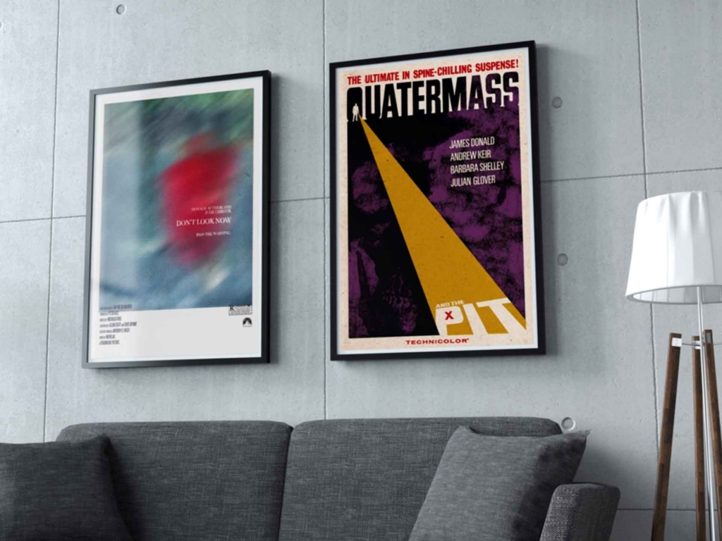
When I set out on a new project I look at a lot of things for inspiration, and sometimes I find out that they happen to be alternative movie posters
We live in a 24/7 cycle of constantly changing and updating content. Often sites are starved for content and these things are proving so popular that I imagine that they are almost guaranteeing a good click-through response. They are a pop culture touchstone, which allows people to feel connected to each other because it’s fun to share cool things with family and friends. Because the general movie-goer today is pretty well-versed in marketing and generally more consumer-savvy than they have ever been before, they want to have something that talks to them at their level. Unfortunately, there are times when the studio movie poster fails to deliver on that.
The goal of a movie poster, commissioned by a studio, is to create interest in a property that has not been seen yet by the public, and sometimes to remind you of how much you liked the trailer. This is all based on you not having seen the property. Whereas the point of the fan-made movie poster is nostalgia, to remind you of a key scene, to give a wink and a nod to your friends who share the love of the property. The AMP is reliant on prior knowledge, which drastically changes the way it needs to communicate. One requires you to have no knowledge of the film and sparks an interest, while the other requires you to be an expert and has a secret handshake.
The rise of the AMP, despite having this different mandate, shows you what the studio’s core demographic is responding to, what they want, and what they like. In that way, they are a barometer of the public’s interest in entertainment, and there is no question that they are of great cultural relevance. Because so many people are so invested in these properties that they like to spend their free time making fan art it is definitely something that must be recognised and considered. And, of course, these items are now available online for purchase, often having been commissioned, which kind of proves that they must a worthwhile design practice, otherwise the demand would be stagnant or shrinking. An interesting development is that a third type of poster that has emerged recently, which is a hybrid of the two — the ComiCon poster.
The studios have realised that the fans want to be in on it and a part of the process. These people help do the marketing for the studio to create a groundswell and do a lot of the social media work for them. So the ComiCon poster will be a lot closer to an AMP than the actual one-sheet that gets released because they want the fans to get that same feeling of inclusion and specialist knowledge that they get from the AMP. A good example of this was when I worked on WATCHMEN and we couldn’t do a poster that was just the Comedians happy face button — until ComiCon, and that was the poster they used. To the average person, the button meant nothing and was confusing; to the savvy viewer, it let them know that you weren’t talking down to them.
The AMP is reliant on prior knowledge, which drastically changes the way it needs to communicate
In closing, talking as a professional studio movie poster designer, one major thing to consider is that often we designers don’t know what the real marketing plan is from the studio. Even as a designer, I rarely am clued into their strategy. Only recently, some of the newer streaming studios (Netflix, Amazon, Hulu) have started sharing some of the metrics of who they are attempting to reach with the key art. You can be working on a drama, that seems to clearly relate to a particular demographic, but the studio has done market research that one of the actors scores high within another demographic that they don’t currently have access to. At this point, the creative direction becomes geared towards that new audience they think they can bring in. They already know they have their core audience, and they are attempting to grow their base.
Obviously, growth is a primary concern for the studio. For the agency, typically the primary concern is to do the highest quality work they can so that it will garner them more work in the future. If these two foci are at odds (or ignorant of each other), the final product doesn’t lead to what you would assume to be a natural conclusion. When those two goals are aligned you see what I believe the AMP as a phenomenon is trying to show us that we are missing; truly amazing, beautiful studio commissioned posters.
