
coded alphabet for horror film identity
I was invited by the director of a Munich-based independent horror film to produce an identity for the production. The brief was incredibly open, simply to develop a ‘never-before-seen‘ ancient-looking script that could be used as the visual identity for the film but also within the feature as a diegetic visual language.
Taking the Devil by the horns, so to speak, I set off on the journey. The first step was to read the finished shooting script, an original narrative that told the tale of a man’s obsessive hunt for the killer of his family, a concept that would have been dark enough without its eventual demonic undertones.
With the story now in mind, I set of on my odyssey to find a creative route that would have a suitably unusual aesthetic
My first stop was to look at alphabets created for science-fiction such as Star Wars and Star Trek but these are essentially created by substituting a new symbol for the standard letterforms found in Latin alphabets. I wanted my version to have a more systematic approach and so my search for inspiration went off into the realms of hieroglyphics, cryptography, and Japanese astrological birth charts, via the language system created for the sci-fi film Arrival and, of course, the time-honoured horror genre trait of using ancient runes.
After some experimentation I landed at a concept that used what I call an ‘alphabet wheel,’ which is essentially creating a circular version of the alphabet by dividing 360 degrees by 26. With this in place, I then picked out each letter by applying a diagonal line from the centre to the required letter. This produced a series of lines that were differentiated from one another by being at different degrees of slant. Each different line thus becomes a new symbol for each chosen letter.
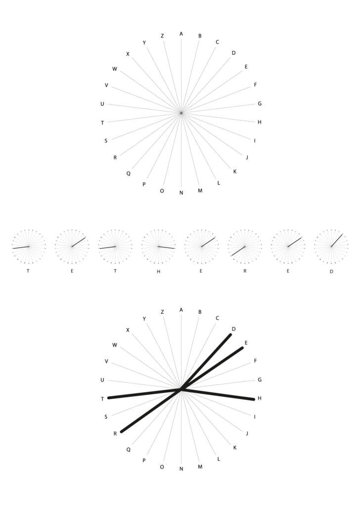
putting together the word using the ‘alphabet wheel’
By then super-imposing the lines over one another, the end result was a set of lines radiating out from a centre point. This result was pleasing but it presented 2 new problems, namely what to do with letters that repeat, and how to determine which letter was the start of a word, and which was the end letter. My solution was to repeat the lines underneath the original line, when a letter repeats. For the initial and end letters I applied a hook – pointing clockwise for the initial, anti-clock for the end letter.
refining the mark
The complete mark succeeded, I felt, in calling to mind runic symbols without being connected to any actual ancient symbols, except by coincidence. Pleasingly, the addition of the hooks lent a certain demonic flavour by looking reminiscent of horns or claws, especially when I added the finishing touch of turning the keylines into pencil strokes which, again, lent a certain tone of voice by looking as if they had been scratched by a sharp object onto a given surface.
With these extra additions the result looked suitably peculiar and otherworldly
The final stage in my journey was to further test the concept by writing out some other words, in the event I took the directors name and my name. The results were equally pleasing, at once dynamic and strange. With a successful conclusion, I mocked up a poster and shared with the director!
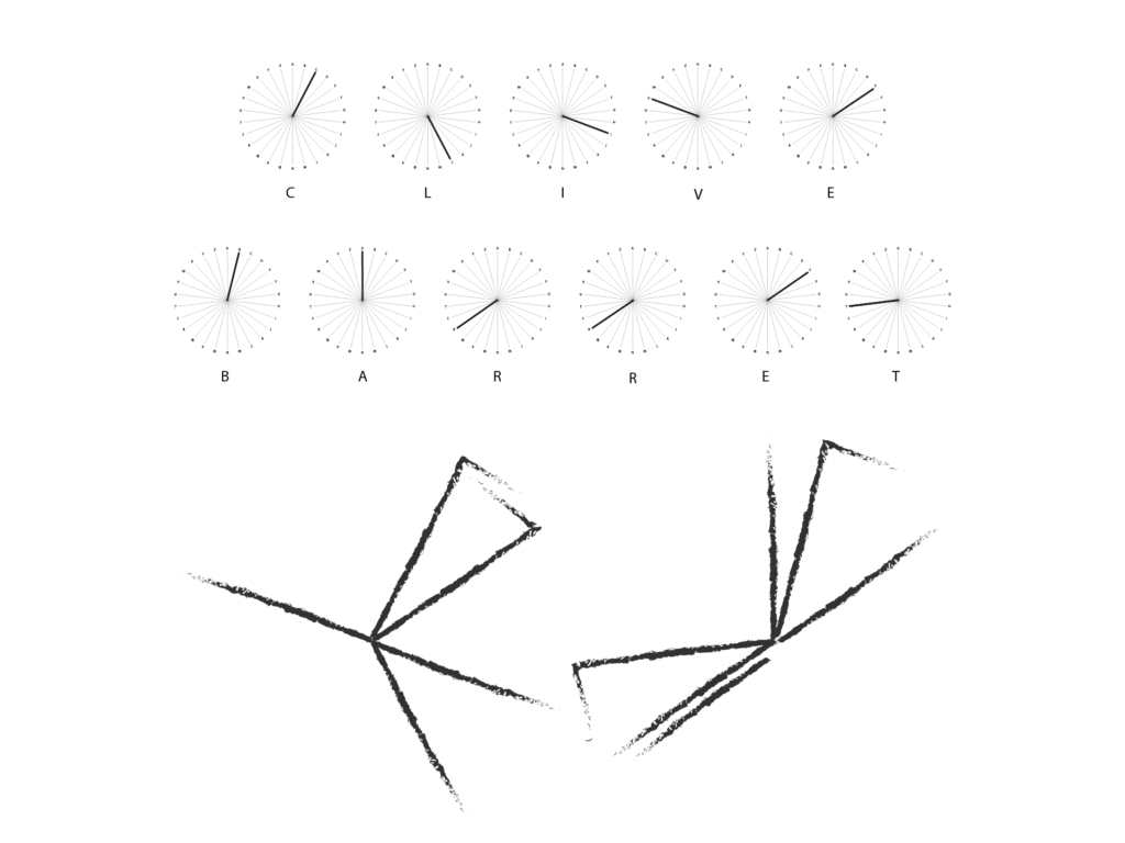
Proof of concept: the directors name
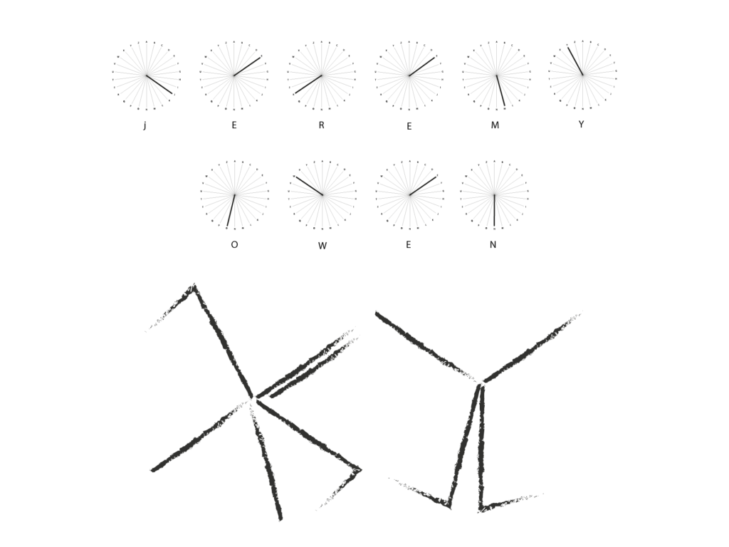
Proof of concept: the graphic designers name
This result completely blew me away – the mechanics, the form, the visual appeal. It’s a fully functional graphical alphabet that follows rules and order all based on unique symbolism. Outstanding!
Clive Barret

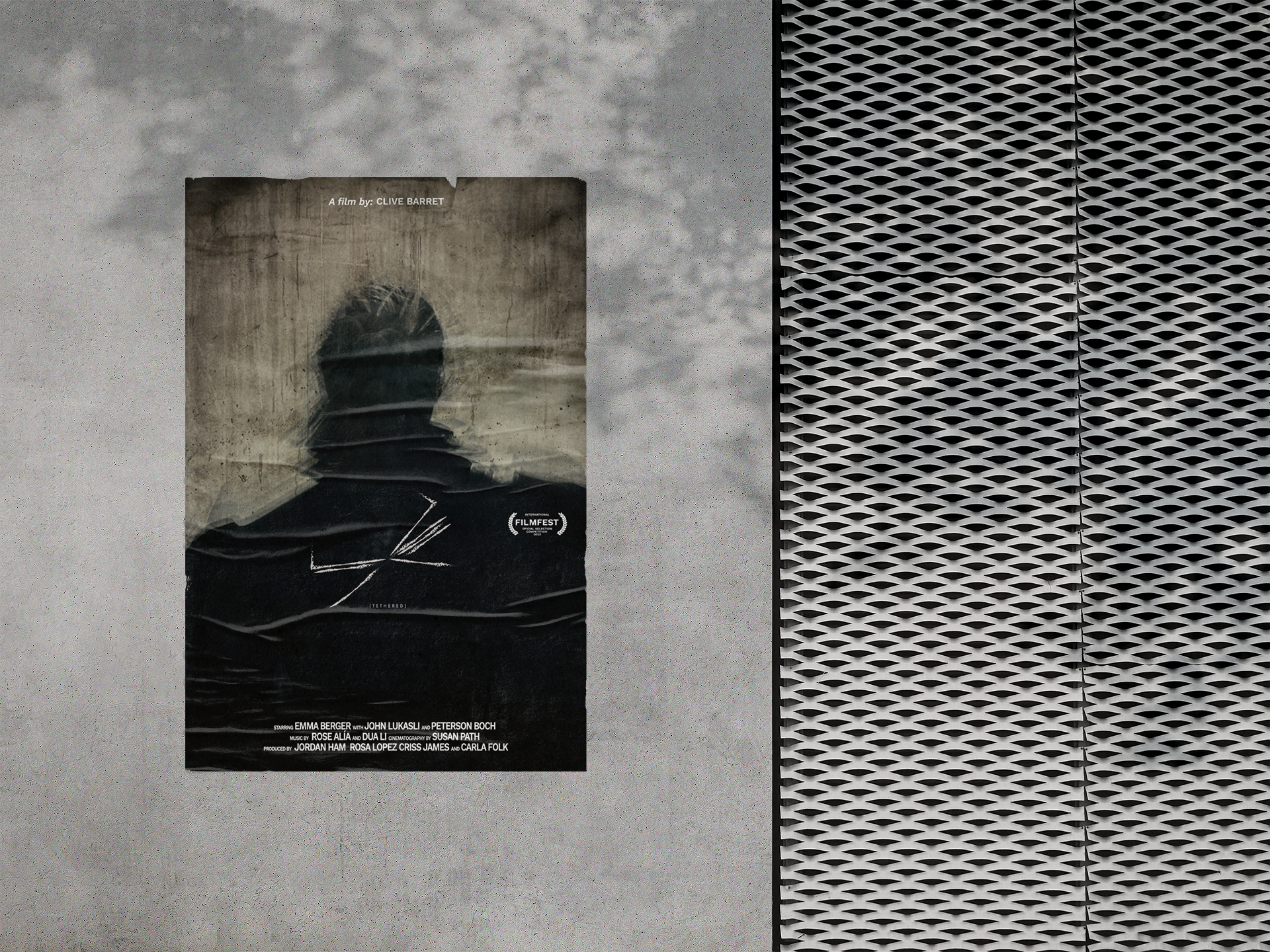
Poster concept mockup
Added value

