
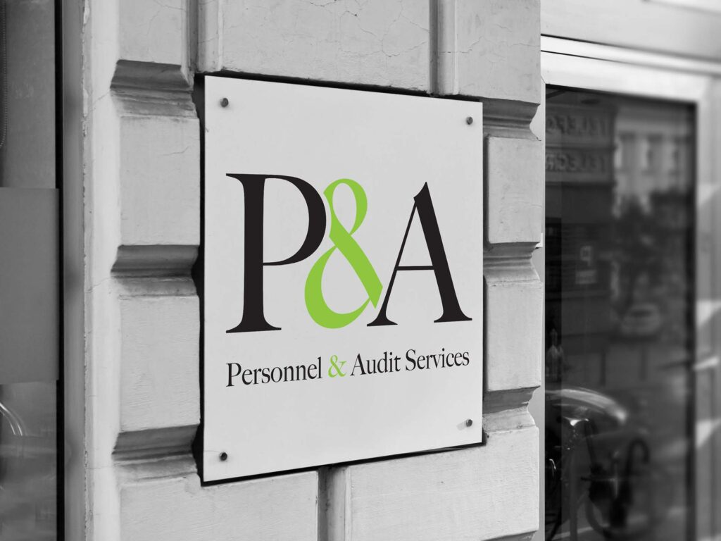
Logo for a start-up providing legal and HR services.
Accordingly the style needed to look suitably grown up but I wanted to ensure that it wasn‘t boring.
The solution for the logo was to build in slight overlaps into the serif font, taking away parts of the amplisand, so that it wasn‘t just a straight textual solution.
The usage of a vaguely neon green accent colour added some pep although I did explore a variety of other colourways before the client settled on the final version.