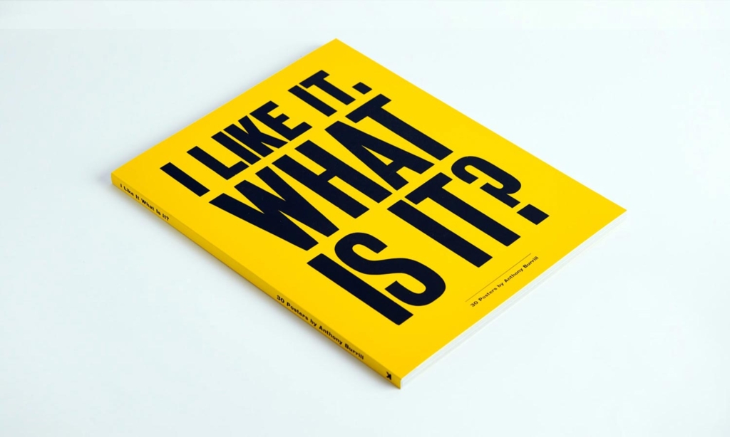
Anthony Burrill, possibly the nicest man in graphic design, talks about his unique approach and the publishing of his first book, I like it. What is it?
Once upon a time, I have to admit that I was not really a fan of Anthony Burrill’s work.
His is an oeuvre that explores the boundaries of simplicity and ephemera and so I couldn’t escape the creeping suspicion that somehow he might be cheating the graphic design game, that by the repetition of this pared-down approach he was managing to somehow avoid doing as much work as every else, namely me.
When his monograph was released I tweeted a fairly rude missive and received an appropriate response
I wrote back and invited him to defend his work in an interview. In the event, we had a great chat and in so doing I completely changed my mind.
Splendoid: Hi Anthony. Great to speak to you. Now, whose idea was it to create such a compendium? Did you approach Laurence King or did they approach you?
AB: Patrick Burgoyne (Creative Review editor – Ed) and I initially spoke about a potential book and approached publisher Laurence King. I’ve had contact with Laurence King before and I felt they would be a good publisher to work with. We put a proposal together with a rough outline of the content of the book and presented it to Jo Lightfoot, the commissioning editor. Rather than produce a straight monograph we all agreed that a poster book would be an interesting format to show the work. Our proposal was accepted and we made a start on the book.
I asked APFEL to work on the design of the book. I have known Emma and Kirsty for a long time and have always admired their beautiful work. It was important to have a fresh pair of eyes looking at the work and selecting the strongest pieces. I gave APFEL access to my archive of projects and together with Patrick we selected the strongest projects to be included in the book.
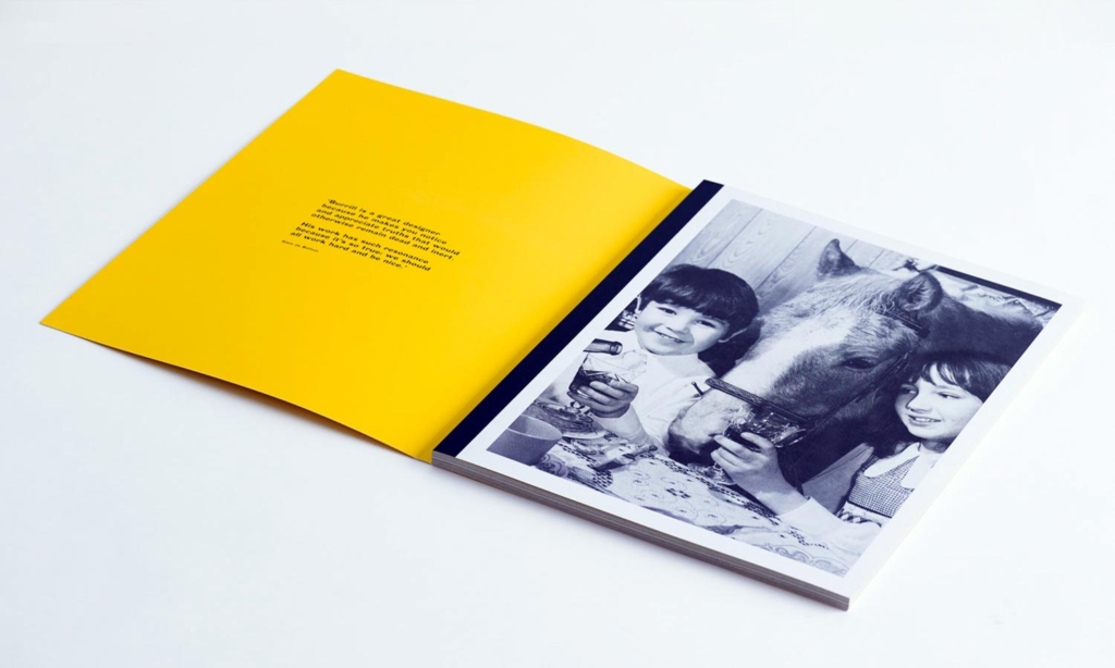
How long was the process of producing this book?
The design and editing process took around two months, production took three months. There was lots of contact with the printer in China, we were keen to use specific materials and print finishes which involved lots of proofing and lengthy discussion. It was interesting to see how the process worked. Once we all agreed on the final production of the book the initial run of 10,000 copies was made.
All the work is splendidly reproduced in the book. Did you produce any of the work again especially for the book i.e redraws, reprints, retouches, etc?
We were working with a specific format and limited colour palette, so all the pieces had to be adjusted to work in the book. I tried not to change too many things and kept as much of the original designs as possible. We started off with a larger colour palette, but quickly reduced it down, making the book feel cohesive and true to the work.
How much control over the books contents did you have?
We had complete control, Laurence King were very good with us and didn’t request any changes. They were keen for us to produce a book that we were happy with.
I became aware of your work with ‘Work Hard.’ Was this the break through piece, and how did that happen?
I first made the WORK HARD poster in 2004, it’s my best known piece. I moved down to Kent with my family from London and soon discovered Adams of Rye, a local printer who continue to use hand set wood and metal type to produce their work. I asked Adams to produce a poster for me that I could send to friends, it was like a postcard from our new life in the countryside. I began to get requests for copies of the poster, so printed more and slowly began to sell through shops and galleries. I think the timing was good, it was at the start of the ‘graphic art’ scene and was something that people were beginning to collect.
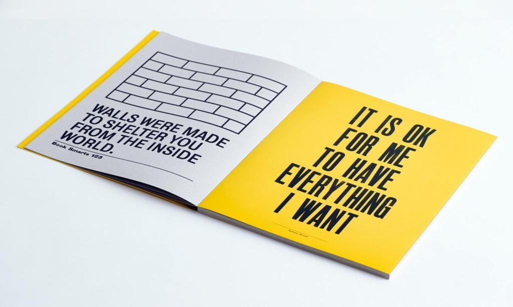
From the book I see that you’d been working in this minimal style for some time but how did you arrive at that aesthetic?
I graduated from the Royal College of Art in 1991, it was still the pre-digital era, nobody I knew could afford a computer, so everything was made traditionally. I used a photocopier to produce all my work. Hand setting type that I’d found in old type catalogues. I used lots of clip-art and found images and made small photocopy publications, I was involved in the Mail Art scene, making work on the kitchen table of my girlfriend’s house. It was all very lo-tech and handmade. The way the work was produced was reflected in the way it looked – very simple, minimal and bold. It’s an aesthetic and approach that I’ve always liked.
The way the work was produced was reflected in the way it looked – very simple, minimal and bold.
It’s an aesthetic and approach that I’ve always liked
Would you say that working with the traditional techniques of Adams (Burrill’s letterpress printer) refined your creative direction?
I like to work within restrictions, it’s good to have something to work around or a framework that gives you limited choices. I like to strip things down to their bare bones, I like to say ‘the most using the least.’ The aesthetic and the idea has to work together to tell the story. A lot of what I say is very simple, so it needs to be presented in a straightforward way, but still be visually appealing.
From the outside it seems like this collaboration led to the development of the heavy typographic approach. Would you agree?
Yes, I’ve always been interested in words and writing, so working within the restrictions of wood and metal type was a perfect fit and felt very natural.
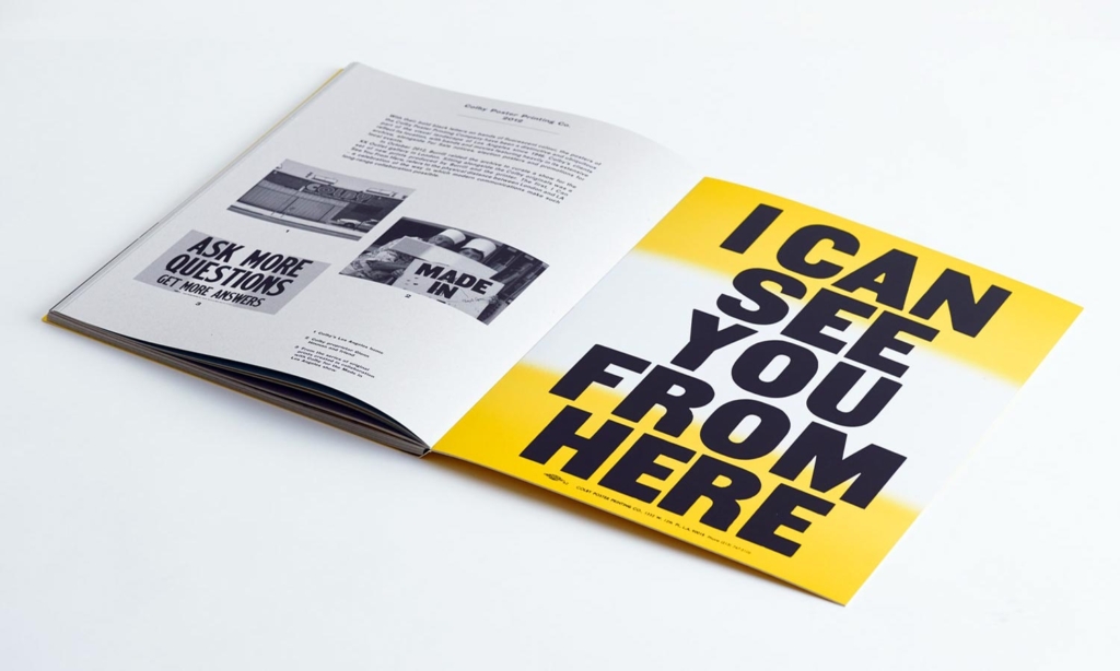
Either way, the result is some rather fine typography. How long do you spend getting it right? Is it a long process or are you instinctively correct the first time?
Typography is very hard to get right, I’m still learning how to do it. Good typography is hard to teach, its something you have to work on constantly. I draw a lot of inspiration from ‘folk typography’, work produced by non-designers. I like simple type with enough character to feel individual.
Do you go in with a set idea or are the results derived from the process?
When I set type with Derek Stonham at Adams it is a collaborative process. I go in with a rough idea of what I want to achieve, but always try to embrace the chance aspect of working with wood type. Sometimes words don’t fit in to the layout, so I have to edit or re-write the phrase so it will fit. I like having this restriction and the decisions it forces you to take.
When you’re working with the typesetter, how much direction do you need to give?
Derek and I have a good understanding of what I’m looking for, we’ve been working together for a long time. Normally it starts off with a rough pencil layout and a cup of tea. We then start to pick the type and work out how it will fit in the poster layout.
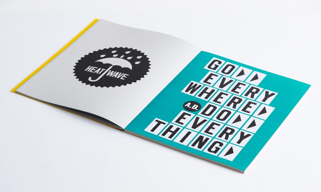
How do you get your ideas for your slogans? Do you keep a file of found phrases until they find a place or is it more immediate?
I try to remember odd things that I hear in conversation, an interesting turn of phrase or funny combination of words. I look for inspiration in the every day, and try too keep it feeling spontaneous and engaging. I write things down sometimes, but the most memorable lines stay in my head unaided.
Are these statement-based works your favourite way of working? I know you have other methods – surface patterns, etc. Which you find most enjoyable?
I like variety in my work, no two days are the same. The variety keeps things interesting. I particularly enjoy collaboration and exploring new techniques.
Your work most known by the public tends to be self-initiated in your signature style. Do you produce any work for clients as a jobbing designer that means stepping out of your own approach?
I work for clients that are interested in my approach, so don’t get asked to make work that I’m not happy with. This hasn’t been always the case, but I’ve worked long and hard to ensure that I only work on projects that I’m interested in now.
Every piece of work that I produce is made in the same way, I aim to make work that feels truthful and honest.
To move into a more critical mode now, seeing a lot of your work together it strikes me that some pieces (i.e WORK HARD, I LIKE IT) absolutely hit home as pieces that have a double-hit approach, the initial perception, and then a secondary motion where the audience thinks a bit deeper about what you are saying. However, others follow a similar formula and start to verge on glib gags. Have you intentionally created this mix or do you do what you feel at a given time? Or perhaps there’s another reason, commercial pressure?
When I first made WORK HARD & BE NICE TO PEOPLE I didn’t know it would have the impact it has had. Every piece of work that I produce is made in the same way, I aim to make work that feels truthful and honest. Not every piece works as successfully, but each one is based on ideas that I think are valid. What might appear glib and formulaic to some, might appear thoughtful and resonate deeper to others.
In the book, you mention that you have had issues about the audience not being clear if you are questioning or endorsing the statements that you utilise. Personally, I also have struggled at times to see the point of your work but with a bit of interpretation, such as this book, it does all start to make more sense. When seen in their self-contained form however there is no explanation or context. Do you find that potential for misunderstanding problematic? There is a risk that people get less out of it than if they knew the whole story, do you think that matters?
I like ambiguity, each person who sees the work brings along their own interpretation, I guess that’s what art is for? I don’t pretend to have any massive insights or sage advice, my aim is to simply put out positive messages that encourage people to believe follow their own path.
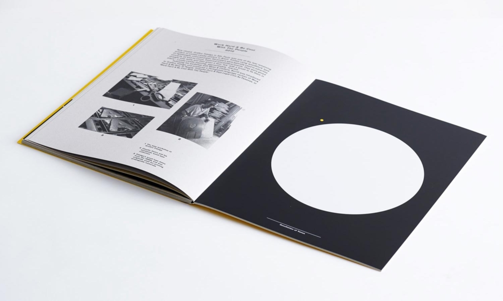
Your work offers another enigma when arguably there are enough of these in life already. As designers shouldn’t we offer solutions, not more questions?
I think we need to work out our own questions, and find our own answers. I’m very wary of anybody who offers solutions to life’s problems, I think it’s good to offer tips and advice, but never any solutions.
Your work is about the ideas expressed, and a certain stark aesthetic inspired by protest banners and similar. In a technical sense, it could be seen to be basic graphic design as a result. Is your work a reaction against the ‘over-design’ seen across much of the output of our industry?
I’m aware of what’s going on in design, but my work isn’t a reaction against it. I see myself working within design as a questioning voice, aiming to produce work that connects with people and not just to service the commercial world.
On one hand, your simple approach seems to ask us to stop taking ‘graphic design’ so seriously and yet it also asks us to focus on the cerebral element. As De Botton says, your style ignites the statements you choose and gives them an emotional weight. Do you think that this is reading a bit too much into things or is this a point that you set out to make?
I work within graphic design, but I feel less and less like a designer. I’ve always been somewhere on the boundaries between art and design, maybe we should make up a new category? Or maybe the old boundaries don’t exist any longer.
And finally, we know what other people think but what is it about the work that you believe has resonated with the public?
I’m not sure, all I know is that I make my work and try to keep it as honest and truthful as possible.
*Lancashire-born Burrill studied Graphic Design at Leeds Poly and at the Royal College of Art, London. His clients include Wallpaper*, The Economist, and The Design Museum whilst the stark typography and the enigmatic statements of pieces such as the eponymous I Like It and Work Hard have transcended the insular graphic design world to become popular artworks in the public sphere. His work is now held in the permanent collections of the V&A Museum and the Cooper-Hewitt, New York.
