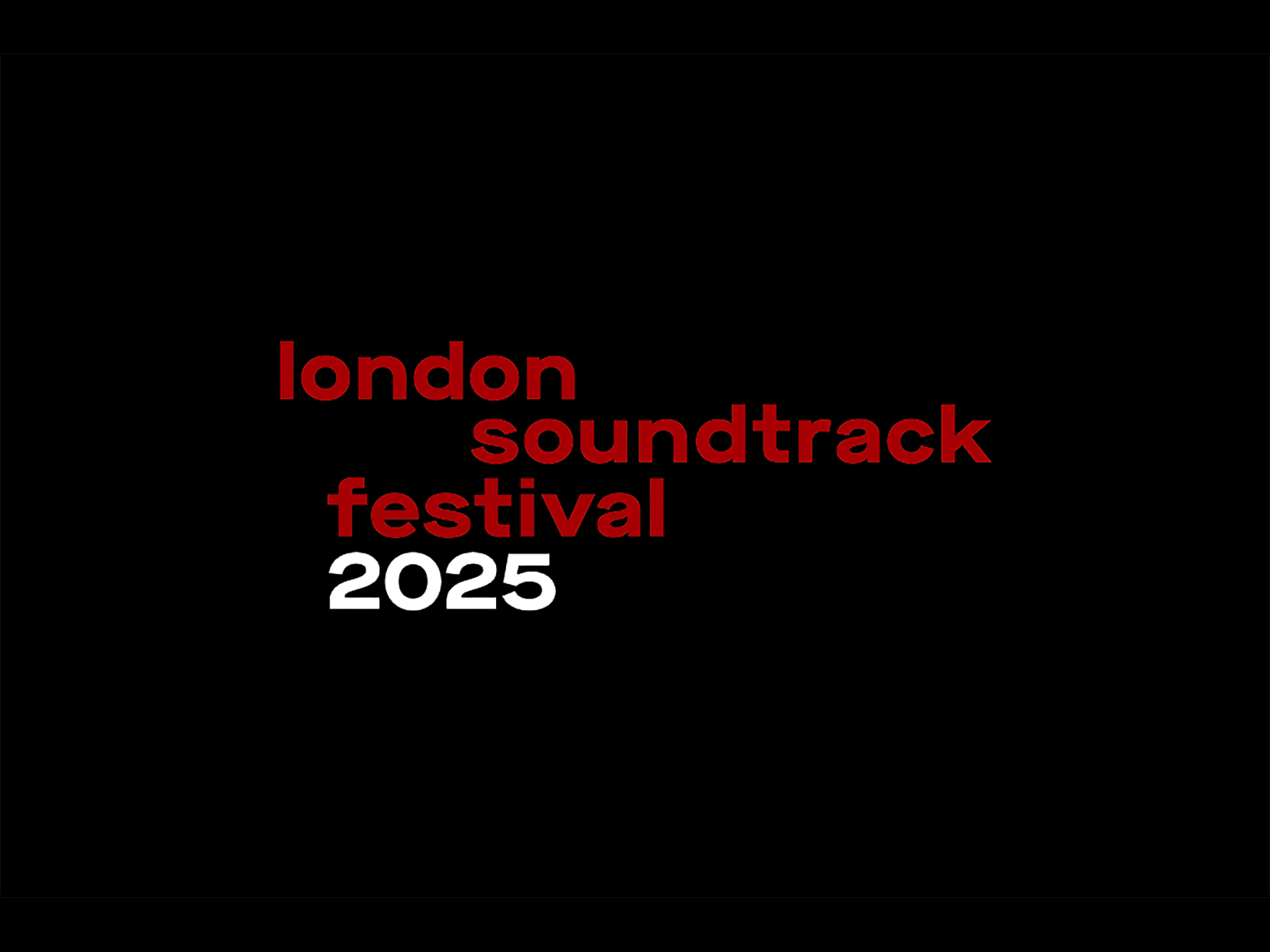
one half of the driving force of multi-award winning graphic design studio Baxter & Bailey talks about how his team put together the extraordinarily dynamic brand identity for the London Soundtrack Festival, an event created to reflect the ever-increasing interest and enthusiasm for film, TV and games music and to acknowledge that London is one of the most important centre’s for soundtracks in the worlD.
SPLENDOID: Hi Matt, Welcome to Filminutiae. As ever, I like to kick things off by looking at the very beginning. Could you outline how you got involved in the project?
MATT BAXTER: The simple answer is that we’re pretty good at keeping in touch with people we like! I think we’ve learned over the years that our best work and most enjoyable projects often come from relationships that have endured for years.
My business partner Dom Bailey and I first worked with the London Symphony Orchestra about 18 years ago, maybe more. Through them we met Tommy Pearson, a producer, broadcaster, writer and all-round dynamo with a huge amount of experience in (and enthusiasm for) classical music.
In the intervening years, we did a little identity project for Tommy’s production company and worked with Tommy’s wife Jo, a member of the LSO marketing team. So when Tommy, alongside co-founder Svitlana Gunning, began to develop the ideas behind the embryonic London Soundtrack Festival, he came straight to us.
There was no pitch at all, though we did of course write a proposal which outlined our process, stages of work, deliverables and fees. So the appointment was professional and diligent, but not competitive. A rare treat!
Yes, totally. It must be very unusual for a studio to get into such a high-profile project in what sounds like a very easy process. So, given that you had worked with Pearson and the LSO previously – did that mean that you perhaps already had a ‘big-picture’ vision for the identity in mind already, based on these past experiences, or was it more of a process of development?
We knew that our identity would need to provide a visual umbrella for a very wide range of content. After all, the festival was intended to encompass film, television and video games – all wildly different visually and tonally.
So our identity anticipated that, even at the early stages. We were keen that the branding should be able to comfortably represent all of that quite eclectic programming. We also knew that the audience would be experiencing the brand on screen – either via the LSF website, or across their socials, or indeed on screens at festival events – and so we were keen to think right from the start about motion design.
We were keen that the branding should be able to comfortably represent all of that quite eclectic programming
Did that vision evolve in any way as the project progressed?
Not at all. They were principles – standards of the creative brief, in fact – that remained throughout the design process. We always co-write a creative brief with our clients at the early stages of any project like this, which helps to cement these types of principles right from the outset.
So if the vision for a project does change or evolve, it forces you to revisit and perhaps redraft the creative brief. Good creative briefs are like life rafts: if the project becomes a bit choppy or the tide changes, you can return to it, get your bearings and reevaluate if you need to. I’m not sure if my analogy entirely stacks up, but it’s sort of accurate!
Agreed. Good analogy. Totally know what you mean. Let’s return to your point earlier – you mentioned that the LSF covers film, TV, and gaming soundtracks. I’m interested in how you approached creating a visual identity that could speak to all those different worlds?
All of those different worlds have their own visual codes, tropes and design language. They’re all visually noisy in their own right. So we felt it important to design something that could encompass and contain all of that, while retaining something of its own quietly confident identity too.
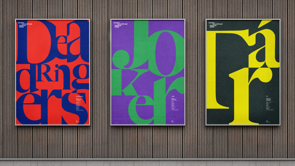
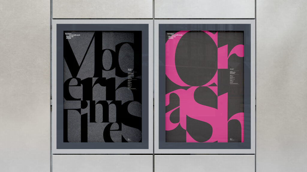
As a result, the LSF visual identity relies on colour and typography rather than its own imagery style. This meant that the identity could act as a ‘stage’ for the visual content – stills and footage from TV, movies and games – rather than fighting with it.
How did you keep the balance between the identity as stage but also having its own identity? From my own experience I know that can be difficult…
Yes, it was a tricky one, looking back. We knew that the LSF identity had to support all of this visual imagery from TV, movies and games – to get out of the way, effectively – but we didn’t want it to be too passive in its own right. Indeed, lots of the LSF branding, when applied, needed to work with no imagery at all. So we knew that the typography, colour and overall design principles needed some dynamism of their own.
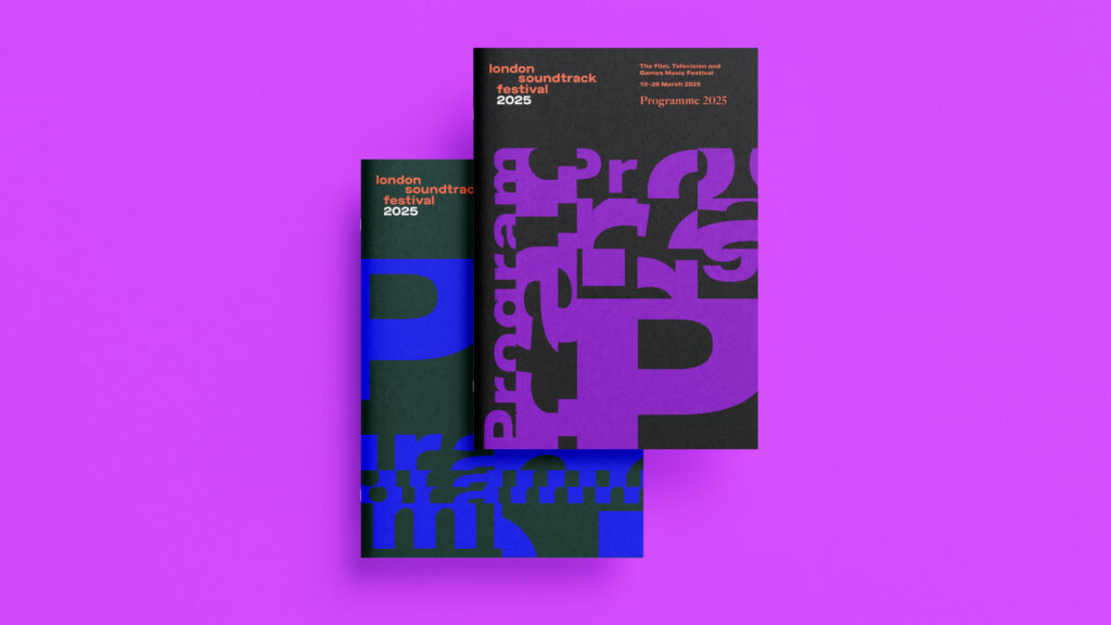
This is where the idea of screens and frames came from. We liked the idea that audiences encounter all of this visual content – TV, movies, games – via screens. So we developed this flexible, ever-shifting grid based on screen sizes and proportions: phone screens, TV screens, cinema ratios. By using this invisible but ever-present grid to scale, crop and arrange our typography, we were able to develop some really arresting, unusual typographic layouts. It was great fun to work with, once we’d developed the idea.
Could we touch base on the logo for the festival itself quickly – in contrast to the other elements of the festival identity, the logo feels very restrained, was this a deliberate move from yourself and the client? Perhaps to ensure readability/recognisability? And the splendid #easteregg, who came up with that ruse? I love that extra element…although I have to admit I didn’t spot it straight away!
The identity system we designed for LSF uses two principal typefaces: Aktiv Grotesk and Big Caslon. The former of these two typefaces formed the basis of the logotype we designed for the identity. We wanted the logo to feel solid, robust and legible. It needed to be visible and consistent within a busy and eclectic visual identity, and this chunky sans serif achieved those aims perfectly. It also needed to be used consistently year-on-year, so the logo includes the festival year as a suffix: by simply updating the year numerals, the logo can be updated for every festival, clearly communicating the annual nature of the event.
The hidden Easter egg was something I developed with our designer Shaheena Pooloo. It was one of those serendipitous design observations that I find very difficult to let go. It’s there if you want to see it, but the success of the logotype doesn’t rely on it. It’s a bonus track, in other words!
the great European modernists like Otl Aicher and Josef Müller-Brockmann are all tucked away in most designers’ brains, providing often unconscious influence. We’re sponges, the lot of us
Definitely a bonus! Getting back to the rest of the visual identity – the screen-ratio grid-based concept was a wonderfully inspired idea and worked really well in terms of the unusualness of the typographic approach. But could you talk a little about overall inspiration for the tonality of visual styling? When I first saw the posters I immediately felt that the ‘flat’ style was very ‘now’ but also seemed to have much in common with iconic design systems from the 1960s/70s – I’m thinking Saul Bass, Paul Rand here but also specifically the 1968 and 1972 Olympics identities. Firstly, would you agree? Secondly, did you look towards these kinds of systems for inspiration or am I way off here?
I’m not sure we did have these touchpoints in mind. Of course, the designers you name are all absolute heroes. Saul Bass, Paul Rand as well as the great European modernists like Otl Aicher and Josef Müller-Brockmann are all tucked away in most designers’ brains, providing often unconscious influence. We’re sponges, the lot of us.
But for this particular project, it wasn’t necessarily that the flat graphic approach was inspired by specific design references. Instead, it was more that the requirements of the brief led naturally to a solution like the one we arrived at.
OK, yes. So we’re back to that notion of keeping the brief in mind at all times?
It’s back to the idea that the identity needed to sit alongside or to ‘present’ lots of photographic and video content, so a flat graphic style felt right: it wouldn’t fight.
When I first saw the work it made me think of the trend for Alternative Movie Posters – designers reworking or remixing their favourite posters, a pastime that has grown wildly in the last 5–10 years. Was that an inspiration, or did you look towards any artists in that area – or any known artists working in film brand and marketing?
Again, not consciously I don’t think. By designing a visual identity system to represent specific titles in the style of the festival itself, I guess we are ‘remixing’ to a degree. But again, the approach was driven by the necessities and requirements of the brief, rather than a desire to reflect a trend.
It’s extremely rare for us to present just one design route at a first-stage creative concept presentation and I admire those designers and agencies who have the chutzpah to pull it off
Sure – which makes me wonder, adhering to the brief is one thing, but there are many directions that the identity could have gone in within those boundaries. What inspired the idea of going for a purely typographic design system? Did you experiment with other ideas before settling on that?
We actually presented two design routes. Two distinct directions that the work could possibly have followed. It’s extremely rare for us to present just one design route at a first-stage creative concept presentation and I admire those designers and agencies who have the chutzpah to pull it off. It’s a brave move, and you need to be totally confident that (a) your single solution is absolutely right and (b) your client trusts you well enough to go with your single solution. Talk about a high-wire act!
That said, we don’t predetermine at the project’s outset how many routes we expect to present. We try to allow the process to determine that. It’s typically two, sometimes three and very occasionally more.
Can you share anything about this second route concept? I’m intrigued now…
As I say, we did present both routes and, because they were driven by the same creative brief and needed to achieve the same outcomes, there were definitely similarities between them. So neither route introduced festival-specific imagery, for example.
But the unsuccessful route was perhaps more organically expressive – less typographically led and more of a loose, shifting, organic graphic language inspired by sound and how sound can affect the world around it. It felt important to explore a solution that more overtly relied on the notion of sound, given the nature of the festival. It is the London Soundtrack Festival, after all!
We felt confident that either route could solve the design challenge, so I’d have been happy to develop either option. That said, another (very famous) design agency has recently launched a brand identity which used the same sound-led organic graphic language, so I think we dodged a design industry moment there!
Given that we knew this particular design route was typographically led, we knew that type choice would be important
You may well have done! But interesting how sometimes similar ideas surface at the same time, isn’t it? So, moving on. Given the flavour of the identity, an inevitable typography geek question now – what drew you towards Aktiv Grotesk and Big Caslon as your font choices? Did you go through a lot of font options before settling on them, or was it a case of them just working from the outset?
We did explore lots of options. The early design stages of the project were led by Senior Designer Shaheena Pooloo, working with our Creative Director Rory Brady, and the font choices were led by Shaheena. Given that we knew this particular design route was typographically led, we knew that type choice would be important. The combination of a sans and a serif was something we arrived at early: we liked the eclecticism of typographic arrangements that this combination allowed.
We touched on it earlier but I love the screen ratio-inspired grid system. It really worked well in terms of lending a sense of dynamism to the moving image element of the project. What made you confident this would become the backbone of the brand?
Thanks! It’s probably the thing I love most about this project too. Ultimately, the idea of using a grid based on screen ratios is central to the design concept. It’s the thing that ensures the concept is relevant and connected to the subject matter.
It was an idea that we arrived at early on, but we did do a lot of experimenting with it before we arrived at some underpinning rules to guide its use. We pushed and pulled it and some of the early tests were wild and abstract and lovely, but not conducive to a system that needed to communicate with an audience. I think we managed to strike the right balance between playfulness and clarity with the flexible grid system and how it’s used.
Indeed, the identity has actually been described as “kinetic and shape-shifting.” Were there moments when pushing for that motion-focused identity felt risky or challenging?
I’m sure the BB team (and maybe some of our clients too) are tired of me banging on about this but… I do feel strongly that any new brand identity needs to move. The consideration of motion principles has fast become embedded in every brand identity project, and for obvious reasons: audiences are encountering brands largely through screens, and those screens (and the networks they’re connected to) are increasingly sophisticated, lightweight and fast. So the conditions are perfect for motion to become a natural part of every brand’s visual language.
That said, we’re not abandoning static principles. Far from it: print graphics, physical manifestations of brand and environmental applications all need brands to work brilliantly when static.
The LSF project is a good illustration of this: the roll-out included posters, tickets, programmes (designed by our old client Sarah Breeden from the LSO, in fact) as well as static digital and social assets. One of the nice things about the flexible grid system – and the way typography is cropped and scaled within it – is that even static applications have a sense of movement. Those lovely posters, designed by Senior Designer Sammy Harpin, are so full of movement, it’s a delight. So to come back to your question: it didn’t feel like a risk, it felt imperative.
Unless the brief specifically requires us to do so, we’re not all that interested in ‘design for designers’
Beyond looking great, the brand of course had to perform well technically. Specifically, it needed to achieve a good rate of accessibility for general audiences as well as those well-versed in reading creative branding/design systems. Was this something that you had in mind, and did it change how you and the team executed the work?
It’s always a major consideration in our work. Unless the brief specifically requires us to do so, we’re not all that interested in ‘design for designers’. We want our work to help our clients reach their audiences successfully and compellingly, whatever the audience.
So while an audience for a festival celebrating music for film, television and video games is likely to be pretty visually sophisticated, we also knew that the festival’s founders Tommy and Svitlana wanted to reach the widest possible audience. Classical and even modern classical and electronic music concerts are often the preserve of the elite, and are branded and marketed in off-puttingly aloof ways.
We wanted to help this new festival break through some of those barriers. We’re also fortunate to have Digital Director Dan Howard in the BB team. He’s absolutely dedicated to accessibility and digital best practice. So the digital components of this project – most notably the website we designed and built – score very highly across Google’s Lighthouse benchmarks.
Right now, the site scores 98 for Performance, 94 for Accessibility and 100 for Best Practices, and bags a cool A on the Website Carbon Calculator. All of these results are down to Dan’s focus on audiences and accessibility.
Were there any times you had to limit or adjust the creative vision due to external feedback or technical limits? How did you handle that?
As a start-up festival in its first year, budget was naturally a major consideration. This was perhaps the major limiting factor, rather than feedback or technical concerns.
While we do work flexibly and follow a hybrid model, we’re naturally studio-based and that helps to keep everyone on the same page
You were overseeing a diverse team – designers, motion specialists, front-end developers. How did you keep everyone aligned on the creative vision? Did you have any specific strategies or rituals that helped?
That all-important creative brief I mentioned earlier? If everyone understands the brief and is working to it, it helps enormously. We’re also a pretty tight team and all of the skills you mention sit within our studio.
We had a little external motion help from talented animation specialist Richard Coldicott of All Available Space, but he’s also in the same building as Baxter & Bailey here in Brighton! While we do work flexibly and follow a hybrid model, we’re naturally studio-based and that helps to keep everyone on the same page. You can see the work on one another’s screens, or pinned to the studio wall, and you can comment and discuss in the room and in the moment. All of that helps enormously.
Were there any moments when disciplines clashed or priorities shifted? How did you handle that, if so?
I can’t think of any specific moments where that actually happened. Sorry, I know that’s a boring answer! Especially in the world of movies, where executives are always being held by their ankles from skyscraper windows by angry studio bosses. None of that at Baxter & Bailey, I’m happy to say.
I know from my own experiences that working with stakeholders like the BFI and Southbank Centre can be complex. How did you manage those relationships to protect the creative direction – were there any moments when you had to advocate for the design under pressure?
I read a Design Week interview with North Creative Director Jeremy Coysten earlier today and he said something very pertinent to this question: “Tenacity. Don’t ever give up on what you believe in.”
Absolutely every design project has a moment – several, usually – when you have to advocate for the design under pressure. The hoops, hurdles, twists and turns that every design project and its design leads must navigate are many, varied and treacherous. It’s partly why the design sniping you see on social media is so dispiriting: surely other designers know the challenges involved in getting anything over the line!
Luckily for the London Soundtrack Festival project, we had the strongest advocate in our client Tommy Pearson. And, because the stakeholder relationships – with the likes of the Southbank Centre, Barbican, BFI IMAX, St John’s Smith Square and the Roundhouse – were his, he managed many of those tricky conversations brilliantly. To come back to Jeremy Coysten’s interview: Tommy is as tenacious as a client gets!
The festival’s founder and artistic director Tommy Pearson was really the conductor (no pun intended) of all of those relationships
And were the individual film/game studios involved at any stage? As you were essentially creating a new identity for each of the films, specifically in the posters, I was wondering if you had to pass the finished pieces by any brand teams/stakeholders (the directors etc.) that were involved in the individual productions?
The festival’s founder and artistic director Tommy Pearson was really the conductor (no pun intended) of all of those relationships with film studios, games companies, distributors and venues. So he was the conduit between us and some of those sign-offs and approvals. Tommy is incredibly well connected and networked in the cultural sector and he manages those conversations with great skill and charm. It’s one of his superpowers.
And from your perspective, which part of the creative process did you find most critical to getting the identity right? The initial research, the design iterations, something else?
I think understanding the client’s vision is perhaps the most critical bit of all. Understanding it and aligning with it, so that any creative suggestions you make are in service of that vision. After all, if you don’t understand where your client is heading, how on earth are you going to help them get there?
What were the signs that told you the identity was resonating with audiences and stakeholders? Any feedback or results that stood out?
It’s not always advisable – it can derail you if you’re not careful – but I often keep an eye on my clients’ faces as we’re presenting work. You can usually tell when the work is landing well: smiles, nods of approval and assent, those obvious signals that your creative recommendations are being understood and welcomed.
We had all of that, thankfully, in our very first design presentation. Some thoughtful and constructive feedback aside, the concept was there and approved right from the start.
The festival’s planned as an ongoing event. How do you see the brand evolving in future editions? Any ideas you’re excited about exploring?
I think there’s sometimes a desire to switch things up too soon – to reinvent and evolve before a brand identity has had time to establish itself. So I’d love to see the LSF identity carefully and consistently deployed for a few years, just to let it bed in.
That said, there’s one aspect of the identity’s application that I’d really like to push further, and that’s the motion brand.