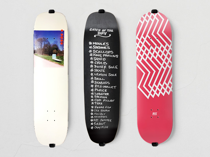
Every skater loves the idea of riding a board with their own graphics.
I’m no exception so once in a while I decorate a blank deck with my own original visual themes.
Featured here is a selection of my latest ruses. What’s interesting about art on skateboard decks is that they are designed to look great, and when they do it makes you feel like you can skate better. But, at the same time, the graphic elements are also kind of meaningless and ultimately designed to be destroyed.
Client: self-led
input: art direction, design & layout, illustration, photography, making
Under the paving stones…

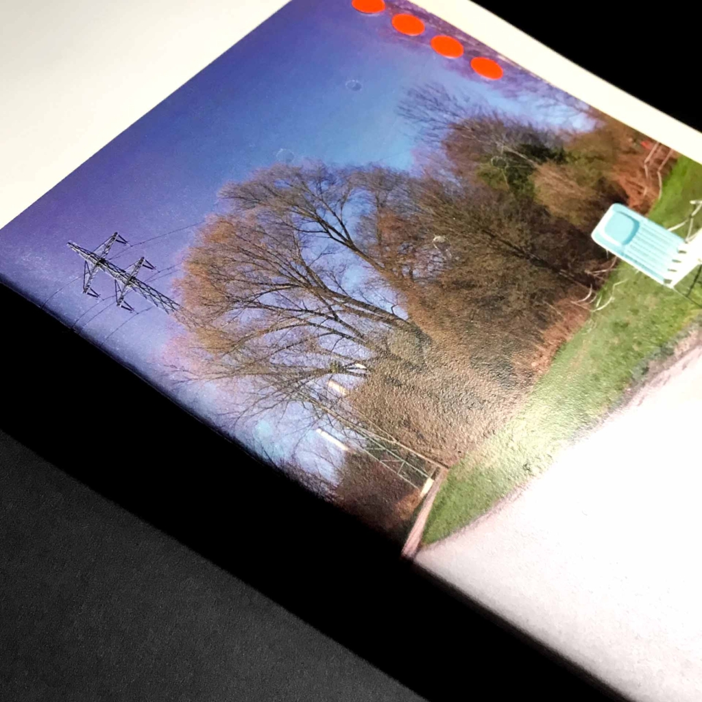
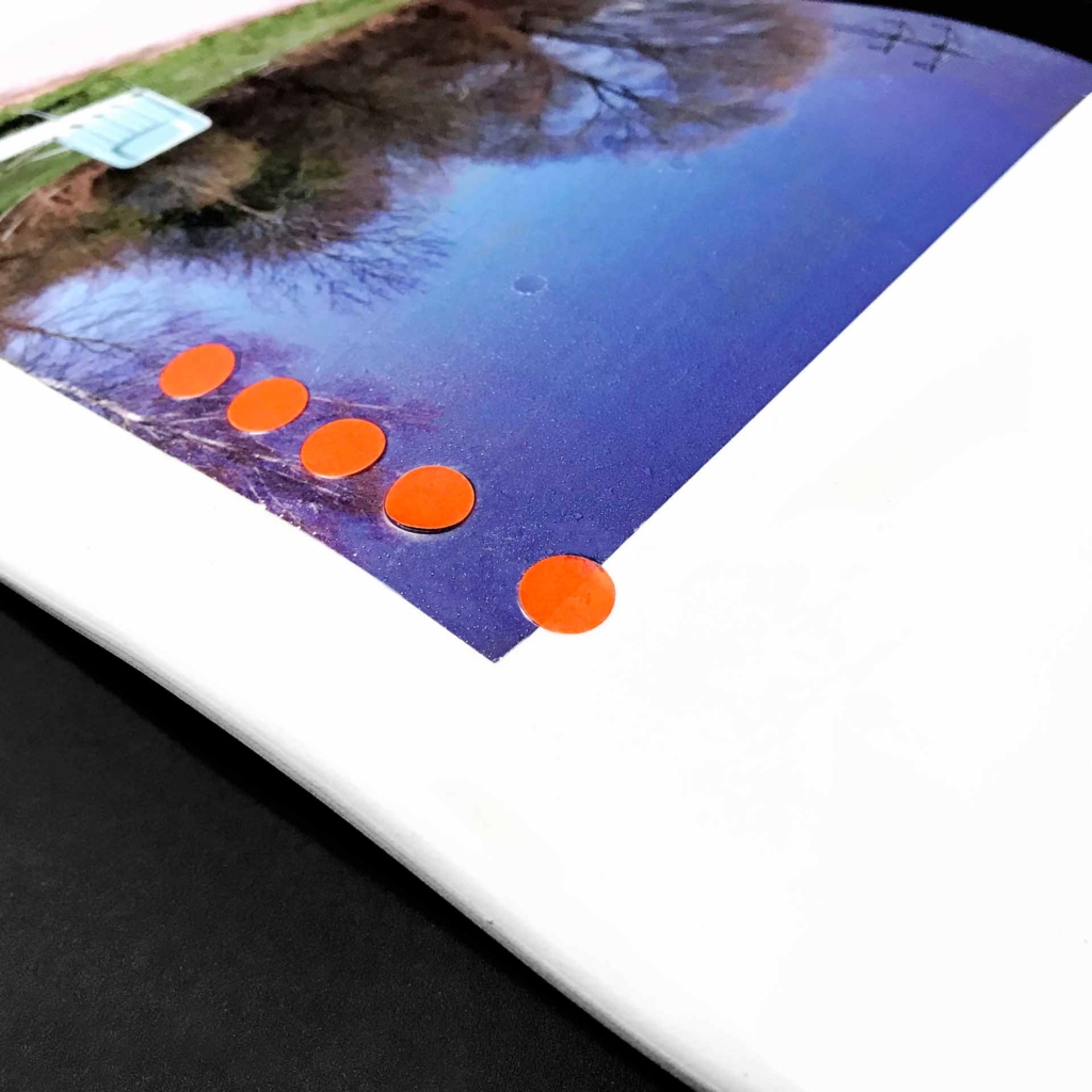
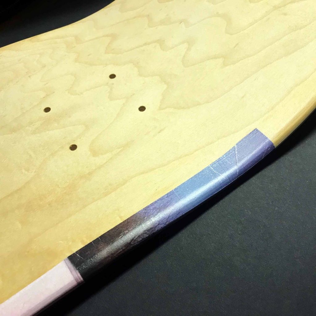
This board features one of my favourite personal photographs, plus some repurposed price stickers for added visual jazzery.
The image seemed perfect for a deck graphic as it depicts a random sunlounger deposited in the somewhat unlikely surroundings of a grass verge under an electricity pylon next to a road leading to a power station.
I felt that it was a perfect visualisation of that old Situationist slogan – Under the paving stones, the beach – which is an encapsulation of the idea of finding joy in unlikely places.
The deck itself was another new school shape manufactured for me by Nebel Skateboards.
Catch of the Day

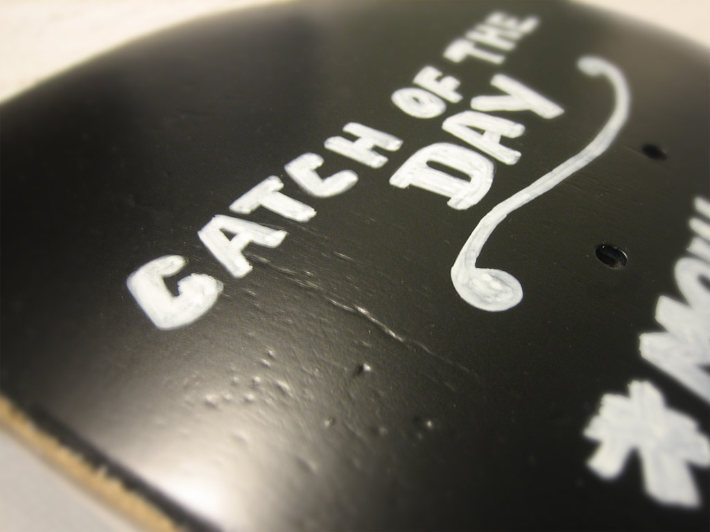
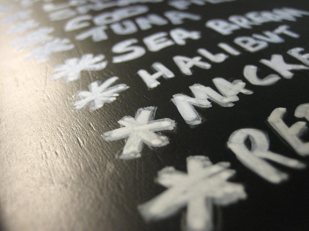
This board was inspired by a blackboard that I saw outside a fish restaurant advertising the catches available for the day’s dishes.
As it bore the name of a particular fish, a ‘skate,’ I thought it could be fun to make a graphic that looked like the same blackboard.
To make the graphic, I enlarged my photograph, traced the text, and then re-traced it onto a deck prepared with blackboard paint. Using a chalk marker, the same as one might use if making a list on a real blackboard, I rendered the text. The whole surface was then varnished to seal it against the weather.
The deck itself was a bespoke new school shape that I developed with Nebel Skateboards.
Iris Worldwide Team Model
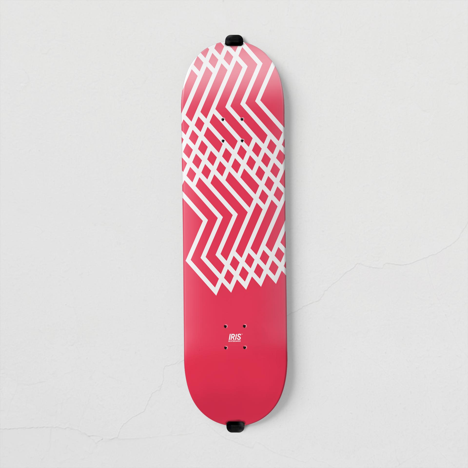
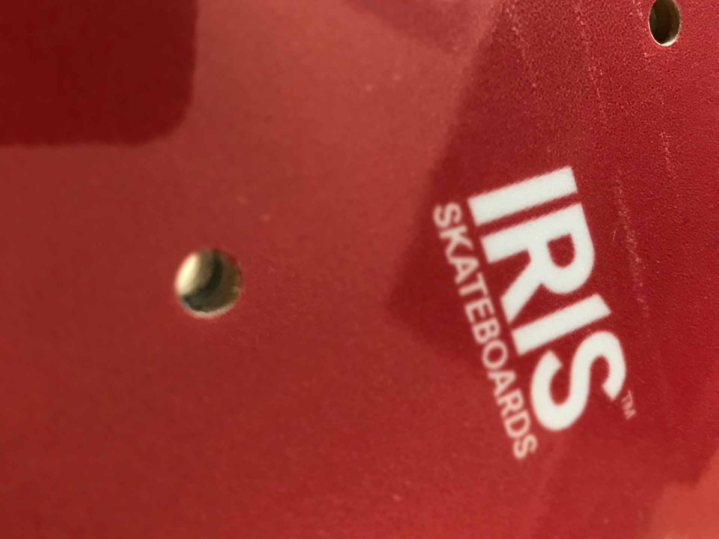
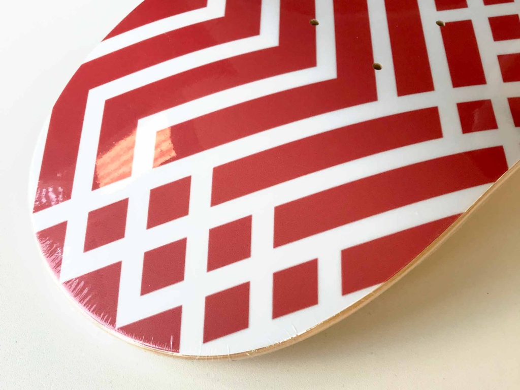
This board was created as a leaving present for an agency colleague.
The person in question was a keen skateboard enthusiast so I put together the first (and probably only) Iris Worldwide team model featuring a bespoke design using the agency logo.
The graphic was produced electronically and then printed on a standard 8″ popsicle supplied by Promodel. The final product was delivered shrink-wrapped for freshness.
