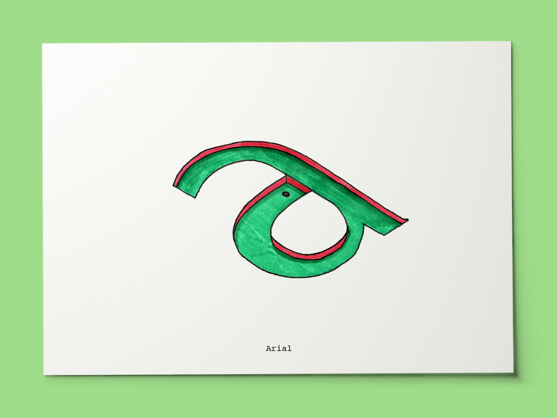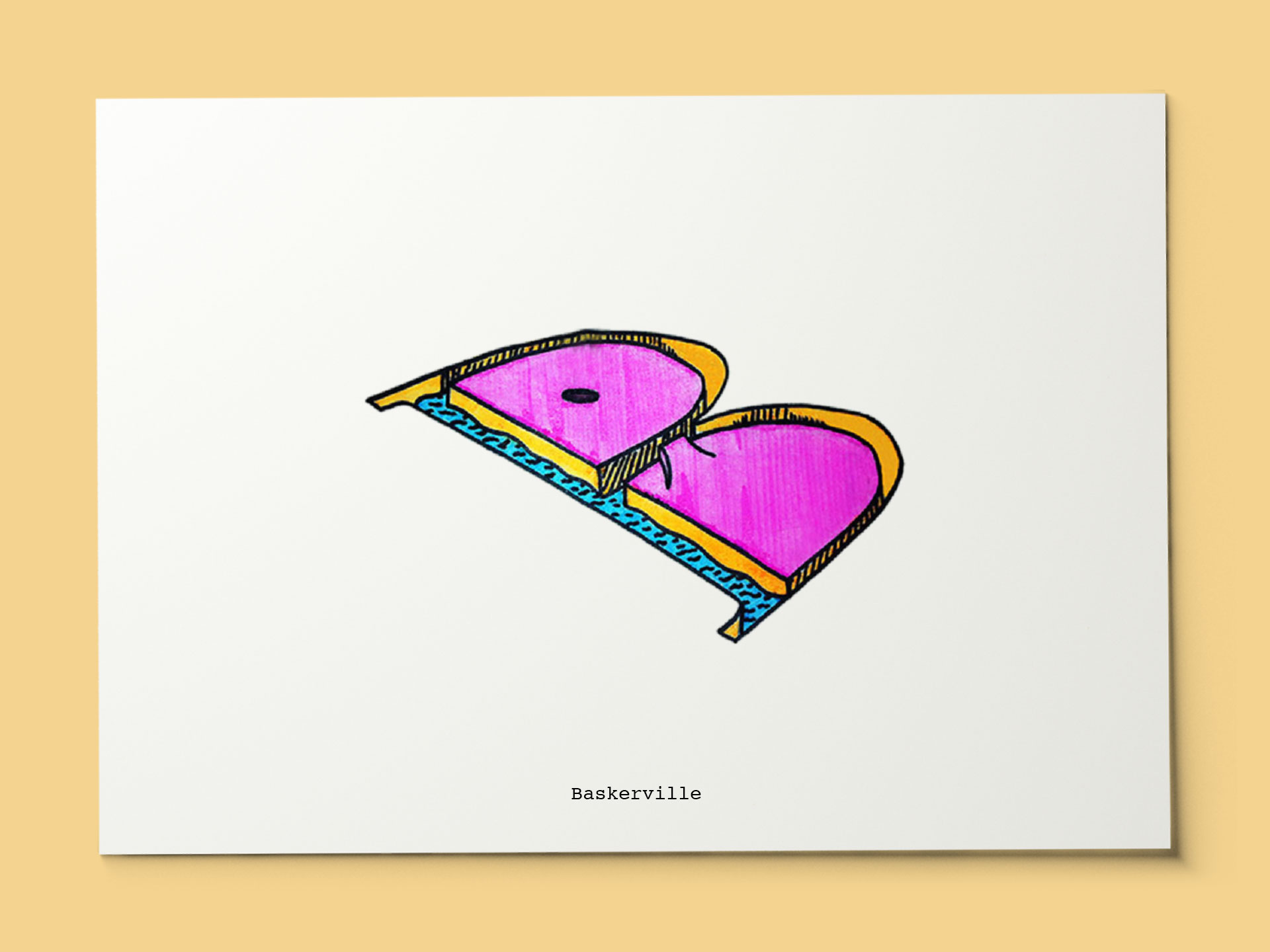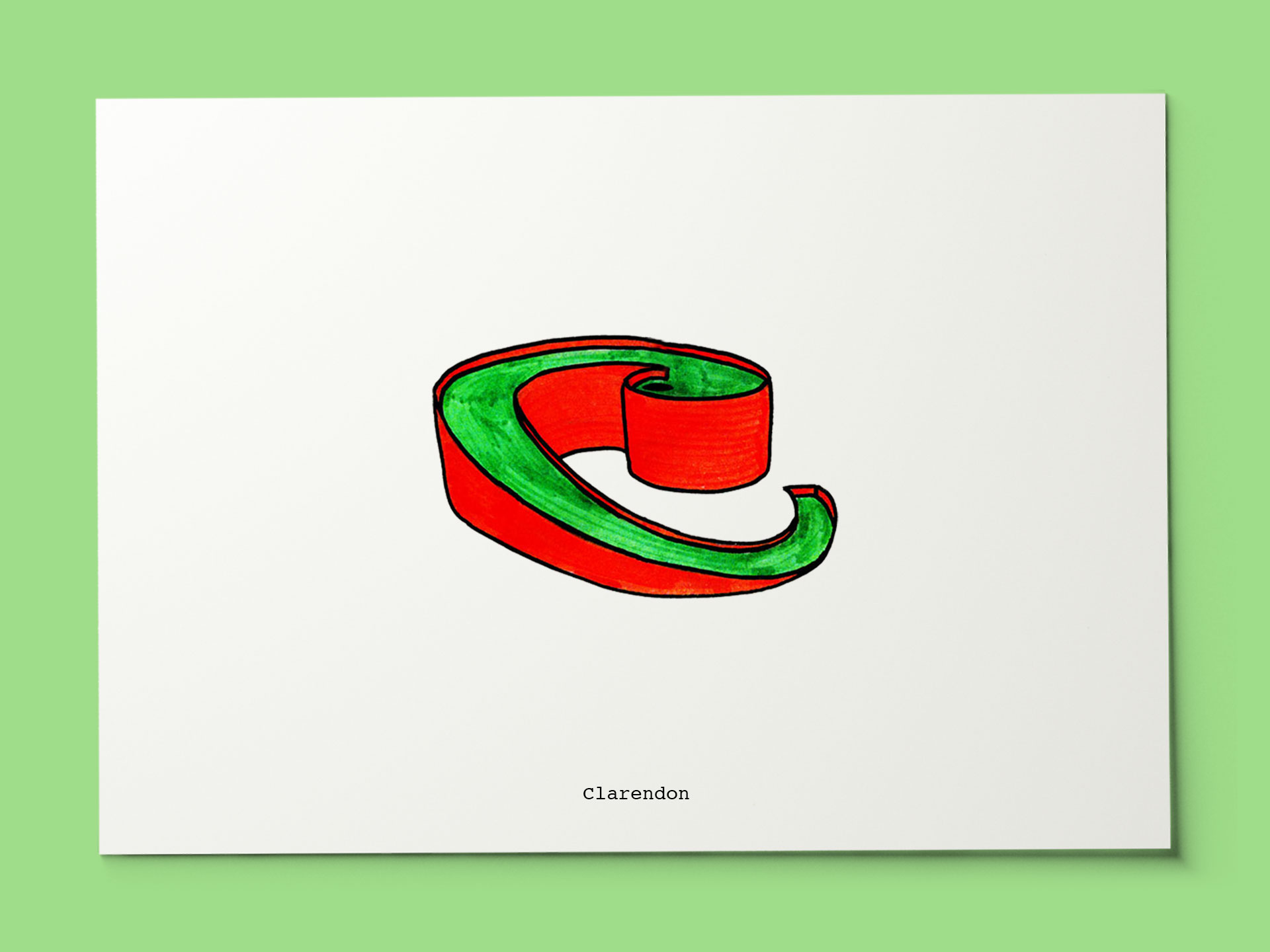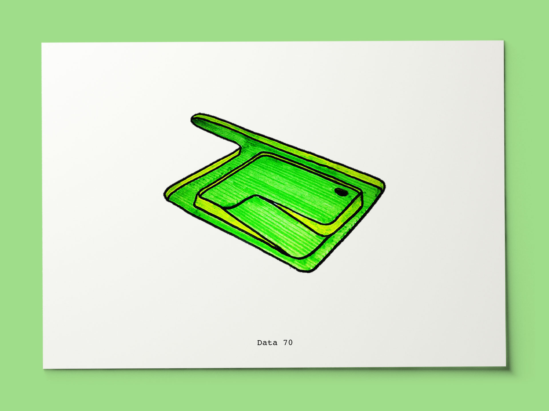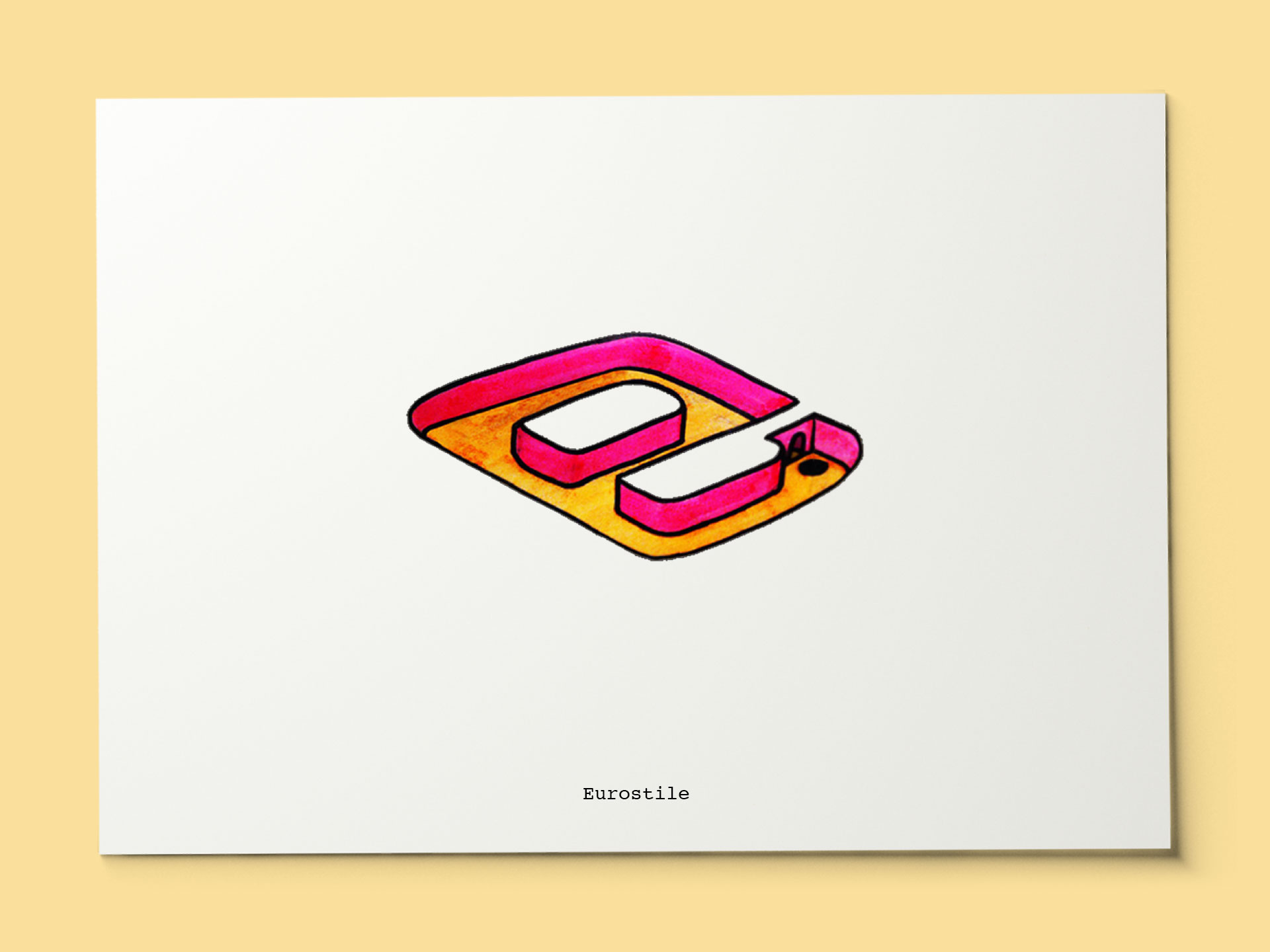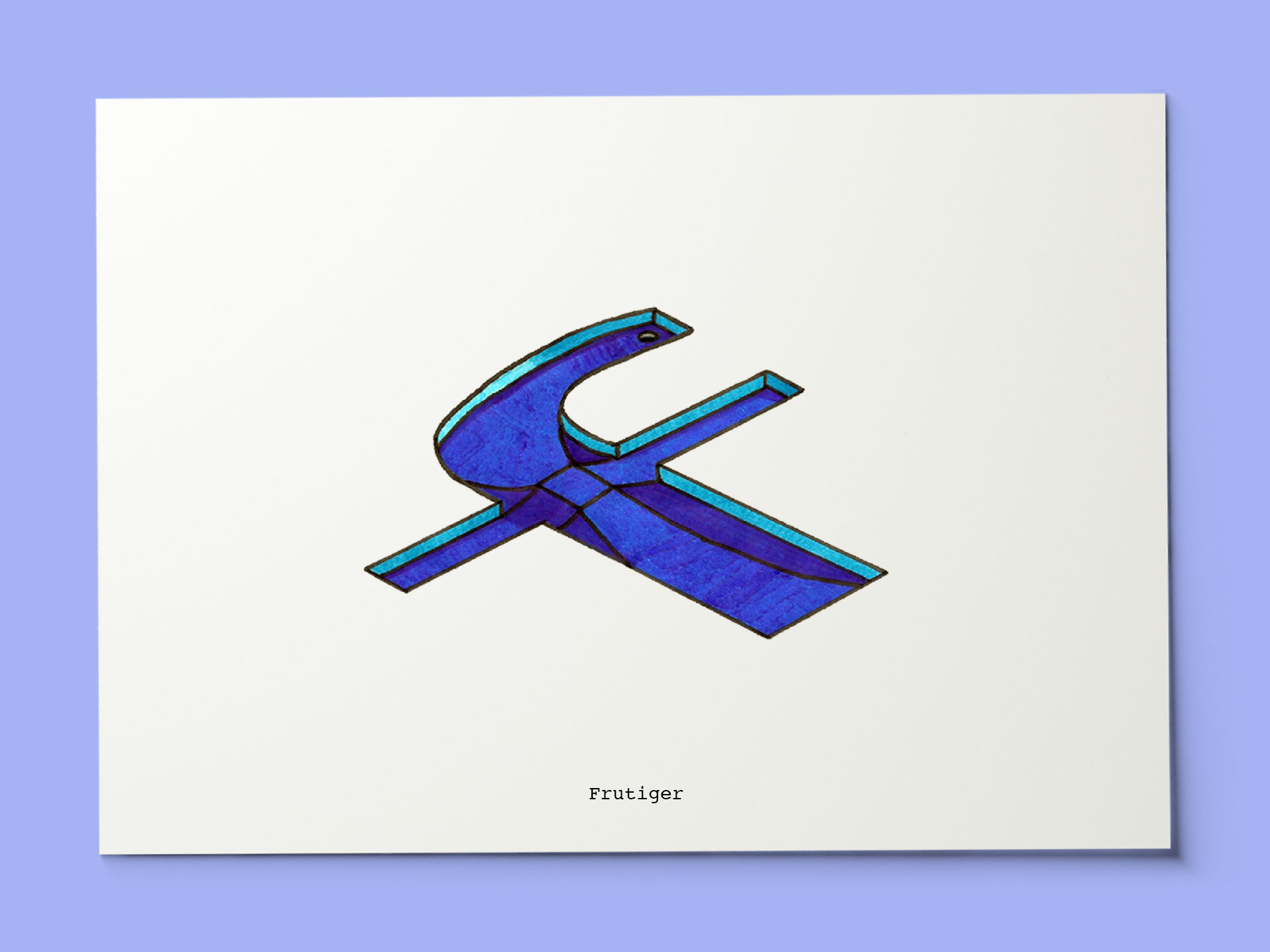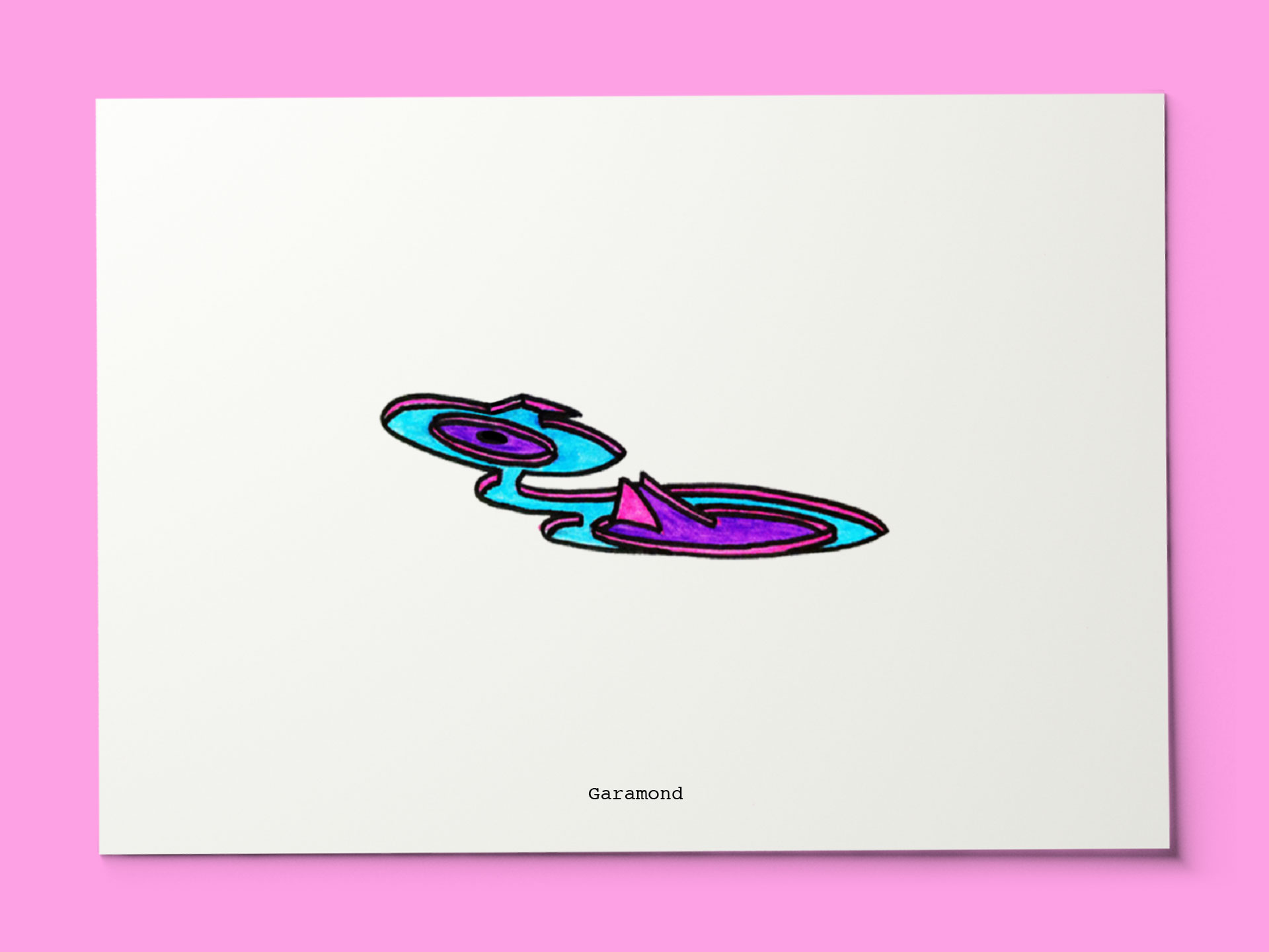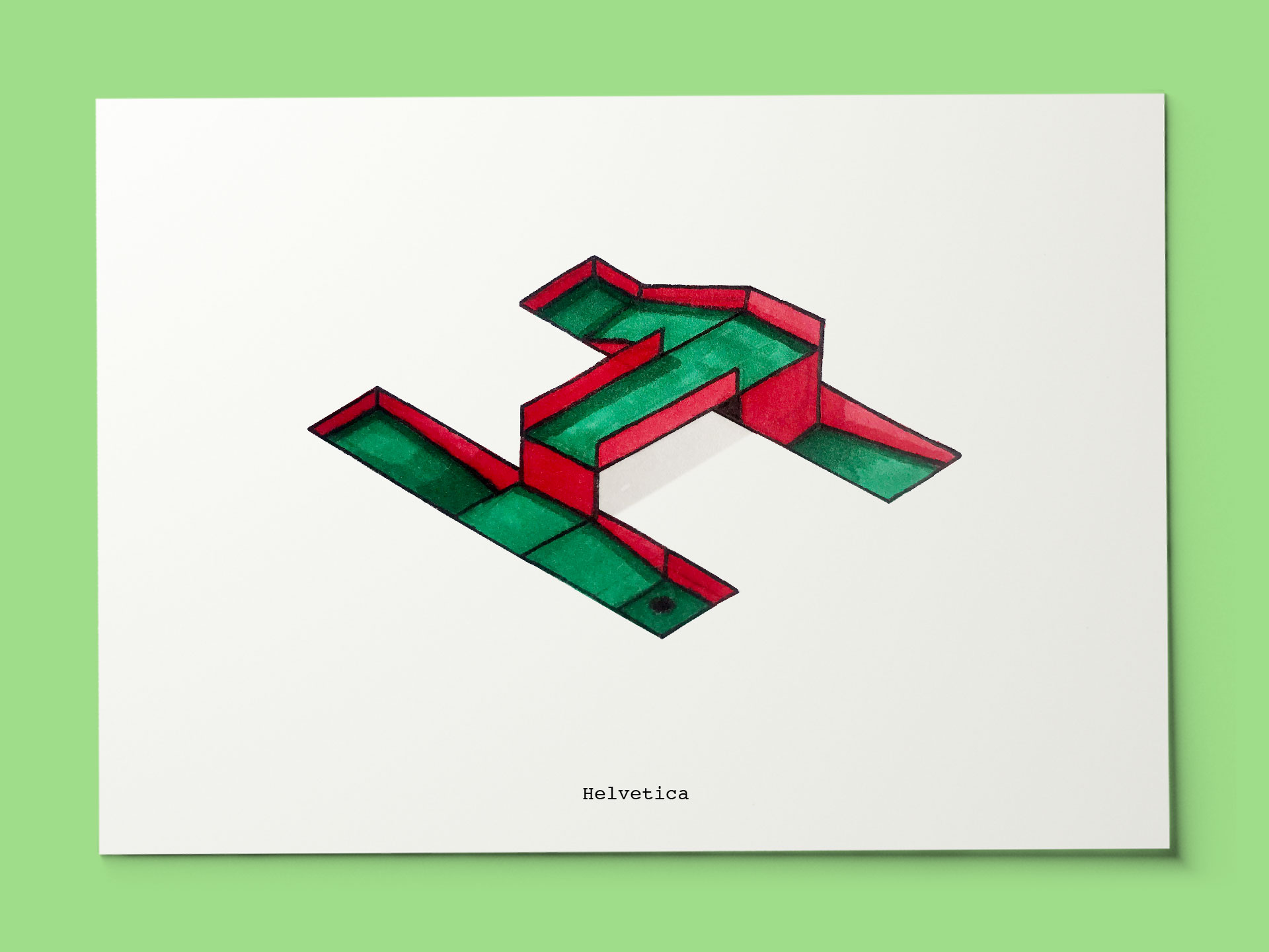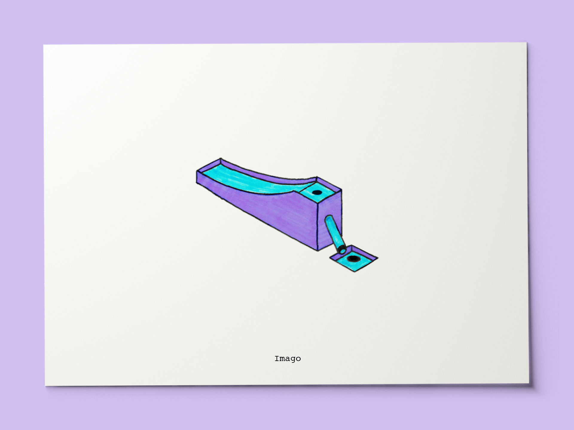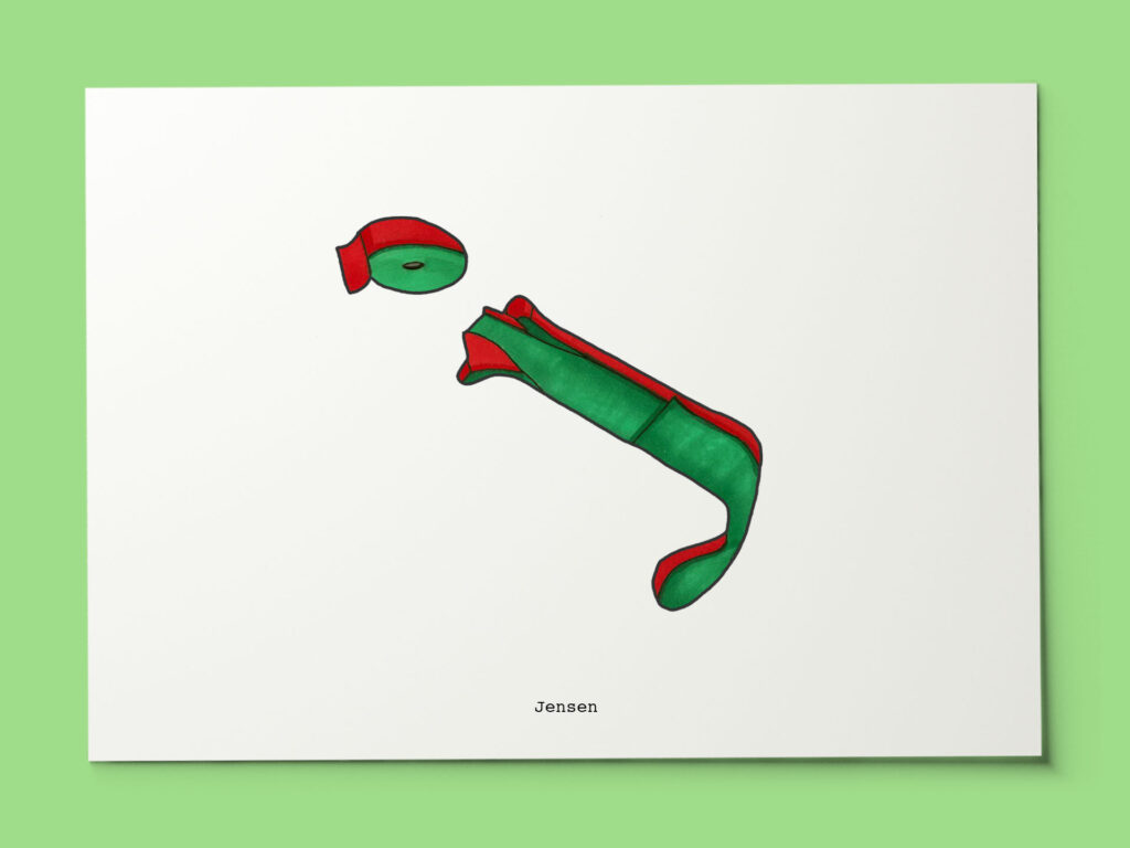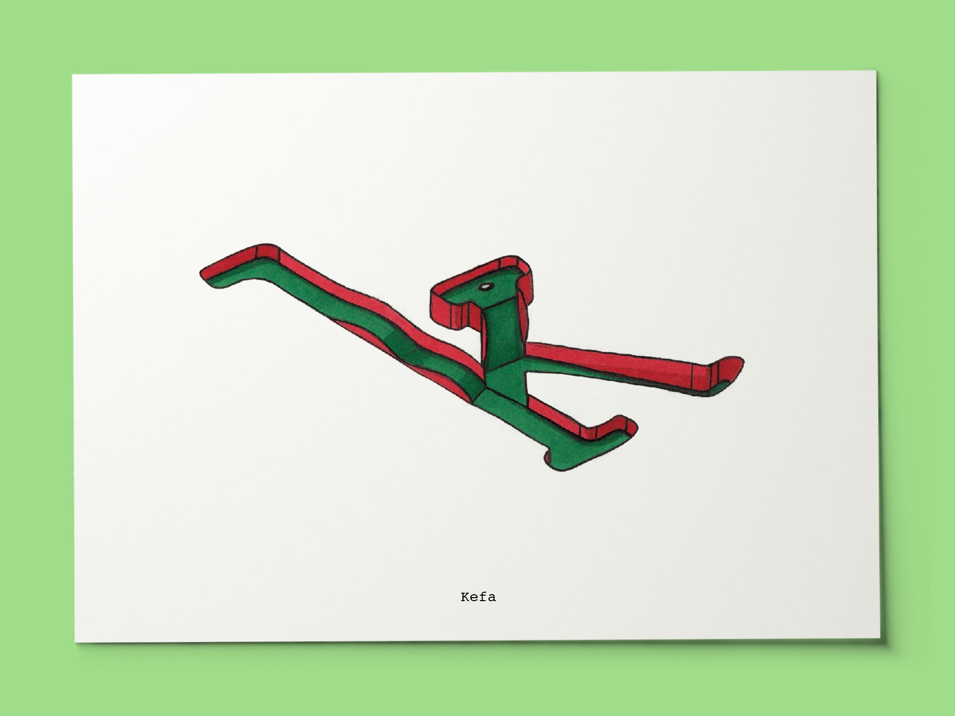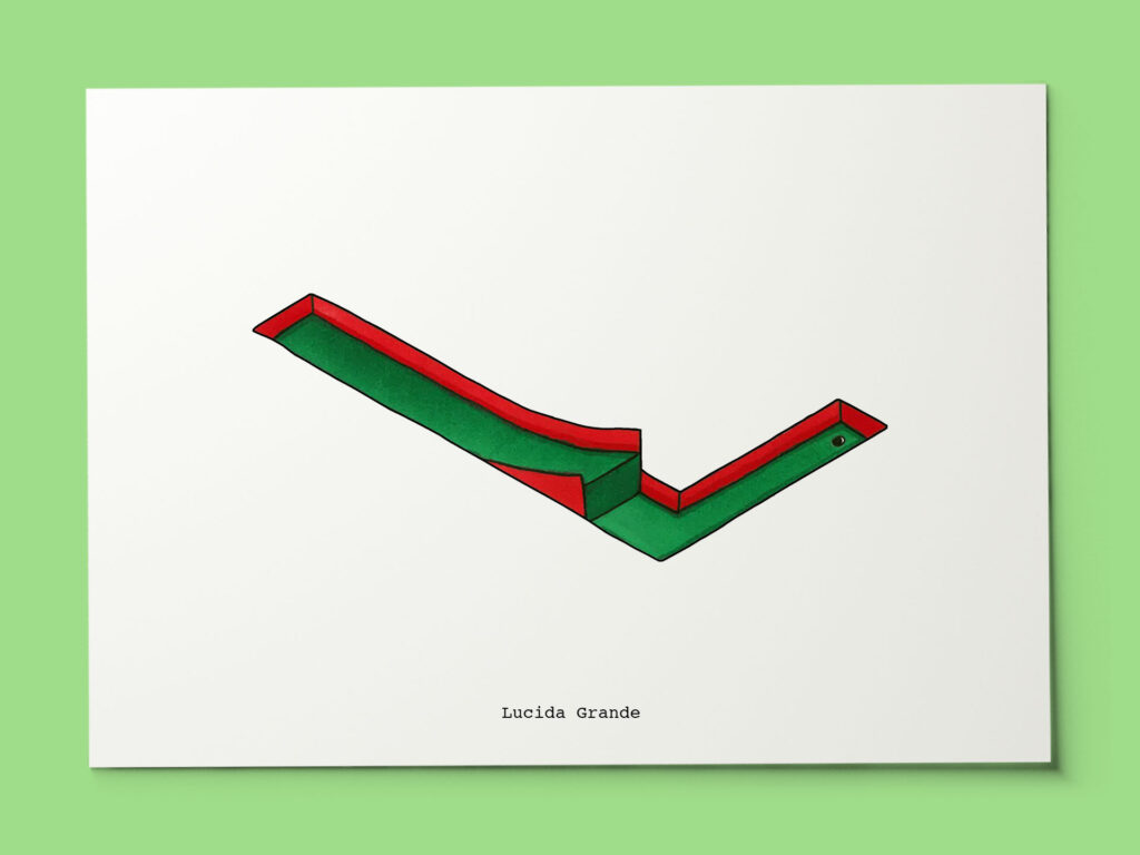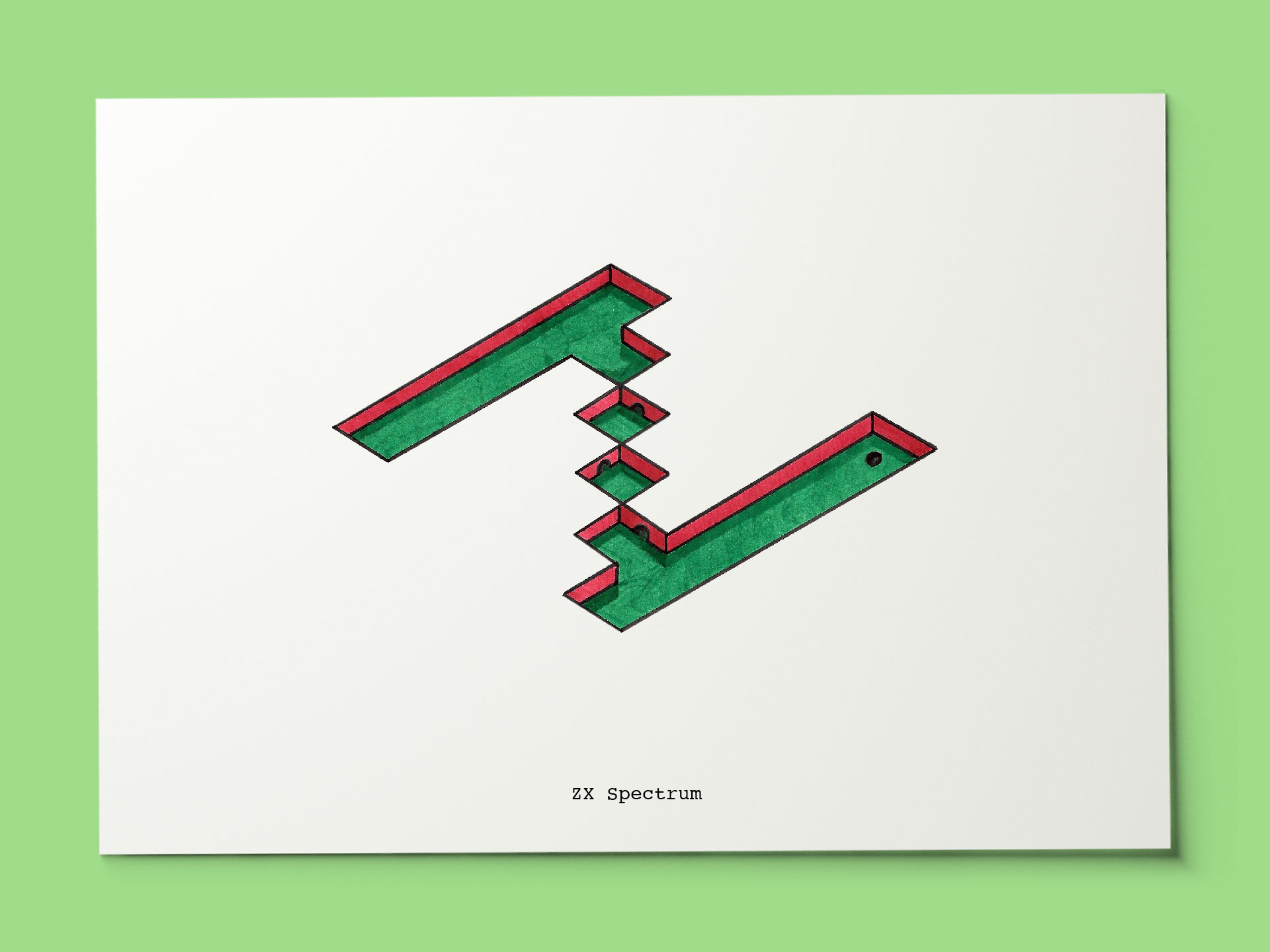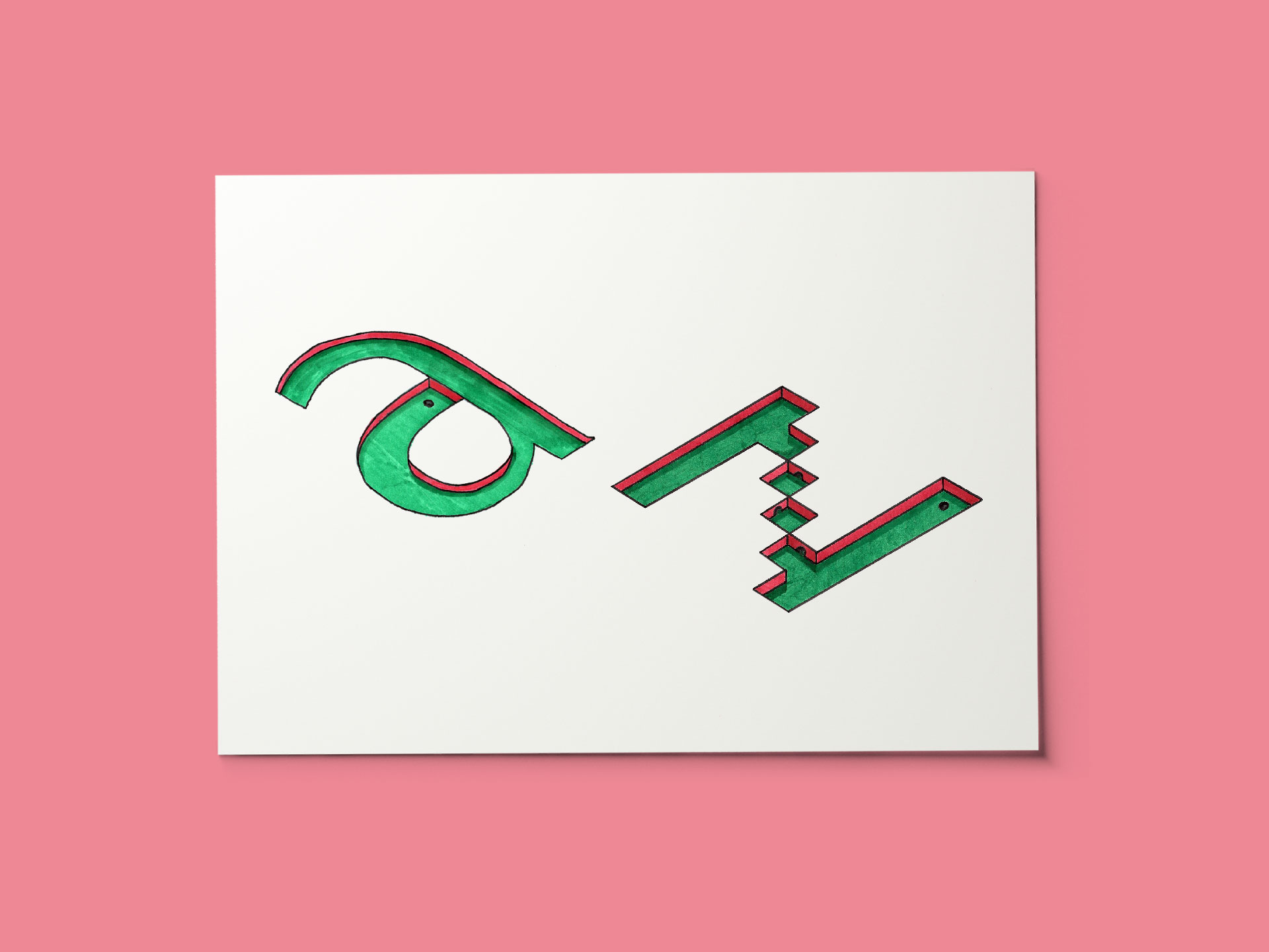
I love typography, I love mini-golf. So, I brought all these interests together by establishing a typographic alphabet using letterforms as the basis for mini-golf obstacles.
I take a letter of the alphabet and then I find a font that I like that begins with the chosen letter. From there, I look at the shape of the letterform and consider what kind of obstacle might work in that space.
I set the rule (although I did promptly break it) that all the play must be contained to the body of the letter, outside the letter or within the counter form is generally banned
The drawings are rendered in pencil and then inked before being professionally printed as postcards. They then come together in a premium presentation box before being used as promo items or for personal gifting, as needed.
