My versions of film posters are sometimes to improve on the original concept but more often than not they are simply to express my enthusiasm for the film in question.
One thing that I do like to do is to take one or two elements from the original poster artwork and ‘remix’ them inside the new layout. I enjoy this aspect as it forces me to look closely at the graphic design provided by the original designers and understand the decisions that they made before I subvert or discard them.
Client: Self-led
input: art direction, concept, design & layout, illustration, photography
Daleks invasion earth 2150 A.D. (1966)
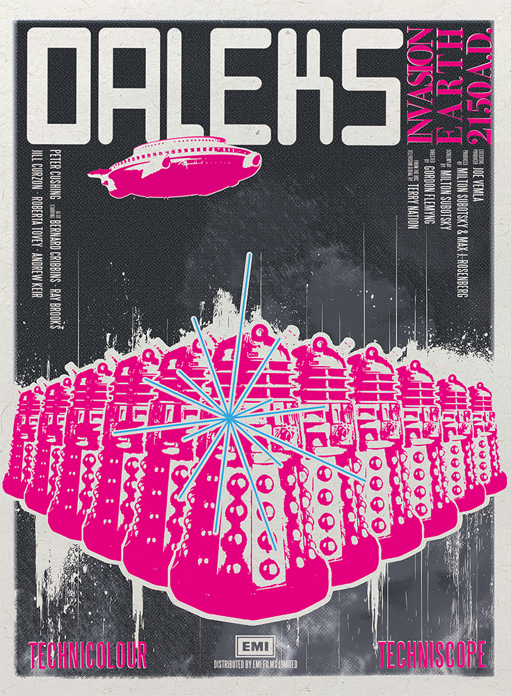
I love this film for its mix of danger and high camp, a cocktail that can only be 1960s Doctor who.
As such I wanted to create a poster that reflected what I get from the film. I therefore went hard on a ‘pop-art’ approach, rendering the whole thing as if it was a screen print – I therefore landed on a monochrome fiery background with hot pink overprinting of the details.
There’s no real concept behind it as such – what you see is what you get – a lot of Daleks (one of whom is already in ‘exterminate’ mode) coming towards the camera with the iconic ship flying overhead.
One other thing to note is that the main DALEKS font is self-created for a retro-futuristic flavor.
for your eyes only (1981)

The hook for this poster was a ‘google Maps’ satellite image of the Actual location of the swimming pool that features heavily in one of the early action sequences in the film.
I wanted to use that as my key motif, as I felt that the rest of the films narrative is set in motion from those events – essentially the hitman responsible for the deaths of the parents of the heroine, is himself killed in the said swimming pool by said heroine – if you look carefully you can see him in the pool…
I then overlaid everything with footage of bubbles to appear as if underwater – seafaring and diving is a key theme throughout the film.
GET carter (1971)

I was inspired by the famous scene where Jack Carter (Michael Caine) throws rival gangster Cliff Brumby (Bryan Mosley) over the edge of a staircase of Gateshead car park.
The point of view of the poster, using the crosshairs, is to suggest that Carter is being watched at all times by the hitman who will eventually ‘get’ him.
I deliberately flipped the scene on its head to enhance the feeling of confusion and disorientation that is at the heart of this classic piece of British crime realism.
The funereal colourway is taken from a 1990s re-release poster that I always felt suited the film.
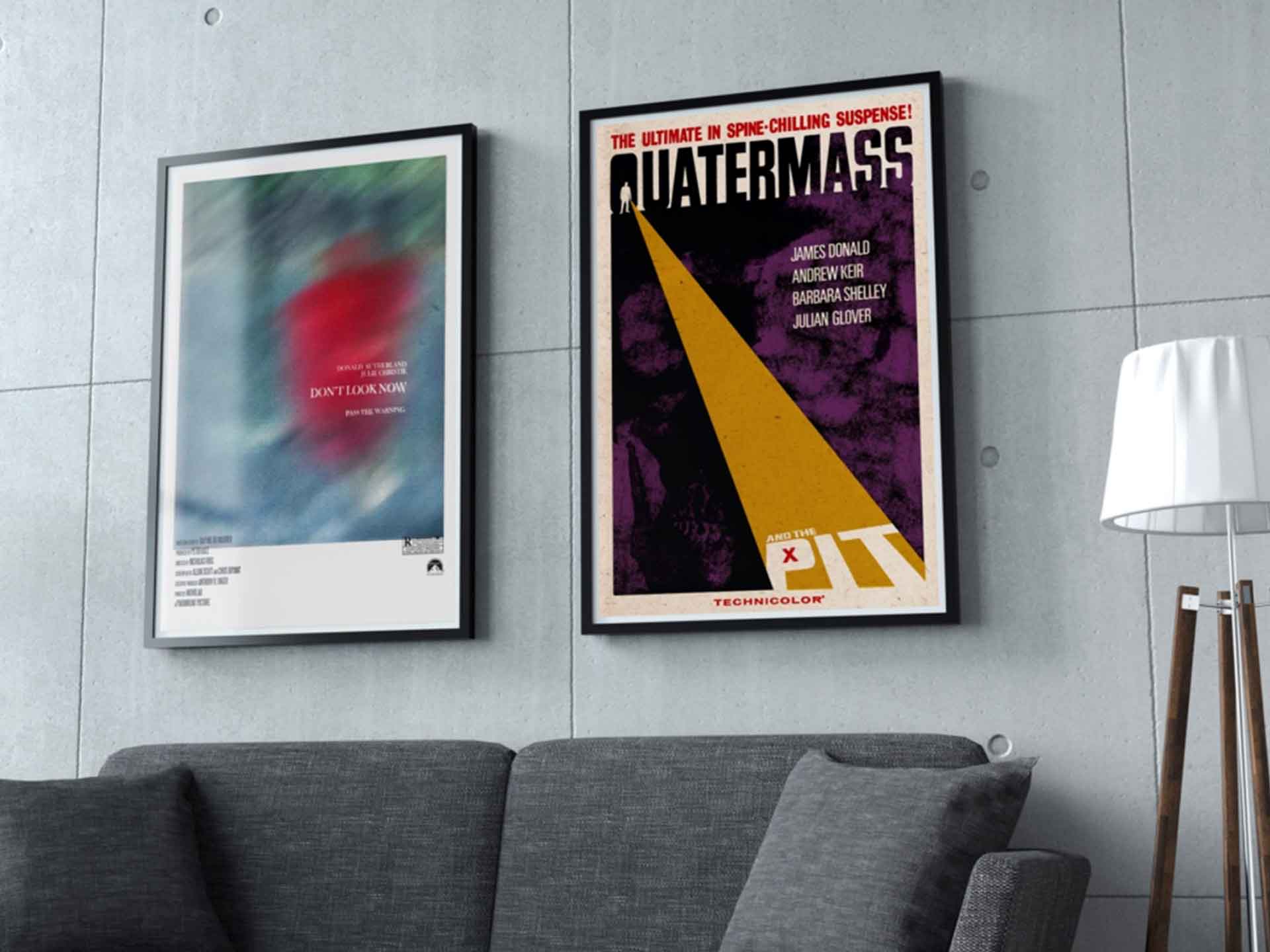
Quatermass & the Pit (1968)
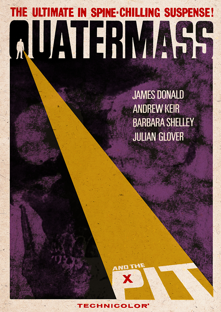
This is my take on Alternate Key Art for the Hammer Studios version of Nigel Kneale’s classic sci-fi story.
The plot revolves around a mysterious object uncovered during the digging of a London Underground tunnel extension. The erstwhile physical scientist Prof. Quatermass is called to the scene, at which point chaos ensues.
My new proposal is essentially a typographic piece that symbolises Prof. Quatermass shining his flashlight into the eponymous pit.
Don’t Look Now (1974)

Nicholas Roeg’s film has long given me the fear of little people in red duffel coats.
As such, I made the red coat the theme of the piece – taking a still of one of the film’s pivotal moments and then blowing it up large to distort it.
Otherwise I didn’t touch it other than offsetting the 4 colour channels to further its feeling of being ‘not quite right.’
the duelLists (1977)

A simple treatment for Ridley Scott’s first feature.
I love the theme of the film – a duel between 2 officers from the Napoleonic era lasting over 30 years – at the end of which they wonder quite what they were arguing about in the first place.
My visual styling seemed to be a no-brainer: I wanted to express the main theme/visual of the film simply, so I resolved to two pistols standing back to back superimposed over a vainglorious French flag.
Soylent green (1973)

I love how much people need Soylent green so I decided to feature the product large.
The main focus of the treatment is an actual biscuit of Soylent Green itself, coupled with the title and the slogan.
This seemed to be a nice traditional marketing approach that benefitted from being very graphic and, hopefully, attention-grabbing.
The shining (1980)

For a new version of Kubrick’s classic, I created a version that went heavy on one of films many piece of iconic production design, the design from a carpet on the floor in the overlook.
Taking this stark shape I then added a blood drip to reference one of the pivotal scenes, namely the flood of blood that suddenly appears from the elevator shaft and runs into the hotel.
These are elements that would only be known to a viewer who is already a fan but I hoped that such an image would be suitably eye-catching that it would bring in the new viewer also.
sky sharks (2017)

For a key visual of the decidedly shlock-horror film, there Was only one way to go!
My aim was to try and create a shark-themed poster as iconic as the one created for Jaws (1975) so I went with a simple visual statement.
As we are in the world of flying sharks, a bank of cloud becomes the stand-in for the ocean, the dorsal fin protrudes through bearing the National Socialist emblem – referencing a key theme of the film.
n.b the poster was created for a competition to find the final key visual that would market the film – my ruse received a highly-commended remark, and was posited to be used for the German home entertainment release of the film, although this sadly never came to fruition.