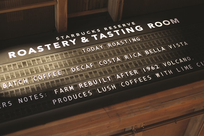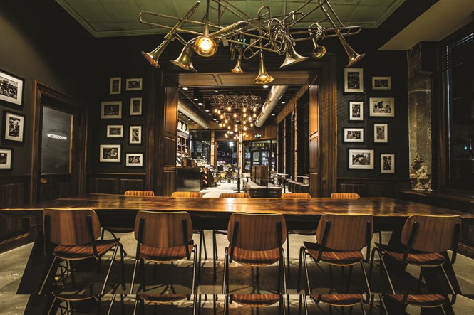
Coffee culture is determined by local factors. Thus, when building a global coffee brand, Starbucks has to take into account the diverse global consumer audience, as well as architectural and design differences, when focusing on the built environment
When you go into Starbucks to order your next Pumpkin Spice Latte how much will you be thinking about store design? The truthful answer is probably not a great deal. But, how do you feel when you walk into a store? You might feel comfortable, positive about the day, maybe even enjoying yourself during the work day. These environmentally- induced good vibes are no coincidence, but are engineered by Starbucks to ensure a positive brand experience.
Starbucks calls this the ‘Third Space.’ It is a pioneering approach to retail and merchandising design that allows the brand to replicate the same emotion in its customers around the globe, whether those customers are enjoying their beverages in the Willy Wonka-style wonderland of a flagship store in Seattle (which is approaching its one-year anniversary), getting a quick hit at one of the new ‘Espresso Shot’ stores trialling this year or simply visiting their trusted local store round the corner.
To understand how Starbucks has arrived at the formula, we need to take a trip back in time and look at the roots of another servery superbrand. In 1950s America, the brothers McDonald are engineering a concept for food franchising built around the principle of architectural guidelines, a literal blueprint that allows for the creation of restaurants that look and taste the same wherever the customer is, somewhere the customer knows they will enjoy food they know in familiar surroundings.
With our store designs we try to create that platform that brings everyone together, so yes, we influence the brand perception, but we also build from the existing brand perception in how we design the stores. It goes both ways.
Ad De Hond, VP, Store Design EMEA
Fast forward to the 2000s, the selling of reassurance has now developed into an aggressive commercial strategy used by multiple companies and is inspiring a wave of popular criticism of what is now called the fast food industry. Led by mainstream publications such as Naomi Klein’s ‘No Logo,’ the umbrella approach to store design has become a bogeyman that is corrupting the public’s soul.
In pure design terms, fast food companies were thinking more bottom line than brand. Mass produced interior kits allowed for rapid, ambient brand roll-out. But for Starbucks, the result was not one of customer satisfaction until the global economic meltdown changed the situation. Starbucks was hit hard and had to close a considerable number of stores, which provided a perfect time to regroup.
The Starbucks maxim was always to be ‘a different kind of company.’ Many firms use that as catchy copy for the corporate brochure, but Starbucks is apparently trying to live it – somewhat successfully as the brand is currently #45 on Forbes’ ‘Most Innovative’ companies list, way in front of activation behemoths Adobe, Coca-Cola and H&M.
Crucially, Starbucks never saw itself as part of the fast food industry and happily turned away from the increasingly unilateral approach to the design of food retail space.
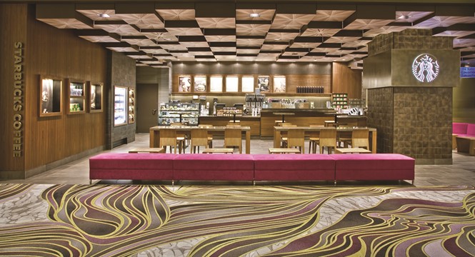
Store design became not just about designing coffee shops, but about creating a new place, somewhere away from home and work in which people can live out the everyday moments of their lives – business meetings, dates, interviews – a place away where, in the words of Ad De Hond, vice president of store design EMEA, “It’s all about our customers connecting with us.”
This is led by an adherence to the same set of brand values that inspired the company’s first store in Seattle’s historic Pike Place Market back in 1971. From just a small shop, Starbucks offered some of the world’s finest fresh- roasted, whole bean coffees with the aim of inspiring and nurturing the human spirit – one person, one cup and one neighbourhood at a time, as the company says.
This modern perspective is, in effect, a back-to-basics approach for the brand. The first store was inspired by its seafaring location and the company’s chosen name, inspired by Moby Dick, evoked the romance of the high seas and the seafaring tradition of the early coffee traders. Now the global approach to the design of Starbucks’ stores is to be locally relevant in order to appeal to customers. This of course translates into a commitment to serving the high quality, ethically-sourced coffee, but moreover it’s about being good neighbours. Every store is seen as part of a local community and engagement is achieved by bringing together partners, customers and the community to contribute every day.
Store design became not just about designing coffee shops, but about creating a new place, somewhere away from home and work in which people can live out the everyday moments of their lives
With more than 22,000 stores in over 60 countries around the world, Starbucks has to work hard not to dilute its brand in all elements of design and marketing. For customers, it is becoming more and more important to engage with a brand that relates to its locality – whether that is by serving a unique new product or by the store design incorporating elements of its surroundings. But as a global brand, the overall façade branding must be the same in intent and must be recognisable from a micro- and macro-level, wherever the site.
Where possible, the features of the buildings chosen for each new store are celebrated. Artistic influence is taken from local architecture, design and handicraft. Local artists and manufacturers are often used to bring a community feel to the store design. The challenge then, is for this global brand to ensure significant elements of its design strategy remain consistent.
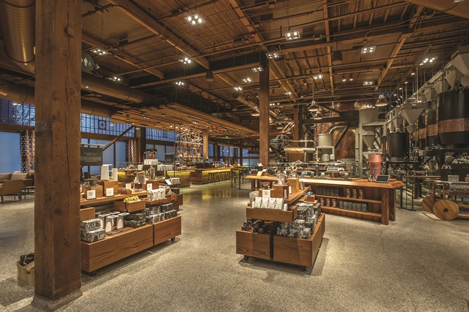
This means assessing the space, the location, the architectural features, the history, the coffee culture, the adjacencies, the consumers who would shop there and the future employees’ needs, before any pens are put to paper. As De Hond says, “We literally look at the location of the store, the history, the local coffee culture and how we connect our brand DNA with the local stories. We truly listen to what makes sense in order to create a soulful profitable store, then we start making the designs. We start with schematic layout sketches and then dive into the storytelling and materialisation which will result in a detailed design package for our construction team to take on and build the store.”
Naturally, when dealing with real places rather than AutoCad generations there are always challenges, but De Hond views these as positive, “When you start stripping walls and ceilings, you may find details that enhance the overall look and feel of the store and increase the sense of soul. We love these unforeseen surprises!”
This balancing of brand consistency with the realities of physical space is where innovation lives. Effective spatial branding must have elements of design that remain consistent in order to engage with customers wherever in the globe they might be. But rather than having one or two design studios that sit removed from the situation, Starbucks uses in-market design teams that really understand the spaces they are designing and incorporate a local look and feel. This design strategy aims to meld the brand’s heart and soul with market relevance and innovation.
When you start stripping walls and ceilings, you may find details that enhance the overall look and feel of the store and increase the sense of soul.
Ad De Hond
We love these unforeseen surprises!
And it’s an approach that seems to be working. In brand creation and activation, finding that magic element that can create meaning for a brand in the minds of the public is important. It’s that magic element that gives the brand its elasticity, which in turn allows Starbucks to create stores of every conceivable size and shape.
But does Starbuck see this elasticity as inherently linked to how its brand looks and feels when walking into a store? Does the brand come alive because of the visual identity which then affects people, or does the brand always exist in the attitude of its staff and customers first of all?
De Hond says, “I think the answer is that it comes from both angles. Starbucks is in the heart of our store partners and many, many customers. We share the same values and passion for coffee and coffee culture. With our store designs we try to create that platform that brings everyone together, so yes, we influence the brand perception, but we also build from the existing brand perception in how we design the stores. It goes both ways.”
