If you are an art lover, or a car enthusiast, the phrase ‘Fine art curated by corporate automobile manufacturer’ might be enough to give you a shiver of dread.
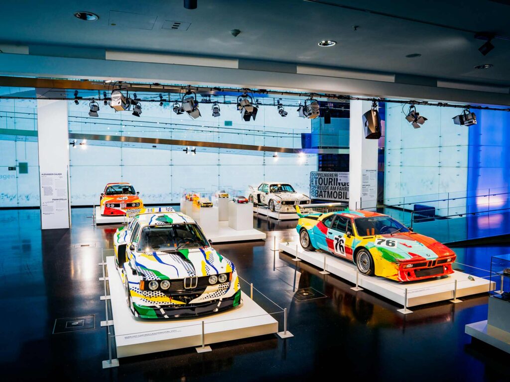
but the BMW Art Cars are exactly that; famous artists try their hands at graphic design, transforming sports cars into motorised canvases.
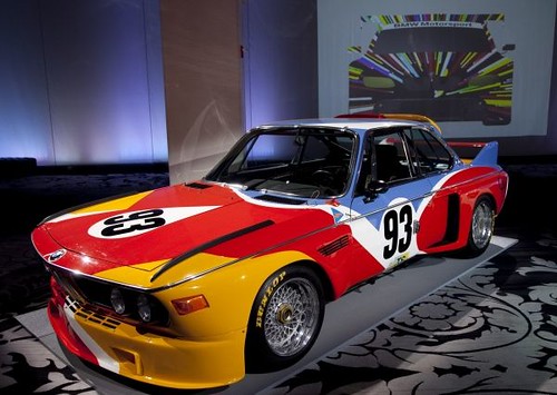
The Art Cars project is the brainchild of French art dealer and sometime racing driver Hervé Poulain. He combined his passions with a high-concept scheme to turn a sports car into a moving canvas through a paint job provided by a gallery artist working as a commercial graphic designer. He not only encouraged his friend, kinetic sculptor Alexander Calder, to supply the artwork, but he also talked Jochen Neerpasch (then director of BMW Motorsport) into giving the project a green light and letting him pilot the car in the 1974 Le Mans endurance race. The car did not finish the race, but it proved such a hit with the crowd that a second car, painted by Frank Stella, followed a year later. To date, there have been nineteen Art Cars, though they do not appear at regular intervals.

At that time, the relationship between graphic design and motorsport was nothing new. Initially, cars and / or drivers were identified according to geography, with certain colours becoming associated through repetition of use: red for Italy, green for Great Britain, plain polished metal for Germany (who were already displaying such technical knowhow that they dispersed with paint for the weight-saving advantages) and so forth. It wasn’t until corporate sponsorship found its way into motorsport in the mid-1960s that geometric form and colour – taken from the corporate identities of the sponsors – was used to emphasise the aerodynamic lines of the vehicle, establishing the tradition of racing livery as we now know it.
We are not a cultural institution, we are not making money from the cars. The Art Cars belong to the company, but we would never sell them.
Dr. Thomas Girst, BMW Culture
They are about paying tribute to the heterogeneousness that constitutes art
From the outset the Art Cars deliberately eschewed this vernacular, their aim was to be unique, unreproducible and display nothing of the brand identity of BMW. In that sense, they have much in common with hot-rodding and so-called ‘RICE*-ing’ – high-performance tuning of stock cars with equally loud paint schemes. However, unlike this type of pop-culture customisation they does not bear any of the recognisable idioms, there are no flames, enigmatic animals or comely women. Instead, the self-conscious avoidance of any kind of identifiable repetition of motifs provides as varied a set of visual approaches as could be wished for.


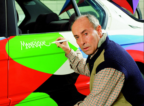
They can be categorised into three specific approaches. First, there are those that follow Calder and Stella’s approach verbatim. Roy Lichtenstein (#03), Ernst Fuchs (#5), César Manrique (#10) and John Baldessari (#19) adjusted their art to fit the format of a car, using shape, colour and, in the case of Jenny Holzer, (#15) typography, to pick out certain details of the bodywork which, in some cases, comes quite close to looking like a corporate paint job – Jeff Koons’ #17 being the zenith.

© BMW AG
The second approach, favoured by Robert Rauschenberg (#6), Sandro Chia (#13), and David Hockney (#14) are designs that follow on from their previous, non-motorised work – meaning that the same image could easily have been painted on any commercial object or canvas.

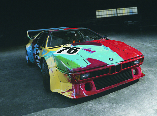
The third approach subverts the medium of both automobile and graphic content. Andy Warhol’s #4 is deliberately slipshod, with overt brush strokes and drips that question the idea of a perfect car finish and open the doors for a more conceptual approach. Other cars in this category have been remarkable: Olafur Eliason’s #16 housed the innards of a hydrogen-powered car in a shell of refrigerated ice, while Cao Fei’s plain matt black #18 has graphics only visible via a smartphone app.

There are a number of cars (painted by A. R. Penck (#11), Michael Jagamara Nelson (#7), Ken Done (#8), Matazo Kayama (#9) and Esther Mahlangu (#12), that seem at odds with the rest. For the most part, the artists chosen by BMW’s jury of art world experts seem to display a graphic proclivity that suits the end application perhaps more than artists who were not invited. These five cars are no exception but in comparison to the visual bombast displayed by the rest of the field, they feel almost humble. According to my own rationale, they are ‘Category 2’ but they form a subgenre by using motifs and techniques inspired by the ethnic art of the artists’ home countries; Australia, Ethiopia and Japan, respectively, as opposed to the smorgasbord of twentieth-century Modernism displayed by their colleagues.
This mix of gleaming Fordism and folkish naiveté might seem off-kilter, but beyond the obvious observation that an automobile is the ultimate folk object, do they have any lasting worth, aesthetically, culturally or otherwise?

It is easy to conclude that Art Cars must be a sort of content marketing stunt, but such a judgement misunderstands the nuances of the project. Emerging from a global corporation and boasting the most ‘inside’ names in the creative business, both of whom are working for no pay, the Art Cars have more in common with a designer’s personal side project. They could even be read as being the ultimate expression of Outsider Art sensibilities. Thomas Girst, the current director of the programme says: ‘We are not a cultural institution, we are not making money from the cars. The Art Cars belong to the company, but we would never sell them. They are about paying tribute to the heterogeneousness that constitutes art. We put it in our contract with the artists that we don’t have the right to use the cars for marketing purposes. We want to make the artist feel absolutely safe with us, that they should take pride in participating.’
With feet in both the automotive industry and the art world, arenas that usually function with a vast amount of self-aggrandising, pecuniary noise, the real takeaway of the Art Cars is not so much aesthetical as societal. In their instance graphic design has become a direct challenge to the visual culture of all organisations, commercial or otherwise. And if BMW is able to do something so deliberately disruptive, what’s your excuse? I wait with interest for Art Car number twenty.
* Race Inspired Cosmetic Extras
Notes:
It was a great pleasure to research the #BMWArtCars project for Eye: International Review of Graphic Design
Whilst I quite like the cars to look at I have always struggled with the question of whether they are ‘good art’ or ‘bad livery design’. In an effort to get to the bottom of the riddle, I got in touch with #BMWCulture and was subsequently invited over to BMW towers for a privileged look behind the scenes of the ongoing project.

